|
|
Critique By:
Luke Luther (K:14693)
8/21/2003 12:56:04 PM
i like this image. it makes for great reportage especially since there is no identifiable person in the portrait. the colors are great and i like the composition. i also am thrilled that it was taken with a maxxum
|
| Photo By: rosanna jerkins
(K:159)
|
|
|
Critique By:
rosanna jerkins (K:159)
4/30/2002 10:30:53 AM
Original window w/out crop or color added
|
| Photo By: rosanna jerkins
(K:159)
|
|
|
Critique By:
rosanna jerkins (K:159)
4/28/2002 2:37:49 PM
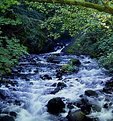
Joe, I totally agree. The branch is distracting when cropped and the "laughing waters" becomes the stronger subject in the last photo. Thanks for your input =)
Rosanna
|
| Photo By: rosanna jerkins
(K:159)
|
|
|
Critique By:
rosanna jerkins (K:159)
4/28/2002 2:36:11 PM
Steve - thanks for your input, I actually like it better too! =)
|
| Photo By: rosanna jerkins
(K:159)
|
|
|
Critique By:
Joseph Rushmore (K:240)
4/28/2002 11:48:02 AM
im gonna have to go with the last one, i think the branch in the upper part of the frame is a bit distracting. I think having the water as the main focus in this shot works well, great photo....................................joe
|
| Photo By: rosanna jerkins
(K:159)
|
|
|
Critique By:
Steve Kompier (K:4629)

4/28/2002 11:10:50 AM
This is much better.
|
| Photo By: rosanna jerkins
(K:159)
|
|
|
Critique By:
rosanna jerkins (K:159)
4/28/2002 10:40:43 AM
oops - forgot to check box. Water predominate
|
| Photo By: rosanna jerkins
(K:159)
|
|
|
Critique By:
rosanna jerkins (K:159)
4/28/2002 10:39:12 AM
Here is the same w/the Rainforest predominate
|
| Photo By: rosanna jerkins
(K:159)
|
|
|
Critique By:
rosanna jerkins (K:159)
4/28/2002 10:37:40 AM
Here is a cropped version with the water predominate
|
| Photo By: rosanna jerkins
(K:159)
|
|
|
Critique By:
rosanna jerkins (K:159)
4/27/2002 11:23:35 PM
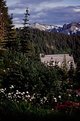
Marc, the only thing I've used w/Velvia film for capturing deep blue skies is my polarizer. Would a Yellow gradient filter bring out the clouds? And... is there such a thing? Thanks for the suggestions!! Still trying in Seattle... Rosanna
|
| Photo By: rosanna jerkins
(K:159)
|
|
|
Critique By:
rosanna jerkins (K:159)
4/27/2002 11:20:29 PM
Bill, I used a polarizer in this shot - but will try the gradient filter you suggest. Thanks for your suggestion! =) Rosanna
|
| Photo By: rosanna jerkins
(K:159)
|
|
|
Critique By:
Marc Robin (K:3385)
4/27/2002 10:27:05 PM
Hi, I also think this is a great photo. The house looks peaceful tucked into the woods like that. I was wondering though about gradient filters. what colour gradient filter do you use to make skies become 'obscenely' blue? A blue filter? a purple? I've got a blue one I haven't had the opportunity to use. Also, a gray gradient can be used to balance light between sky and earth, can't it? Thanks. Marc
|
| Photo By: rosanna jerkins
(K:159)
|
|
|
Critique By:
Bill Krul (K:5597)
4/27/2002 7:19:24 PM
Very nice. I like the flowers in the foreground. Have you tried a polarizing filter or a gradient filter. I sometimes use both to get obscenely rich blues in the sky. Especially with velvia.
|
| Photo By: rosanna jerkins
(K:159)
|
|
|
Critique By:
Halid Izzet (K:373)
4/17/2002 1:02:17 PM
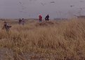
I understand what you were trying to capture, and I'm sure it serves as a good personal reminder of the moment for you. I think that one major element missing is a clear subject. You could say its the people - but which one ? they are so spread apart that my eye fleets about the picture randomly trying to find the main subject. For me its a rather difficult photo to read.
The foreground grasses certainly communicate wind to me, but could be better used if it was more uniform - the bare patch of foreground is another "eye disturber" as is the boy running out of the picture - its a shame he is not running into it. Perhaps lying down and getting really close to the grasswould be more effective ?
Overall I think that the concept is good. Quite often the photo that we choose from the contact sheet is not the one that speaks best to other people. Why not take a look at the other photos taken that day, and see if, by any chance , you haven't overlooked a silent gem !!
I hope this was helpful - I do go on a bit !!!
Halid
|
| Photo By: rosanna jerkins
(K:159)
|
|
|
Critique By:
rosanna jerkins (K:159)
4/17/2002 9:59:10 AM
What I was trying to relay was; salt spray, ocean mist, heavy fog, cold damp air, beach grass, some sand, lots of sea gulls - nevertheless families still find enjoyment just being at the beach.
Guess it didn't work very well
|
| Photo By: rosanna jerkins
(K:159)
|
|
|
Critique By:
rosanna jerkins (K:159)
4/17/2002 9:58:50 AM
What I was trying to relay was; salt spray, ocean mist, heavy fog, cold damp air, beach grass, some sand, lots of sea gulls - nevertheless families still find enjoyment just being at the beach.
Guess it didn't work very well
|
| Photo By: rosanna jerkins
(K:159)
|
|
|
Critique By:
chris meyer (K:597)
4/17/2002 1:44:49 AM
Wondering what you are trying to say with this photo with respect to the title. Looks a bit underexposed.
|
| Photo By: rosanna jerkins
(K:159)
|
|
|
Critique By:
rosanna jerkins (K:159)
2/14/2002 11:10:23 AM
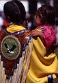
Thanks for your input! Here is the uncropped original version of the shot. Not much head room to begin with... hmmm need to work on that. There was a lot of color everywhere - a riot of color all day. I like your idea of getting more detail in the beading, but I didn't want it to compete but to add to the story of the 2 women. It was difficult to frame shots and it was my first attempt at 'photo journalism'.... so much to learn! =)
|
| Photo By: rosanna jerkins
(K:159)
|
|
|
Critique By:
Chelsea Burke (K:5750)
2/14/2002 10:54:39 AM
Cropped a little tight around their heads, and the bright background a little distracting. Nice exposure and focus. Perhaps an angle a little more to the left, just a tad, to pick up the beaded design a bit better.
|
| Photo By: rosanna jerkins
(K:159)
|
|
|
Critique By:
Petros Stamatakos (K:12101)
2/13/2002 10:18:00 AM
Rosanna, this is much better. I do think that it could be even brighter though... Nevertheless, interesting effect :-)
|
| Photo By: rosanna jerkins
(K:159)
|
|
|
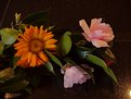
Critique By:
rosanna jerkins (K:159)
2/13/2002 10:12:22 AM
Thanks for the input - here's another made brighter... is this it?
|
| Photo By: rosanna jerkins
(K:159)
|
|
|
Critique By:
rosanna jerkins (K:159)
2/13/2002 9:33:34 AM
Maggie - the shot was taken on a kitchen counter w/daylight coming through the window to the left changing the leaf color. The light on the lower right is from a light over the sink! As I said, just a whimsy shot of some flowers growing wild and tossed on the counter. I felt that any arrangement on my part (turning leaves, moving flower) would have looked 'staged' and I was trying to capture the moment... DOF point taken - thank you! =)
|
| Photo By: rosanna jerkins
(K:159)
|
|
|
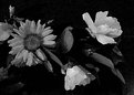
Critique By:
Deleted User (K:6775)
2/12/2002 6:48:01 PM
Hi Rosanna...welcome to usefilm. I like the feeling of this pic very much but there a a couple of little things I would have done...see what you think.
First off you need a bit more DOF and I'm not sure what the light is coming in from the bottom right corner but I find it a bit distracting to the overal image. I'm not sure, but it, or another light is changing the color of the leaves on the left side of the image also.
The other thing is the pink flower that is face down on the counter..I think I would have preferred it being tilted a little forward, not much just a little. And I would have turned some of the leaves so the shiny topsides were showing rather than the dull bottoms. These last two things are just little things I would do and wanted to see what you think... I dont shoot alot of flowers so I'm no expert just sharing my thoughts *smile*....Maggie
|
| Photo By: rosanna jerkins
(K:159)
|
|
|
Critique By:
Petros Stamatakos (K:12101)
2/11/2002 10:44:39 AM
Rosanna, first of all, welcome to Usefilm. You have done a great job with this image. As I'm not an expert on florals, I'm afraid my input stops here. Again, this is a beautiful photo. Keep posting :-)
|
| Photo By: rosanna jerkins
(K:159)
|
|