|
|
Critique By:
john amore (K:14015)
3/18/2004 6:33:40 PM
well done very interesting good color and bright and up beat good Job John
|
| Photo By: F. Scott Kennedy
(K:60)
|
|
|
Critique By:
C. Gull (K:509)
1/13/2004 2:07:28 AM
I like this very much. It is natural, real, and very well composed.
C
|
| Photo By: F. Scott Kennedy
(K:60)
|
|
|
Critique By:
Monty Emken (Ostracon X) (K:4804)
1/4/2004 11:50:55 AM
Very crisp and gorgeous!
|
| Photo By: F. Scott Kennedy
(K:60)
|
|
|
Critique By:
Bahadir k (K:8825)
10/7/2003 12:49:36 PM
purple rain..is coming
congrats
|
| Photo By: F. Scott Kennedy
(K:60)
|
|
|
Critique By:
Tiro Leander (K:19060)
8/30/2003 5:07:55 PM
A very good portrait.. Whyd did u stop posting here..
|
| Photo By: F. Scott Kennedy
(K:60)
|
|
|
Critique By:
. . (K:1787)
7/15/2003 1:54:53 AM
great light and model look! regards
|
| Photo By: F. Scott Kennedy
(K:60)
|
|
|
Critique By:
Ersin Tek (K:355)
7/9/2003 8:12:49 AM
looks like some kind of wedding photo in studios.
|
| Photo By: F. Scott Kennedy
(K:60)
|
|
|
Critique By:
B:)liana (K:30945)
7/9/2003 7:22:25 AM
Lovely as the love look can be!
|
| Photo By: F. Scott Kennedy
(K:60)
|
|
|
Critique By:
sadaf farahani (K:1740)
4/18/2003 1:28:18 PM
very nice model and good pose but I think it needs more contrast!
|
| Photo By: F. Scott Kennedy
(K:60)
|
|
|
Critique By:
AJ Haselwood (K:2148)
1/8/2003 1:15:54 PM
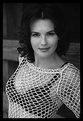
What Brett said!!! Excellent photograph!
aj
|
| Photo By: F. Scott Kennedy
(K:60)
|
|
|
Critique By:
Brett Prucha (K:17)
1/8/2003 1:11:28 PM
I am surprised no one has commented on this photo. Looking through the photos in the fashion section I began asking myself a question, "Can no one portray the beauty of a woman without having to put her entire body on display?" Don't get me wrong, I am not attacking nude portrails of the female body in an artistic way but rather the lack of attention given to the true aspects of what female beauty is all about. This photo goes beyond the perfect body put on display and shows the true character and beauty of the model. Thanks
|
| Photo By: F. Scott Kennedy
(K:60)
|
|
|
Critique By:
Ken Alexander (K:3905)
8/21/2002 9:13:09 PM
You might try cropping closer to the horse, because the building is a distraction, and the horse is too centered. But the flowers are nice and the light is good.
|
| Photo By: F. Scott Kennedy
(K:60)
|
|
|
Critique By:
Reynaldo Guimaraes (K:2422)
8/19/2002 12:29:32 PM
Hi, Scott.
Beautiful Model and shot.
I never used ilford film. Every tone is very good.
Nice photo.
|
| Photo By: F. Scott Kennedy
(K:60)
|
|
|
Critique By:
Vincent K. Tylor (K:7863)
8/19/2002 6:35:22 AM
I am not a fashion or portrait kind of guy. But this is a nice shot of a beautiful model. Where do you guys keep finding these girls?? Sharpness is excellent.
|
| Photo By: F. Scott Kennedy
(K:60)
|
|
|
Critique By:
Kenneth Kwan (K:3084)
8/18/2002 10:14:01 PM
Nice shot. The composition is very good. The placement of the house is perfect. The road is a nice touch but it leads the eyes a little away from the shot. I am really not crazy about the nearly fluorescent purple. To me, it doesn't fit the mood. The shot's wonderful subtlety is lost. Also, I'd crop a hair off the right to get rid of that bit of a lamp post.
|
| Photo By: F. Scott Kennedy
(K:60)
|
|
|
Critique By:
Kim Culbert (K:37070)
8/18/2002 3:47:39 PM
Simplistic and elegant. A very nice image. Wish it was uploaded a bit larger though so I could jump into the detail! Haven't seen you on here for a while so not sure if you know that images can now be uploaded at 640 x 480 pixels.
Looking forward to more!
|
| Photo By: F. Scott Kennedy
(K:60)
|
|
|
Critique By:
Sarah Needham (K:2482)
8/18/2002 6:47:29 AM
Nice image, but how did you get the pinky/purple glow?
Sarah
|
| Photo By: F. Scott Kennedy
(K:60)
|
|
|
Critique By:
F. Scott Kennedy (K:60)
8/18/2002 6:25:16 AM
Thanks to both of you for the comments!
Scott Kennedy
|
| Photo By: F. Scott Kennedy
(K:60)
|
|
|
Critique By:
F. Scott Kennedy (K:60)
8/18/2002 6:24:22 AM
Thanks to both of you for the comments!
Scott Kennedy
|
| Photo By: F. Scott Kennedy
(K:60)
|
|
|
Critique By:
Kenneth Kwan (K:3084)
8/17/2002 12:52:35 AM
Very cool! Extremely well-seen and original. Beautiful sharpness and DOF. Flawless composition. Wonderfully smooth background. Well-seen, well executed.
|
| Photo By: F. Scott Kennedy
(K:60)
|
|
|
Critique By:
Petros Stamatakos (K:12101)
8/16/2002 5:56:34 AM
Stunning.
|
| Photo By: F. Scott Kennedy
(K:60)
|
|
|
Critique By:
Nicolette Kintz (K:146)
8/9/2002 9:59:51 PM
They do look in love. It's like a still from some old movie. Lovely shot.
|
| Photo By: F. Scott Kennedy
(K:60)
|
|
|
Critique By:
William R Eastman III (K:2141)
6/23/2002 4:09:23 PM
I love Chris's work and I see this image as a parallel with his 'hang on' circus photo. This is not a 'cookie cutter' concept. You didn't recreate this image, you found it all by yourself. Nicely done.
|
| Photo By: F. Scott Kennedy
(K:60)
|
|
|
Critique By:
Chris Moore (K:5591)
6/23/2002 2:45:15 PM
Hi there,
I like the lighting and texture of this shot, but find the angles a bit unnatural and confusing.
Chris.
|
| Photo By: F. Scott Kennedy
(K:60)
|
|
|
Critique By:
Kim Culbert (K:37070)
6/9/2002 8:52:41 PM
The focus looks a bit off with this one.. and without reading your about I couldn't tell that he was homeless... might have been nice to see some background (his home?) to give the setting to make the picture.
His expression does speak words, though.
|
| Photo By: F. Scott Kennedy
(K:60)
|
|
|
Critique By:
F. Scott Kennedy (K:60)
6/8/2002 8:49:56 PM
Yes I was trying to keep the picture in a state of softness like in a fairy tale land. The use of fill light would have whitened the light to much(unless it was reflected off a gold reflector) and taken away the depth that I wanted to have. Thanks Kim for the review!
|
| Photo By: F. Scott Kennedy
(K:60)
|
|
|
Critique By:
Kim Culbert (K:37070)
6/8/2002 3:55:37 PM
Beautiful light here... really makes the picture, although I'm dying to see more detail in her face, especially around the eyes. Fashion photog. isn't my thing, so I don't know if using a fill flash slightly further away would add the catchlights and just a bit more light to the face, or if it would take away from the warm colour you've got happening.
Keep em coming.
|
| Photo By: F. Scott Kennedy
(K:60)
|
|
|
Critique By:
Tony Blei (K:575)
6/7/2002 11:44:26 PM
It looks like I don't know what I am doing -- This time I will check the little box that sez "check this box to add attachment."
|
| Photo By: F. Scott Kennedy
(K:60)
|
|
|
Critique By:
Tony Blei (K:575)
6/7/2002 11:40:47 PM
Hey F. Scott,
Nice picture -- but I think it needs a little help in the contrast department. I love it when the blacks are black and the skin tones resemble skin tones.
I'm not sure I agree with the blown out whites -- but that is the cool thing about photography -- we all get a chance to make art that makes us happy.
I took the liberty of downloading your image and did some burning and dodging. I hope you like it. -- Tony
|
| Photo By: F. Scott Kennedy
(K:60)
|
|
|
Critique By:
Phillip Filtz (K:1792)

6/7/2002 10:34:21 AM
Scott, curious as to the time of day this was taken. If it was after the sun was down, that might explain the blue tones. The later in the evening a shot is taken, can result in a blue'sh tone.
You didn't remark on exposure times and shutter speed so it's a bit hard to determine more about how it was taken.
I would tweak with it in PS. Possibly adjust curves, and dodge and burn a bit.
My .01 worth 
|
| Photo By: F. Scott Kennedy
(K:60)
|
|