|
|
Critique By:
Becky V (K:9699)
10/18/2008 12:41:28 AM
Hey, I remembered about this place!
Is this a recent shot? I don't recall seeing it before, but it's really, really good. Definitely pro-worthy! It would be nice to have a bit more light in the baby's eyes (difficult, I would imagine, with dark eyes and a white shirt on dad), but the softness and warmth more than make up for it.
|
| Photo By: Kim Culbert
(K:37070)
|
|
|
Critique By:
Becky V (K:9699)
10/14/2007 8:19:16 PM
I don't think I've seen this one before, but I lurve it. Very well spotted! What kind of filters did you use, if any? Whatever the setup, the result, exposure-wise and colour-wise is right on the money. I'm totally digging the gentle gradient of light blue at the top of the frame to deep blue at the bottom.
I really like the gentle ripples in the water too. On the one hand, the way those ripples run diagonally across the photo is a nice contrast to the horizontal lines of the branch (plus they direct the eye across the entire photograph), but on the other hand, for some reason I expect those ripples to run vertically. Did you rotate this photo at all? Regardless, you deserve hearty applause for this shot!
|
| Photo By: Kim Culbert
(K:37070)
|
|
|
Critique By:
Becky V (K:9699)
8/19/2007 8:41:55 PM
Awesome - postcard perfect!
I think I like this one a bit better than Nature Reflected. The trees in the foreground give it a bit more depth . . . plus the lookout angle gives it a bit more height. Gorgeous colour . . . I can never get that kind of colour!
|
| Photo By: Kim Culbert
(K:37070)
|
|
|
Critique By:
Becky V (K:9699)
8/7/2007 11:14:04 PM
Hi Kim - thanks for the comment!
This one is an oldie. I haven't been to PH since October of '05 . . . but I hope to get there this fall.
|
| Photo By: Becky V
(K:9699)
|
|
|
Critique By:
Becky V (K:9699)
6/16/2007 5:03:54 PM
Hi Collin. Thanks for the comment.
As for the beach, I was standing on it when I took this photo. Of course, I've taken that information for granted, and it didn't occur to me that others can't see the beach and will therefore wonder where the heck it is. D'oh.
Technically, they're not bionic implants from another planet as Pluto is no longer an official planet.
|
| Photo By: Becky V
(K:9699)
|
|
|
Critique By:
Becky V (K:9699)
2/23/2007 9:42:14 PM
Really? Are you going to be in Vancouver soon? Please let me know if you are . . . it would be great to share a Vancouvery shoot!
I wouldn't have immediately guessed the photo was taken here . . . unless you had mentioned it was taken this past winter, which has been especially brutal in these here parts. It was even snowing this morning in places. We're supposed to see blooms by now!
You know, I've lived here for 8 years and I have yet to go to Van Dusen Gardens. *runs and hides*
|
| Photo By: Becky V
(K:9699)
|
|
|
Critique By:
Becky V (K:9699)
2/22/2007 10:29:09 PM
Audrey! (Except I mean it more like "Aaaauuuuudreeeey!") So nice to hear from you! How have you been?
"Supposed to be" . . . heh. You crack me up. :) I really appreciate your critique (especially since I've been a UF deadbeat for the last, oh, couple of years). This photo could have benefited from a ND grad, only I didn't have one at the time. (I do now. Wheeeee!) I metered off the sky, but perhaps I should have metered off some of the lighter planks? Anyway, I was wondering how dark I could leave the bottom. I'll have to play with it some more.
Anytime you want me to list off primo photo opportunities in BC (or AB!), just let me know. I kind of like playing photographic tour guide. Vancouver is particularly great for shooting, and there are always more intriguing niches around the corner to discover.
Thanks again, Audrey.
|
| Photo By: Becky V
(K:9699)
|
|
|
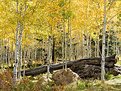
Critique By:
Becky V (K:9699)
12/11/2005 8:55:25 PM
The lighting in this photo is amazing . . . the autumn sun really lights up those yellow leaves! Great exposure, by the way . . . I'm amazed you got detail in the leaves and white trunks while retaining detail in the dark trunk - perfect contrast!
I like that the fallen trunk is in the midground, behind a few trees. I think it would be too overwhelming if it was right in front. Although I like its juxtaposition with the slender, vivid trees around it, I wonder what this shot would look like concentrating just on those trees. More abstract, probably, but I'd really like to get lost in that forest without the trunk acting as a slight barricade to the eye being drawn into the photo.
Terrific autumnal shot!
|
Photo By: John Bohner
(K:8368)

|
|
|
Critique By:
Becky V (K:9699)
12/10/2005 10:50:02 PM
Another awesome nebulaic shot. That's what it looks like to me. Something pertaining to nebulaism. The abstractiness is great . . . I actually don't see a definitive image in this, but rather some great flowing lines and interesting textures.
Out of the three "colour edits" you posted, I think the original is by far the best. The deep, rich black and blues really invite the eye into the photo . . . I find too much white or bright/light colours actual repel the eye a bit. But that's probably just my eyes. Plus, I'm a great fan of the black/electric blue contrast.
As for your other dye projects, I also like "Another Phoenix", mostly because of the juxtaposition of the tightly curled, horizontal line and the sheetlike spread of the second dye cluster . . . it gives the image an unexpected depth. I also like the amber hue.
Although I appreciate your attempts to experiment with these dye projects, my reaction to "Confrontation" is kind of a mixed bag. On the one hand, I love the effect of the backlighting and how the foreground has this dark sheen . . . it really makes me feel as if I'm in an aquarium! On the other hand, the inclusion of the glass provides some context, which sort of cuts down on the magic of the abstraction . . . one is less likely to think, "What IS this?!" and also less likely to concentrate solely on the shapes of the dye (although that was probably your intention). I really like the geyser-shaped dye column in the middle and wonder what it would look like with a close crop on just that shape alone.
Always a pleasure to view your dye & light experiments!
|
| Photo By: Stefan Engström
(K:24473)
|
|
|
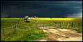
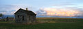
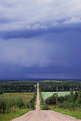
Critique By:
Becky V (K:9699)
12/8/2005 3:40:03 AM
Oh wow . . . there are so many things I like about this shot. First is the most fortuitous lighting that lights up the subject and gives it an almost cheerful feel as it sits it in stark contrast to the black, ominous sky. I like the panoramic-ish dimensions of the photo, as I think it captures the vastness of the prairie better, not to mention makes the storm look even more massive and threatening. Finally, my favourite part about the shot is how you composed it. My instinct would have been to stand on the fence and zoom into the house/barn, but what you've done is so much better. Placing the fence in the foreground gives the shot depth and placing the house/barn waaaay off in the midground makes it look so tiny and vulnerable against the dark, descending sky. That's the clincher for me!
|
| Photo By: Tim Schumm
(K:29196)
|
|
|
Critique By:
Becky V (K:9699)
12/7/2005 11:51:56 PM
Thanks for the quick answer, Tim . . . hope you didn't mind the question. I know how vivid dusks can get up there . . . I just wish they would show up on the rare occasion I go back for visits! *L*
|
| Photo By: Tim Schumm
(K:29196)
|
|
|
Critique By:
Becky V (K:9699)
12/7/2005 7:39:22 PM
Holy nostalgia, Batman. I grew up near here and I remember how summer evenings could look like this . . . the colour of the sky - of the *air* - would get so overwhelming that, as a kid, I always thought the world was ending! Okay, so I was a paranoid kid . . . *L*
Wonderful photo . . . I love the drama of the clouds in the sky. I also like how you captured the bit of dust kicked up by the baler. The motion of the tractor and sky is a nice contrast to the solid stoicism of the bales.
Out of curiosity (if you don't mind me asking!) did you use a filter with this shot, or is it completely "as is"?
|
| Photo By: Tim Schumm
(K:29196)
|
|
|
Critique By:
Becky V (K:9699)
12/7/2005 7:25:43 PM
By the way, here's the same shot, but with some foreground. I really like the extra splash of colour, but I don't feel the photo has the same impact as the one above. Which do you prefer and why?
|
| Photo By: Becky V
(K:9699)
|
|
|
Critique By:
Becky V (K:9699)
12/5/2005 7:39:59 PM
Was this a spontaneous capture, or a pose? Regardless, what really works in this portrait's favour is how the body and arm are positioned as well as the angle of the tilted head. It's very dynamic and draws the eye in much easier than if this had been a more perpendicular shot. I particularly like how the arm kind of swoops from the body into the foreground. I'm usually not a fan of partially cropped objects, but I think cropping out part of the fist was a good decision here . . . you don't really need it to convey the "power" in "girl power" - it's the face that conveys this message, and in a more interesting and complex way. Too much blurry fist in the foreground would have been distracting, methinks.
As always, and this is said with the usual jealousy, great job with the tones, especially considering the light coloured jacket against a fairly dark background.
|
| Photo By: Stefan Engström
(K:24473)
|
|
|
Critique By:
Becky V (K:9699)
10/27/2005 2:24:42 AM
Stefan, if tinkerers of others' photos end up in a special level of hell, then I'll be there to serve cookies and lemonade. I always appreciate the educational efforts of others!
Your tweaked version definitely has more drama and punch (and highlights my sky fiddling, which I thought wasn't that obvious . . . I really have to stop PSing photos on bright days inside bright rooms). Personally, I think I'd dial it back to a 50/50 mix of my photo and yours. And if Santa Claus doesn't bring me a ND filter, then I'm DEFintiely buying one come January.
Tim, I agree some height would have benifited the photo. I'd probably have to invest in a pack mule, though, for the photo expeditions of the long hike variety.
Do they make inflatible ladders? They probably should.
|
| Photo By: Becky V
(K:9699)
|
|
|
Critique By:
Becky V (K:9699)
10/26/2005 11:56:03 PM
Do I like it? I do, I do! I liked your Barn Study photo, but I like this one much more. For one thing, the house is shot more on an angle, which adds dimension and depth to the structure. Another reason is that here, you've included less ground and more sky, which is great because that's where the interest lies. The exposure is on the money, as you can see detail in the ground and house, while the colours in the clouds remain eye-catching, but not overwhelming. The inclusion of the farm in the faaaar distance on the right draws the eye right into and through the photo and the panoramic crop, plus the action of the flying birds makes me feel like I'm watching the opening frame of an epic film.
Favourited!
|
| Photo By: Mark Mahar
(K:3233)
|
|
|
Critique By:
Becky V (K:9699)
10/26/2005 11:10:24 PM
I'm really enjoying your flower macros - they're all so colourful and full of vitality! This one is no different (plus you get a few bonus marks for including one of my favourite flowers :p). The contrast of the red and orange against the green is quite awesome. I also like the choice of angle . . . backing off from an extreme closeup in favour of more background and space around the two focal flowers. I like your attempt to include the third flower on the bottom right - the out of focus head is like a dash of colourful paint, however, ultimately I think it distracts from the subjects (if it were smaller and/or in the background rather than the foreground, I think it would be okay) and it takes away from the great green space surrounding your subjects. With this image, I think less is probably more.
Still, I love it all the same. Great job!
|
| Photo By: Jorg Reif
(K:16020)
|
|
|
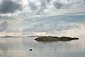
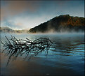
Critique By:
Becky V (K:9699)
10/26/2005 10:36:23 PM
Actually, I like this photo much more than "Sunrise". In Sunrise, the composition is great and I like the perfect exposure of the fog and the hint of detail on the shore, but the lack of detail in the hill pulls me out of the photo . . . I find that empty black space a touch overwhelming.
In THIS photo, the fog may not be as goldenymagical, but I like how the photo is exposed to catch detail in everything, especially the hill, which is beautifully lit with fall foliage. The branch in the foreground works well for added interest and depth and I like the various colour tones of the water. Perhaps you could try lassoing that "edited" selection of sky in the top left corner and give it a little colour tweak so it matches the peach/orange tone in the water on the lower left. That, or blue it up a bit.
Anyway, I agree the fog is a unifying theme between the three pictures, but I kinda think it looks different/has a different personality in each one.
|
| Photo By: Stefan Engström
(K:24473)
|
|
|
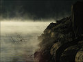
Critique By:
Becky V (K:9699)
10/26/2005 10:20:36 PM
I can sympathize with the bite-sized conundrum. Nature makes her sandwiches so wonderously large, but it's a quandary for photographers. And my current camera has lockjaw. 
At first glance, I felt the exposure was just a touch under, but at the same time, I like the strong shadows on the shore. For one, there's a contrast with the water, for two, there's a really cool sketch-like quality to the textures found there. I like the inclusion of the branch in the water as it provides a context for the photo. Without it, the shot would be pretty abstract (not saying that's a bad thing, just saying!) I like how the tranquil play of water, light and fog stave off the potential menacing atmosphere of the shoreline shadows.
|
| Photo By: Stefan Engström
(K:24473)
|
|
|
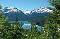
Critique By:
Becky V (K:9699)
10/26/2005 10:10:20 PM
Given how horizontally intense this photo is, it has a really good feeling of depth - the diminishing clouds (from top to bottom) really pull the eye in. I also like how you were able to get the foreground buildings in a darker shade than the midground ones . . . that separation does a lot for the shot. It's too bad you didn't have a stepladder. I think with just a little more height you could have seen the purple waters of the inlet stretch across the shot for even more depth/separation, but still, great shot as is. Good to see the Sensia is working out for you . . . can't wait to see more shots from this roll!
|
| Photo By: Kim Culbert
(K:37070)
|
|
|
Critique By:
Becky V (K:9699)
10/21/2005 10:34:12 PM
Amr: I would sometimes fly down that hill on my bicycle, which was as close as one could get to flying, I imagine (potholes notwithstanding).
Stefan: I really lucked out with that sky. I think it was a combination of lighting conditions (liiiittle bit of sun left while the storm was barreling in), and a polarizer. I'm not sure why the Velvia didn't cast a cool hue over everything . . . maybe because everything's mostly green. I'd love to hear other theories . . .
|
| Photo By: Becky V
(K:9699)
|
|
|
Critique By:
Becky V (K:9699)
10/21/2005 10:27:36 PM
Thanks for the USM tip, Audrey.
I try to view my photos on as many computers as possible (which usually means just my home & work comps) . . . I viewed this photo on a relative's computer the other day and EGAD! I can totally see what you're talking about now. This "halo" everyone is mentioning? Totally invisible on my computer (and I swear I have the monitor calibrated correctly . . . but then again, maybe not).
I wonder how many more of my photos look as horrendous to others? Gadzooks! The thought!
|
| Photo By: Becky V
(K:9699)
|
|
|
Critique By:
Becky V (K:9699)
10/16/2005 7:31:54 PM
Thanks for the comments everyone - I appreciate you taking the time to record your thoughts. 
It's been awhile since I worked with this photo, but I'm pretty sure I didn't take the sharpen tool to it. However, I would have used Unsharp Mask, which I normally apply to my photos. The settings usually lie at 30% with negligible radius and threshold settings. I didn't realize that would make a huge difference, but I guess it does. Hm.
|
| Photo By: Becky V
(K:9699)
|
|
|
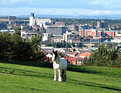
Critique By:
Becky V (K:9699)
10/16/2005 2:58:43 AM
This is a really cool shot . . . I love how there's three elements to the photo: the rural, the urban and the suburban (it's great that the hill slopes away, otherwise the suburban may have remained hidden). I also like how three definitive colours (blue sky, red rooves and green grass) interact to make this unique photo even more bold.
Is the horse tethered? There seems to be a thin rope hanging from its head . . . you could try to clone it out just to remove the (very slight) distraction or make it appear that the horse is roaming free. You may also have been able to get away with irising down one more stop in order to mitigate the sun shining off all the white objects, but overall, I love this intriguing shot.
|
| Photo By: Colin Cartwright
(K:15699)
|
|
|
Critique By:
Becky V (K:9699)
10/15/2005 12:50:50 AM
This may not be a popular opinion, but I kind of like the monochromatic-ness of this shot. The fluorescent (was it? It looks fluorescent) lighting gives the shot an interesting green-yellow tone that I find rather appealing (and no doubt if there was a bowl of fruit or ice-cream, it would have taken on the same tone as well). I also like the lines and depth - way to see something extrordinary in the ordinary.
Is that someone's toe in the top left corner?
|
| Photo By: Etienne
(K:4192)
|
|
|
Critique By:
Becky V (K:9699)
10/15/2005 12:45:52 AM
Thanks so much for your thoughtful critiques everyone!
Kevin: Something was bugging me about this photo and you put your finger right on it: definitive subject! I think you're right. I really like your vertical crop - it gives the photo a lot more depth by pulling the eye into the photo rather than across it. Thanks for the suggestion!
Stefan: I lucked out with the sky here. The afternoon started out partly cloudy, then clouded over with high, white cloud, then a storm blew in about the time I got this shot. Most of my shots were taken in the "high, white cloud" period. I'm so impatient.
|
| Photo By: Becky V
(K:9699)
|
|
|
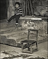
Critique By:
Becky V (K:9699)
10/15/2005 12:38:09 AM
The contrast between the child's soft face and bold shirt and her open, harsh environment gives this photo a significant emotional pull. I like how she's defying convention by finding her own place to sit . . . Really nicely seen and captured.
|
| Photo By: Audrey Reid
(K:5872)
|
|
|
Critique By:
Becky V (K:9699)
10/8/2005 4:30:34 PM
What I like most about this photo is that while it's a portrait, there's still an element of the casual to it, which allows the personality of the participants to shine through. I think you did a great job with the toning and exposure . . . I think I'd rather have perfectly exposed whites and underexposed blacks than the other way around - mostly because you can usually coax out some detail from the dark. There are no details lost on the shirts and the sky in the upper left is not overpowering, so I say good job!
|
| Photo By: Stefan Engström
(K:24473)
|
|
|
Critique By:
Becky V (K:9699)
10/1/2005 3:53:25 PM
Well, I like the pink, but that's probably because I'm a girly girl. :P Your ability to colour B&W amazes me . . . I studied the baby's skin for awhile, wondering if it could have more or less colour, or perhaps colour in more concentrated areas (the cheeks, for example). But in the end, I think it's quite alright as is.
About the gauze, I certainly like it more than the floweryobjectthingie. I think the foreground gauze in the bottom right hand corner could probably go, but it's so light and soft that it doesn't distract too much. My biggest issue with it (and this is less an objective, technical comment as it is a personal "thing" with me) is the texture. It appears a bit rough to me . . . although I admit it makes an interesting contrast. Still, I keep thinking "Loofah Baby!". Perhaps play with softening or even smudging a bit if you're feeling experimental.
I really like how, when you have a subject, whether it be puppies or babies (or ducks!), you use all kinds of props . . . it produces some really great results!
|
| Photo By: Kim Culbert
(K:37070)
|
|
|
Critique By:
Becky V (K:9699)
9/25/2005 6:34:36 PM
This is a photographic side I've never seen from you and I like it! The choice to go with black and white is a wise one (just because baby skintones seem to be so overtly pink), as is the soft contrast - what kind of lighting did you use?
Okay, about the thingie . . . well, that's just it. I had no idea it was a rose until you pointed it out. Because the object is kind of shapeless and because it occupies a lot of foreground, it really distracts. I suppose it lacks motivation, but at the same time, if it was something definitive, like a teddy bear, I could see that being alright.
That said, you did a really great job of colouring the object (and a doubly good job with the red & green edit). At first, I thought this was a colour photo converted to black and white, and then partially restored. Fool me once!
|
| Photo By: Kim Culbert
(K:37070)
|
|