|
|
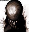
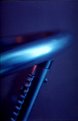
Critique By:
Tomasz Sarna (K:1778)
12/15/2003 8:05:28 AM
very good composition and use of light, good job !
regards
|
| Photo By: Nermin Habib
(K:61)
|
|
|
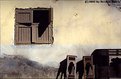
Critique By:
Bryce Hughes (K:2957)
3/2/2003 7:51:16 PM
I hate window shots, but i can't stop looking at this one!!
is it the brilliant composition? the wonderfull tones? the exposure? the cool shadows?
who knows? all i knows is that me likes it alot 
|
| Photo By: Nermin Habib
(K:61)
|
|
|
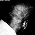
Critique By:
Michael Jenkins (K:329)
11/14/2002 2:31:52 PM
Good photo, Nermin, with nice lines and composition. However, I would like to see it a bit sharper.
|
| Photo By: Nermin Habib
(K:61)
|
|
|
Critique By:
Raymond Bassily (K:3)
11/14/2002 2:48:53 AM
I love the lines created by the stick and the arm. Bravo ya baby xx
|
| Photo By: Nermin Habib
(K:61)
|
|
|
Critique By:
Wayne Harridge (K:18292)

10/23/2002 4:31:18 AM
Looks a little busy, perhaps you could simplify it by reducing the number of colours.
|
| Photo By: Nermin Habib
(K:61)
|
|
|
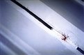
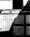
Critique By:
Rana Dawood (K:97)
10/17/2002 5:16:54 AM
haa dingding.....the pic is ok but i think there's too much white and there isnt enough focus on the subject of the photo. The thick black line is the main image that jumps from the pic, not the rust.
I like the diagonals...and i think u have a good eye for interesting shapes and textures to photograph. Maybe u should have zoomed in a little more on the rust to bring out all the cracks and bumps, i think that would have been really good...and maybe increase the contrast of the grey tones.
|
| Photo By: Nermin Habib
(K:61)
|
|
|
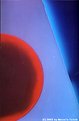
Critique By:
Rana Dawood (K:97)
10/16/2002 1:04:49 AM
woman...im soo jealous...i love this pic it looks like an abstract painting. thanx for your comments on my other photos. I think ur latest stuff is alot simpler than the black and white ones and are so much cooler.
|
| Photo By: Nermin Habib
(K:61)
|
|
|
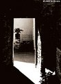
Critique By:
Petros Stamatakos (K:12101)
10/15/2002 4:15:41 PM
Nermine, I agree with the other two gentlemen. Great mood and composition. I too, feel that if sharper, this would be a much better image.
Keep up the good work :-)
|
| Photo By: Nermin Habib
(K:61)
|
|
|
Critique By:
Aiman Nassar (K:11961)
10/15/2002 1:59:55 AM
Nermine,
I love the mood, composition, wish it was more sharper, or I think it is the scanning... good work
a
|
| Photo By: Nermin Habib
(K:61)
|
|
|
Critique By:
Chris Whaley (K:3847)
10/15/2002 1:40:27 AM
Very cool Nermin. Really like the blue tone.
|
| Photo By: Nermin Habib
(K:61)
|
|
|
Critique By:
Nermin Habib (K:61)
10/15/2002 12:45:12 AM
hi kim, this picture was taken in Cairo, Egypt. In an open-air studio.
|
| Photo By: Nermin Habib
(K:61)
|
|
|
Critique By:
Keith Song (K:-11)
10/14/2002 9:49:01 PM
Great shot. I like the composition and the subdued tones. Reminds me of the old colonial buildings in malaysia and Laos.
|
| Photo By: Nermin Habib
(K:61)
|
|
|
Critique By:
Kim Barke (K:278)
10/14/2002 5:39:48 AM
Wonderful, where was this taken?
|
| Photo By: Nermin Habib
(K:61)
|
|
|
Critique By:
Rana Dawood (K:97)
10/14/2002 3:36:42 AM
dingding....im speechless no? i love it
|
| Photo By: Nermin Habib
(K:61)
|
|
|
Critique By:
Aiman Nassar (K:11961)
9/23/2002 3:03:26 AM
Cool abstract, and strong contrast
|
| Photo By: Nermin Habib
(K:61)
|
|
|
Critique By:
Mike Allebach (K:391)
9/21/2002 5:58:25 PM
Love the title...nice picture.
|
| Photo By: Nermin Habib
(K:61)
|
|
|
Critique By:
Vincent K. Tylor (K:7863)
9/20/2002 11:48:39 PM
I'd say this would well sum up many a day, in this system of things. And they SAY I live in paradise! Back to reality.
|
| Photo By: Nermin Habib
(K:61)
|
|
|
Critique By:
000 000 (K:1471)
9/20/2002 9:09:03 AM
Alone is also a very good Project for this Pic.
I would also suggest you use a different backgroud colour. The white backgroud overlaps with the guys t-shirt and much details are lost.
|
| Photo By: Nermin Habib
(K:61)
|
|
|
Critique By:
Nermin Habib (K:61)
9/20/2002 4:18:12 AM
thanks youbs!
|
| Photo By: Nermin Habib
(K:61)
|
|
|
Critique By:
Aiman Nassar (K:11961)
9/20/2002 4:17:32 AM
I think it is cool, you may add it to the Lonely project
a
|
| Photo By: Nermin Habib
(K:61)
|
|
|
Critique By:
Aiman Nassar (K:11961)
9/20/2002 4:16:32 AM
I think it is cool, you may add it to the Lonely project
a
|
| Photo By: Nermin Habib
(K:61)
|
|
|
Critique By:
Aiman Nassar (K:11961)
9/20/2002 1:42:29 AM
Nermin, I like the harsh contrast, the strong graphic lines, but I think the black area on the left and up, are taking out something... here is a cropping I suggest.
a
|
| Photo By: Nermin Habib
(K:61)
|
|
|
Critique By:
Rana Dawood (K:97)
9/20/2002 12:26:56 AM
what does this meeean?
I love this photo ..the shadows are so good and the wierd angles..its soo cool.
|
| Photo By: Nermin Habib
(K:61)
|
|