|
|
Critique By:
Aaron Charlton Smith (K:625)
2/11/2003 2:30:41 PM
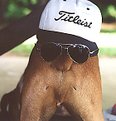
Ya know, with some longer hairs(or a fake beard), you could pass that off as a photograph of ZZ Topp, ;-). Funny pic, reminds of some of the things people would do to there pets on the old America's Funniest Home Videos.
|
| Photo By: Ken Lucas
(K:110)
|
|
|
Critique By:
Russell Love (K:7006)
12/1/2002 1:08:14 PM
ken,
I seem to have a similar problem that you have with the shadows filling in the dark spaces. I keep refusing to take my flash on outdoor shots, eventually, I will learn that fill flash will really help my shots. The underside of his hat seems to of lost the detail without the fill flash, and the left side bg seems extreme. I like the composition however except for the glasses.
Later my friend,
Russ
|
| Photo By: Ken Lucas
(K:110)
|
|
|
Critique By:
Jeff Cable (K:3599)
11/28/2002 1:03:23 AM
Hi Ken. This image looks like a great character study. Unfortunately the scan seems to have its own ideas about what you were displaying and I have no real sense of the tonal range or sharpness. Much of the image looks as if it has been reticulated in development but I am not sure about it. I would like to see the original print. I have discounted all of the digital anomalies I am seeing and say that I think that it is nice work.
Cheers!
Jeff
|
| Photo By: Ken Lucas
(K:110)
|
|
|
Critique By:
Sue O'S (K:12878)
11/27/2002 2:48:08 PM
Hi, Ken! Welcome to Usefilm! Nice image. You don't even look like you're panting!
|
| Photo By: Ken Lucas
(K:110)
|
|
|
Critique By:
nathan combs (K:2242)
11/26/2002 7:57:34 PM
hi there!!!
|
| Photo By: Ken Lucas
(K:110)
|
|
|
Critique By:
Andrew Lahanas (K:7062)
11/25/2002 3:19:51 AM
Well done Ken. With kids there is nothing like natural light to capture a beautiful moment. I find that it helps since you don't need a really fast lens if you have plenty of light there. I think your shot is nicely framed, her expression is pleasant and the innocence is portrayed well. I also have a similar photo posted as well with my daughter. Everyone has tried the same thing once or twice! Well done.
|
| Photo By: Ken Lucas
(K:110)
|
|
|
Critique By:
000 000 (K:1471)
11/25/2002 1:40:36 AM
Nice pic.
|
| Photo By: Ken Lucas
(K:110)
|
|
|
Critique By:
Tony Bruguiere (K:160)
11/24/2002 1:35:45 PM
Good concept, but as you point out, the focus is very soft. While you are in PS, you might consider removing the arching root on the left.
|
| Photo By: Ken Lucas
(K:110)
|
|
|
Critique By:
Ken Lucas (K:110)
11/24/2002 1:27:59 PM
Thanks Bart for your comment. I noticed that when I uploaded the picture. The original is considerably sharper. I'm not sure whether the transfer of data had that much of an effect or I need to sharpen it more in PSP and upload it again.
|
| Photo By: Ken Lucas
(K:110)
|
|
|
Critique By:
Bart Aldrich (K:7614)
11/24/2002 1:21:44 PM
A lovely enough spot and composition, but seems very soft or out of focus altogether.
|
| Photo By: Ken Lucas
(K:110)
|
|
|
Critique By:
J (K:2647)
11/24/2002 3:06:22 AM
The way the light outlines her face is lovely... like a glow. Maybe she is looking up to an angel who makes her face glow. There is "empty" space to the right, that is not really empty, this provides us with context, and makes the viewer think about what she is seeing. The only think that is a pitty is the lack (on my monitor) of detail in the hair in the left side of the photo. Nice photo. :-)
|
| Photo By: Ken Lucas
(K:110)
|
|
|
Critique By:
Kimberly Adams (K:87)
11/23/2002 4:37:26 PM
Wonderful toning. Great expression. The lighting is exceptiona.
|
| Photo By: Ken Lucas
(K:110)
|
|