|
|
Critique By:
Tracey MacLeod (K:3244)
9/18/2005 4:34:30 AM
Hi Lawerence have a safe journey! I'm jealous!
|
| Photo By: Sean Carleton
(K:63)
|
|
|
Critique By:
Sean Carleton (K:63)
8/31/2005 8:43:20 AM
Thanks for your comment Ade
|
| Photo By: Sean Carleton
(K:63)
|
|
|
Critique By:
Sean Carleton (K:63)
8/31/2005 8:42:44 AM
Thank you Mohamed for commenting
|
| Photo By: Sean Carleton
(K:63)
|
|
|
Critique By:
Sean Carleton (K:63)
8/31/2005 8:41:28 AM
Thank you Tracy, it is one of my favorite photos
Sean
|
| Photo By: Sean Carleton
(K:63)
|
|
|
Critique By:
Mohamed Banna (K:34237)
8/29/2005 8:23:38 AM
amazing sky
nice view
|
| Photo By: Sean Carleton
(K:63)
|
|
|
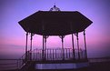
Critique By:
Tracey MacLeod (K:3244)
8/29/2005 7:28:38 AM
Looking at the other photogs pic it's just a different view once you sharpen yours and work it it's just as lovely but definatly different feel the sky takes a stronger presence and the lack of foreground seems to be a little more forgiving! not bad!
|
| Photo By: Sean Carleton
(K:63)
|
|
|
Critique By:
Ade Rixon (K:223)
8/27/2005 1:07:39 AM
There's a nice, peaceful mood about this shot. I agree that there may be too much space in the left half of the frame, but a simple crop might improve this. Everything else - colours, ripples, reflection - works really well.
|
| Photo By: Sean Carleton
(K:63)
|
|
|
Critique By:
Gerhard BuschEFIAP/AFIAP (K:18382)
8/26/2005 1:53:24 PM
A very humorous, if also technically not entirely perfect idea. Regards Gerhard
|
| Photo By: Sean Carleton
(K:63)
|
|
|
Critique By:
Sean Carleton (K:63)
3/7/2003 8:34:24 AM
well .. not really looking for tec comments .. just wanted to share these!
|
| Photo By: Sean Carleton
(K:63)
|
|
|
Critique By:
Martin Huynh (K:2)
3/7/2003 8:30:32 AM
I a newbie, so I'll refrain from making any technical comments. However, it's a very funny picture. Are you going to have a "Where is Lawrence?" series?
|
| Photo By: Sean Carleton
(K:63)
|
|
|
Critique By:
andrea elli (K:1945)
3/3/2003 6:08:33 AM
I agree with Ferdinando, maybe too dark, but interesting colors, Ciao
|
| Photo By: Sean Carleton
(K:63)
|
|
|
Critique By:
Nando Mondino (K:14261)

3/3/2003 5:15:19 AM
Good landscape, nice coloors a bit dark imho!
|
| Photo By: Sean Carleton
(K:63)
|
|
|
Critique By:
Stefano Jemma (K:853)
3/3/2003 3:47:30 AM
nice shot, good light and tones.
|
| Photo By: Sean Carleton
(K:63)
|
|
|
Critique By:
Wayne Harridge (K:18292)
3/3/2003 3:33:57 AM
Greatr shot, good feeling of depth to the image. Where are these baths ?
|
| Photo By: Sean Carleton
(K:63)
|
|
|
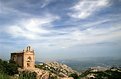
Critique By:
Megan Forbes (K:4617)
2/28/2003 8:12:18 AM
Amazing Silhouette! God really had his paintbrush out for you with this sunset 
|
| Photo By: Sean Carleton
(K:63)
|
|
|
Critique By:
Kai Boehm (K:84)
2/27/2003 5:39:56 AM
Hey Sean, I like your kind of view, very nice perspective! I would prefer to see the bottom of the cross. But all in all it's a very nice capture.
|
| Photo By: Sean Carleton
(K:63)
|
|
|
Critique By:
Sean Carleton (K:63)
2/27/2003 3:02:45 AM
Hi Laura, Chris
Thanks for your comments,I didn't actually plan to add this effect, but was playing about with Photoshop and got this result, I think it came out really well . I don't have the Orignal with me but will put it up when I get the chance, I also made a negative copy of this image and I still haven't decided which one I like!
thanks again
Sean
|
| Photo By: Sean Carleton
(K:63)
|
|
|
Critique By:
Laura Lee (K:990)
2/26/2003 7:42:36 PM
I like the composition...but I think I'd like it without the brush effect (maybe...I'd have to see it though). Just out of curiosity, what made you want to do a brush effect for this particular photo (aside from the fact that Photoshop is fun!)?
|
| Photo By: Sean Carleton
(K:63)
|
|
|
Critique By:
Chris Lauritzen (K:14949)
2/26/2003 6:33:25 AM
Sean,
Great shot but how about some details on it? I like the brushed effect but was that done in PS or darkroom?
|
| Photo By: Sean Carleton
(K:63)
|
|
|
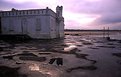
Critique By:
Steven B. Poitinger (K:1757)
2/24/2003 6:48:26 PM
I like this Sean. It has an old-world painting look to it. Perhaps a bit too much sky or maybe too little foreground but very appealing as is.
|
| Photo By: Sean Carleton
(K:63)
|
|
|
Critique By:
J (K:2647)
2/10/2003 9:08:07 AM
This is the very delicate kind of photographs IMO. They seem rather simple, but they aren't. The colours are nice, not sure if sharpness is as well, but lets say it is... you went for a photo in which you have a plain background and one subject, the boat... the way the lines of the waves mimic the one of the boat is nice. The problem is that the boat is so near the egde of the photo... since the whole of this photo is "simplistic" looking, one slightly distracting thing makes the photo work a lot less.
|
| Photo By: Sean Carleton
(K:63)
|
|
|
Critique By:
Megan Forbes (K:4617)
2/10/2003 8:51:51 AM
Beautiful shot - the water reflecting off the wood of the boat is just as interesting as the boat reflecting off the water
|
| Photo By: Sean Carleton
(K:63)
|
|