|
|
Critique By:
K. Lazlow Hud (K:342)
4/5/2003 5:42:56 PM
I just went and looked at your portfolio. I wish I could take pictures like you do. You are an artist.
|
| Photo By: Przemyslaw Piwowar
(K:136)
|
|
|
Critique By:
K. Lazlow Hud (K:342)
4/5/2003 5:37:07 PM
Now this is someone who knows how to take a photograph. Excellent use of space. I love the fact that the subject is fully aware of the photo being shot and while it very likely staged this "type" of image is usually random or observational. The knowledge of the subject, in fact the expression almost saying I'm in on this, is great and it makes the picture. The use of the black graphic further enhances the use of space.
If it was a little sharper it might even be better but no big deal. Best photo posted to day in my opinion. Sevens across the board.
|
| Photo By: Przemyslaw Piwowar
(K:136)
|
|
|
Critique By:
K. Lazlow Hud (K:342)
4/5/2003 5:27:16 PM
Excellent photos and very effective use of Photoshop.
|
| Photo By: R S
(K:294)
|
|
|
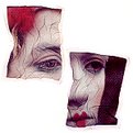
Critique By:
K. Lazlow Hud (K:342)
4/4/2003 5:12:46 AM
I applaud anyone pursuing their vision regardless of how it is received. However I do tend to believe this example is good but derivative at best. There is not enough of the photo showing (composition, context etc.) to make accurate criticsm of its basic elements.
I am off to look at Helena's portfolio now to see if I can undertand her purpose here and possibly allow me to re-evaluate. However I am rating and commenting first to give a purer version of my reaction.
I find it more disturbing that this is the Editor's Choice. I don't see it and recent editorial choices seem to be well out of step with the choices of the community. While this is in a sense great, leadership must be shown or the community itself may start to drift. Let's face it, there are artists out there who are composing in order to win the Editor's Choice. I'd hate to see this great site descend to the "This Is My Cat, Fluffy" type of pictures that diminish and render irrelevant other similar sites.
I voted 5's to 6's because I feel the image warrants that rating.
|
| Photo By: Helena K Karlsson
(K:23)
|
|
|
Critique By:
K. Lazlow Hud (K:342)
3/26/2003 7:33:02 PM
I really like the colours. One might be tempted to produce this in black & white but that would be quite a bit less effective.
|
| Photo By: Rohan Riley
(K:308)
|
|
|
Critique By:
K. Lazlow Hud (K:342)
3/26/2003 7:09:41 PM
Surreal...and cool! I rated an 8.
|
| Photo By: Mark Warmus
(K:17)
|
|
|
Critique By:
K. Lazlow Hud (K:342)
3/26/2003 7:06:11 PM
Meanwhile, while I was doing the border you changed it and it looks great. I'll leave you alone now! Thanks for chatting.
|
| Photo By: Christian Barrette
(K:21125)
|
|
|
Critique By:
K. Lazlow Hud (K:342)
3/26/2003 7:03:30 PM
Sorry, I meant "painting" not paining!! Anyway, attached is sort of what I meant by the border. I apologise for taking liberties and I may have somewhat cartooned the original. Take a look...
|
| Photo By: Christian Barrette
(K:21125)
|
|
|
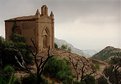
Critique By:
K. Lazlow Hud (K:342)
3/26/2003 6:40:31 PM
Beautiful photo, Christian. The subject matter and composition make a critique almost superfluous. It has the look of an old picture / painting in an illustrated bible. Suggestions...rethink the turquoise border - I think it really distracts from the photo and maybe sharpen it slightly (likely heresy to some of you and kind of contradictory to my paining comment but oh well). Really good, I voted a 9.
|
| Photo By: Christian Barrette
(K:21125)
|
|
|
Critique By:
K. Lazlow Hud (K:342)
3/25/2003 7:51:05 PM
I like this photo a lot, especially the incongruity of the threatening locomotive with the bouncy, almost 1960ish cheerleader looking model. I would think about finishing the photo without the shadowing in the bottom left corner though. Doesn't really fit the picture's feel of realism / surrealism. I rated an 8.
|
Photo By: Phillip Filtz
(K:1792)

|
|
|
Critique By:
K. Lazlow Hud (K:342)
3/25/2003 7:47:02 PM
The picture would be much more effective if a) the subject was in focus and the background blurred and b) it didn't appear staged. I rated a 2.
|
| Photo By: Aaron Charlton Smith
(K:625)
|
|
|
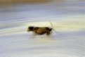
Critique By:
K. Lazlow Hud (K:342)
3/25/2003 7:45:02 PM
A pretty good picture for a Mavica. I rated a 4.
|
| Photo By: Aaron Charlton Smith
(K:625)
|
|
|
Critique By:
K. Lazlow Hud (K:342)
3/25/2003 7:43:16 PM
I like the photo though I do agree with Ivar Hansen's suggestions for a different angle. The shade of blue is my favourite colour although I think both it and the doormat must have been enhanced with an imaging program. I rated a 6.
|
| Photo By: Jorge Vasconcelos
(K:33746)
|
|
|
Critique By:
K. Lazlow Hud (K:342)
3/25/2003 7:35:52 PM
You should probably provide us with details on how you accomplished this piece. It would allow greater understanding and subsequently allow us to appreciate it in its correct context. I rated a 5
|
| Photo By: Frank Hettick
(K:119)
|
|
|
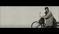
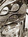
Critique By:
K. Lazlow Hud (K:342)
3/25/2003 7:33:37 PM
I do think less would be more in this instance - i.e. a more focused study of a singular part of the bike. I also feel a non-granular effect would be best as well. On the other hand this photo might be stunning in color...do you have the colour version. I rated "5"
|
| Photo By: Byron Diamond
(K:18)
|
|
|
Critique By:
K. Lazlow Hud (K:342)
3/24/2003 7:15:54 PM
It's very good but I wonder if the novelty factor is pushing the rating up, rather than the actual quality, other than the mood and lighting, of the photograph. Sharper would be more dramatic - unless my monitor is taking detail away. Good job.
|
| Photo By: Steve Kompier
(K:4629)
|
|
|
Critique By:
K. Lazlow Hud (K:342)
3/24/2003 6:34:38 PM
I can't help wondering how this would look in straight black and white. Nice composition.
|
| Photo By: Christian Barrette
(K:21125)
|
|