|
|
Critique By:
Derek Kennedy (K:2270)
9/16/2007 1:46:06 AM
Hey Erwin.
You have interests in becoming a fashion photographer, judging from your photos here you definitely have what it takes. You have an incredible eye. I don't photograph people other than my kid but I sure wish I had your talent.
Unfortunately, I don't exactly get to talk to Dave often (he doesn't fly thru Dryden all the time) but always take the time to talk to him when I'm able to.
|
| Photo By: Derek Kennedy
(K:2270)
|
|
|
Critique By:
Derek Kennedy (K:2270)
2/19/2007 6:36:18 PM
Considering the conditions (choppy water, 25 knots in a Zodiac) you did well. Thanks for that link - it's always nice to see a larger/better version. It looks much better than the smaller post.
|
| Photo By: Nick Russill
(K:929)
|
|
|
Critique By:
Derek Kennedy (K:2270)
2/19/2007 4:23:13 AM
Used Neat Image on your photo.
|
| Photo By: Nick Russill
(K:929)
|
|
|
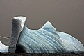
Critique By:
Derek Kennedy (K:2270)
2/19/2007 4:20:59 AM
Considering the camera used, I find the background/sky a little noisy.
Interesting subject with interesting lines. The top edges of the berg/lines is/are too jaggie - maybe too much compression used?
I purchased NeatImage to help with digital noise - works great, and isn't very expensive.
|
| Photo By: Nick Russill
(K:929)
|
|
|
Critique By:
Derek Kennedy (K:2270)
2/19/2007 4:18:06 AM
I love photos like this where the shutter speed is slow to capture a nice milky effect but here there is a bit to much blown out so I would have to say that a faster shutter speed would have been better.
Not sure if you used one or not, but a ND filter can really help with shots like this if you don't shoot during cloudy/overcast days. Less light = slower shutter speed to get the milky look you wanted.
|
Photo By: Roger Skinner
(K:81846)

|
|
|
Critique By:
Derek Kennedy (K:2270)
2/19/2007 4:15:31 AM
Excellent DoF in this photo. Nice detail. Nice scenery too.
Seems a little too dark overall though on my (laptop) screen. If you have PS, I would try using the shadow/highlight tool and/or levels to reduce that darkness a bit.
|
| Photo By: Sandra Berry
(K:8352)
|
|
|
Critique By:
Derek Kennedy (K:2270)
2/19/2007 4:11:41 AM
Too bad the people where not walking towards the camera so we could see their faces! Placement in the frame could be a little better, I'm thinking maybe cropping about an inch from the bottom to position them a little better.
Nice mood though with what I assume is a parent walking with his/her child.
|
| Photo By: Paolo Corradini
(K:59552)
|
|
|
Critique By:
Derek Kennedy (K:2270)
2/19/2007 4:09:36 AM
The one thing that is keeping this from being a excellent image is the lack of focus in my honest opinion.
The DoF is a little shallow as evident with the childs left eye out of focus (more than the rest of the image). The eyes actually look kinda odd - where they moving around? (child looking around but not moving the head)
If the eyes didn't look as they do, and if there was more sharpness to the image, this would be an excellent image.
I do like that you went to b&w though.
|
| Photo By: Mike Rexroad
(K:631)
|
|
|
Critique By:
Derek Kennedy (K:2270)
2/19/2007 4:05:10 AM
The lighting seems perfect to me. Nice colours - I like the choice of flower. The composition is quite good.
My issue is that there might have been a loss of detail when you resized it for upload here as it seems a bit soft to me, also there is some white object in the background that distracts (lower right corner area below the flowers).
|
| Photo By: James Morse
(K:296)
|
|
|
Critique By:
Derek Kennedy (K:2270)
2/19/2007 2:15:14 AM
I know there are people out there that hate waterfall shots with slower shutter speeds but I personally love these sort of photos.
Some areas a little too dark (loss of detail) but overall I like the photo. It has a nice feeling/mood. The slower shutter speed was perfect in my opinion.
|
| Photo By: Barrie Cranston
(K:172)
|
|
|
Critique By:
Derek Kennedy (K:2270)
2/19/2007 2:06:22 AM
There is a little too much of the image that is out of of focus, but I like the LIFE magazine title that is nice and sharp in the water drop - after all water means life. If we couldn't get water, we all die.
|
| Photo By: Carlos A. Alvis
(K:1205)
|
|
|
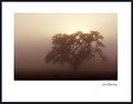
Critique By:
Derek Kennedy (K:2270)
2/27/2005 7:24:23 PM
So simple, yet so elegant. I love the overall mood of the image. The tree may be a little too large in the frame for me (altho well placed IN the frame), but overall it works well. I also like the fog and how it diffused the sun. Nice tones - in camera or in PS? Iether way, it's a great shot.
|
| Photo By: John Barclay
(K:3650)
|
|
|
Critique By:
Derek Kennedy (K:2270)
11/16/2004 10:09:05 PM
Thanx John - I'll pass that info along. I would have e-mailed you but I couldn't find your addy (I'm on your mailing list)
|
| Photo By: John Barclay
(K:3650)
|
|
|
Critique By:
Derek Kennedy (K:2270)
11/16/2004 8:56:22 PM
John: Derek Kennedy here - long time no post! At another site I go to, there is a question as to how to scan XPAN negs...and I was wondering how you did it? Thanks.
|
| Photo By: John Barclay
(K:3650)
|
|
|
Critique By:
Derek Kennedy (K:2270)
5/8/2004 2:32:56 AM
I understand what your trying to do with the flowers in the extreme foreground, but not sure it works that well with this shot - I think it's a little too much, also, it places the main subject (the flower in focus) too centered.
I do like the colours and the detail of the centered flower with the water drops.
|
| Photo By: John Barclay
(K:3650)
|
|
|
Critique By:
Derek Kennedy (K:2270)
5/5/2004 11:45:30 PM
ANother excellent image John.I find the horizon line tilted abit, or is that the actaul lay of the land and the effect of the mountains playing tricks on my old tired eyes? Excellent lighting, good detail and DoF.
|
| Photo By: John Barclay
(K:3650)
|
|
|
Critique By:
Derek Kennedy (K:2270)
5/5/2004 11:43:36 PM
Hey John! I definately feel that, this camera is well suited for this sort of shot...Composure is excellent as is the lighting. Good shutter speed for the water - I'm curious tho, as wether or not a circular polarizor would have been benificial in removeing the reflections off of the rocks in the foreground and perhapse the waters surface as well?
|
| Photo By: John Barclay
(K:3650)
|
|
|
Critique By:
Derek Kennedy (K:2270)
12/11/2003 8:32:26 PM
COnsidering the speed he was travelling and your shutter speed, this came out excellent, god colours as well
|
| Photo By: Harry Eggens
(K:14804)
|
|
|
Critique By:
Derek Kennedy (K:2270)
12/6/2003 6:27:10 PM
Love that reflection, so perfect. I also think that you took this at the perfect time of day for the nice light. This definately looks like a place I'd love to visit.
|
| Photo By: Mike Blanchard
(K:35)
|
|
|
Critique By:
Derek Kennedy (K:2270)
11/20/2003 7:51:04 PM
I like this between the two due to the saturated colours and the 'glow' it seems to have.
|
| Photo By: John Barclay
(K:3650)
|
|
|
Critique By:
Derek Kennedy (K:2270)
11/20/2003 9:52:28 AM
Doesn't look overprocessed to me, but I find that there is too much foreground in the image, some could be cropped from the bottom.
|
| Photo By: Ursula I Abresch
(K:6515)
|
|
|
Critique By:
Derek Kennedy (K:2270)
11/20/2003 9:51:21 AM
The pose is perfect, you captured the perfect expression here. Love the tones and softness
|
| Photo By: Yiannis Gabrilis
(K:2548)
|
|
|
Critique By:
Derek Kennedy (K:2270)
11/14/2003 8:18:25 PM
I definately like this version better John. The other version almost looks bland compared to this one. I like the way 'photos' from the slide sandwich technique look if done right. I also like the way the colours looks so saturated. I'm curious John - ya think this would work at all digitally? hmm...
|
| Photo By: John Barclay
(K:3650)
|
|
|
Critique By:
Derek Kennedy (K:2270)
11/9/2003 7:33:46 AM
An incredeible image - looks like a painting to me, the colours are fantastic
|
| Photo By: Matt Ramos
(K:18)
|
|
|
Critique By:
Derek Kennedy (K:2270)
10/9/2003 10:27:20 PM
I definately like this version better, much brighter (a little smaller, but still a great shot). The colours seem much better as well.
|
| Photo By: John Barclay
(K:3650)
|
|
|
Critique By:
Derek Kennedy (K:2270)
10/8/2003 4:06:44 PM
I don't know John, seems a little dark to me - at least on my screen. Also seemed to have a very slight blue tint overall. Definately not up to your normal standards! Looks like beautiful country tho.
|
| Photo By: John Barclay
(K:3650)
|
|
|
Critique By:
Derek Kennedy (K:2270)
9/28/2003 7:29:40 PM
Seems to be a touch soft (on my screen anyway), but beautiful colours, nice slow shutter speed for the water. Well composed.
|
| Photo By: Kenneth Kwan
(K:3084)
|
|
|
Critique By:
Derek Kennedy (K:2270)
9/28/2003 2:42:38 PM
Not a photo I would be able to attempt where I live. Love the colours, and the longer shutter speed for the effect of the water. Seems overall well exposed, very good composition. DoF is excellent.
|
| Photo By: John Barclay
(K:3650)
|
|
|
Critique By:
Derek Kennedy (K:2270)
9/19/2003 8:22:37 AM
Love the way the model has her hair, she is quite beautiful, and that hair do really allows us to see that beauty. Good lighting, lovely eyes on her as well. I like the use of the tilt too. The button on her blouse, is (almost) a little distracting but overall an excellent photo
|
| Photo By: herwig b
(K:558)
|
|
|
Critique By:
Derek Kennedy (K:2270)
9/19/2003 8:20:12 AM
I like the DoF here, and the lighting/tones. Nice detail where in focus. I do find the nosering a little distracting tho, but that's a personal thing I guess. I also like the cropping.
|
| Photo By: herwig b
(K:558)
|
|