|
|
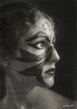
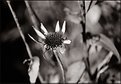
Critique By:
Richard Montgomery (K:1936)
1/23/2005 5:58:43 AM
Judi,
Great tones and contrast in this one. Nice work!
|
| Photo By: Judi Liosatos
(K:34047)
|
|
|
Critique By:
Richard Montgomery (K:1936)
1/16/2005 10:28:39 PM
Very good, happy portrait! (my favorite film, too!)
|
| Photo By: Suzi Q.
(K:426)
|
|
|
Critique By:
Richard Montgomery (K:1936)
1/16/2005 10:27:19 PM
Soojin,
I love the tones and the diagonal elements in this image. Nice image!
Regards,
Richard
|
| Photo By: Suzi Q.
(K:426)
|
|
|
Critique By:
Richard Montgomery (K:1936)
12/11/2004 4:51:18 PM
Very cool! When did you move to Turkey? 
|
| Photo By: Ayse Telci
(K:4168)
|
|
|
Critique By:
Richard Montgomery (K:1936)
11/25/2004 3:59:04 PM
Love the effect that the fisheye adds here . . .
|
| Photo By: Brian T. Ach
(K:1742)
|
|
|
Critique By:
Richard Montgomery (K:1936)
11/25/2004 3:42:30 PM
Looks like a magazine cover!
|
| Photo By: RC. Dany
(K:64104)
|
|
|
Critique By:
Richard Montgomery (K:1936)
11/25/2004 3:32:24 PM
C -- This is really cool!
|
| Photo By: Carlheinz Bayer
(K:14220)
|
|
|
Critique By:
Richard Montgomery (K:1936)
11/8/2004 3:08:04 PM
Awesome capture!
|
| Photo By: Carlheinz Bayer
(K:14220)
|
|
|
Critique By:
Richard Montgomery (K:1936)
11/7/2004 5:29:00 AM
Sarah, I think that this is one of your very best!
Regards, Richard
|
| Photo By: Sarah Moustafa
(K:4456)
|
|
|
Critique By:
Richard Montgomery (K:1936)
11/7/2004 12:52:16 AM
Very nicely done, Zelda!
|
| Photo By: Zelda Zabrinsky
(K:3036)
|
|
|
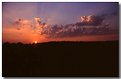
Critique By:
Richard Montgomery (K:1936)
11/6/2004 5:00:10 PM
Very lovely sunset, Judi! Did you use any filtering at all? Great reds and silhouettes in the image.
Regards, Richard
|
| Photo By: Judi Liosatos
(K:34047)
|
|
|
Critique By:
Richard Montgomery (K:1936)
11/6/2004 4:57:59 PM
JG --
Very nicely done! Where on the Shore is this?
|
Photo By: Jim Gamble
(K:12164)

|
|
|
Critique By:
Richard Montgomery (K:1936)
11/3/2004 11:26:29 PM
Good eye, Jim!
|
| Photo By: Jim Gamble
(K:12164)
|
|
|
Critique By:
Richard Montgomery (K:1936)
11/3/2004 11:24:28 PM
Don't get me started . . .
|
| Photo By: Mica
(K:892)
|
|
|
Critique By:
Richard Montgomery (K:1936)
11/2/2004 4:44:57 PM
I like the grain! You got a decent range of tones in this image, especially for an image converted from color.
I'm working on my Hudson River dedication image to you.
|
| Photo By: Mica
(K:892)
|
|
|
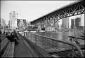
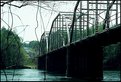
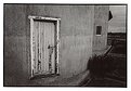
Critique By:
Richard Montgomery (K:1936)
10/24/2004 4:29:51 PM
Chuck,
I too like the background stories that go with your photos. What I really most in this image are the diagonals. Good eye to notice to slopes from where the bridge meets the road. You had a bad sky that day, but you certainly made the most of it.
Richard
|
| Photo By: Chuck Freeman
(K:13616)
|
|
|
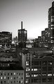
Critique By:
Richard Montgomery (K:1936)
10/24/2004 2:11:12 PM
Good idea, Mica. In NYC there are series ideas all around you.
|
| Photo By: Mica
(K:892)
|
|
|
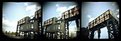
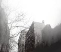
Critique By:
Richard Montgomery (K:1936)
10/22/2004 4:45:42 AM
Hey Mica --
I like this image. The foreground made me think of the movie "Rear Window." The only criticism I would offer is that the title would be confusing to anyone unfamiliar with Manhattan. (perhaps you meant that) You'd kinda have to know what you're looking at to know that there's even water in the image. (I'm smiling to myself at the moment because I was just in NY over the weekend and took similar shots facing Weehawken, I think, from my hotel room. I'll post soon)
Nothing like a Zeiss lens, eh?
|
| Photo By: Mica
(K:892)
|
|
|
Critique By:
Richard Montgomery (K:1936)
10/21/2004 5:52:00 PM
Hey Mica -- I think this is very nicely done. What I really like is the unusual spacing of the segments of the image.
|
| Photo By: Mica
(K:892)
|
|
|
Critique By:
Richard Montgomery (K:1936)
10/8/2004 12:17:32 PM
So simple. So cool!
|
| Photo By: Mica
(K:892)
|
|
|
Critique By:
Richard Montgomery (K:1936)
10/8/2004 1:32:42 AM
Eleanor, I just love images of these old painted signs in cities. I'd like to do a series of them before they all disappear. I like the image. Had you considered b&w?
|
| Photo By: éléanor le gresley
(K:80)
|
|
|
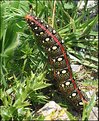
Critique By:
Richard Montgomery (K:1936)
10/4/2004 3:42:45 AM
Very nice b&w macro! Don't see enough of these. It is very nicely done!
|
| Photo By: Michael Grace-Martin
(K:10183)
|
|
|
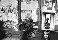
Critique By:
Richard Montgomery (K:1936)
9/6/2004 8:26:20 PM
Mica,
I think you did a remarkable job with this considering that you were using 3200 film. It's hard to balance the lights and darks. The center composition here is fine, because the man (who appears to be quite a character) is balanced by interesting elements on either side of him. Cool image!
|
| Photo By: Mica
(K:892)
|
|
|
Critique By:
Richard Montgomery (K:1936)
9/6/2004 7:37:16 PM
Mica,
This is such a SUPER image! I've just run across your work for the first time today. I really like a lot of your images. On this image . . . I really love the angles, tones, shadows (especially of the people) and how they cut across the image. And what's a NYC residential image w/o fire escapes and some graffiti? Great image!
Regards, Richard
|
| Photo By: Mica
(K:892)
|
|
|
Critique By:
Richard Montgomery (K:1936)
9/6/2004 5:07:49 PM
I love the detail in this image. Nicely done!
|
| Photo By: Michele Maiocchi
(K:685)
|
|
|
Critique By:
Richard Montgomery (K:1936)
9/6/2004 3:52:09 PM
Tanya,
This is an interesting image in its stillness. What's really great about this image is the range of tones you have here. That's always the tough this (I find) with B&W. But you did an excellent jobn here!
|
| Photo By: Tanya Clark
(K:650)
|
|
|
Critique By:
Richard Montgomery (K:1936)
9/6/2004 3:44:00 PM
R -- I like the motion of the man, and how the man is moving into the frame. Also the hint of color in the background is nice. I also like the reflections in the car window. Nice image!
|
| Photo By: Rosiness Ma
(K:629)
|
|
|
Critique By:
Richard Montgomery (K:1936)
9/5/2004 2:57:21 AM
I love the uncommon composition in this image. The texture and tone work nicely as well.
|
| Photo By: Rosiness Ma
(K:629)
|
|
|
Critique By:
Richard Montgomery (K:1936)
9/5/2004 2:55:02 AM
Ray, This is very interesting composition. And I think the grai really does add to the image. Nice work!
|
| Photo By: Ray Heath
(K:4559)
|
|
|
Critique By:
Richard Montgomery (K:1936)
8/28/2004 6:18:40 PM
Inci, I think this is a very interesting photograph. It makes me very happy. Here are 2 people at different stages of life having a good time together. I like that the focus is one the boy, but that one can still see the happiness on the grandmother's face. Very nicely done!
Regards, Richard
|
| Photo By: Inci Turel
(K:718)
|
|


")