|
|
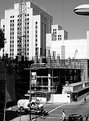
Critique By:
Neil Machin (K:48)
5/20/2003 5:34:11 AM
You were obviously working with contrasty light here and have managed to keep details in the highlights. Shame about the street light in the upper right as it is quite distracting, I guess you were limited to the angles you could have used as you see to have been on a balcony or in a building.
|
| Photo By: Toph Church
(K:206)
|
|
|
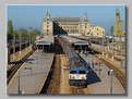
Critique By:
Neil Machin (K:48)
5/20/2003 5:29:26 AM
I do like the way the lines converge just slightly, enough to keep your viewpoint in the photo. The yellow crane does upset the symetry a bit, but there was probably not a lot you could have done about that without loosing the lines.
|
| Photo By: Hayri CALISKAN
(K:16195)
|
|
|
Critique By:
Neil Machin (K:48)
5/20/2003 2:13:29 AM
Great prespective and lighting. Is the foreground a little soft? This could just be the scan, although that is where you need good detail to be carried through to the rest of the image as 'perceived detail'.
|
| Photo By: Monica Riveiro
(K:836)
|
|