|
|
Critique By:
penelope jayne (K:121)
11/24/2003 4:10:28 PM
I would have loved the composition if the line was leading the eye from the bottom right hand corner. If you had just moved to the left to allow this to happen it would have been an excellent shot.
|
| Photo By: charlie f. kohn
(K:25919)
|
|
|
Critique By:
penelope jayne (K:121)
11/24/2003 4:07:52 PM
Handheld so not sharp, this image has nothing with sharp focus, not the lettering, not the letterbox. I like the idea, but you needed to have a steady hand or lean against something, or better still try a carry a mini tripod.
|
| Photo By: charlie f. kohn
(K:25919)
|
|
|
Critique By:
penelope jayne (K:121)
11/24/2003 3:56:26 PM
I like this image, postcard image. The water would have been more romantic on a slower shutter speed.
|
| Photo By: charlie f. kohn
(K:25919)
|
|
|
Critique By:
penelope jayne (K:121)
11/24/2003 3:46:54 PM
Nice colors and movement. You have a few handheld in low light images, I feel you need to explore beyond that and place something of interest in the composition, to allow the viewer to try and far investiage what is this saying to me.
|
| Photo By: charlie f. kohn
(K:25919)
|
|
|
Critique By:
penelope jayne (K:121)
11/24/2003 3:43:57 PM
I feel you should have had better highlights and shadows. It a likeable shot, obviously you have taken the TOC reflections, probably off the highly reflective surface in the shopping mall. The small black cross thing on the far left handside, centre doesnt make sense, I would remove that, I noticed another one of the rubbish bin on the righthand side but that isnt as distracting. Maybe reshoot this shot at a different time of the day to get more detail in your shadow areas.
|
| Photo By: charlie f. kohn
(K:25919)
|
|
|
Critique By:
penelope jayne (K:121)
11/24/2003 3:38:00 PM
I like this one better than your other attempt of low light, handheld capturing movement. The church in the background gives the composition some point of interest. I find the heavy white light going into the bottom right hand corner leads me off the page, I think the image would benefit if you removed that.
|
| Photo By: charlie f. kohn
(K:25919)
|
|
|
Critique By:
penelope jayne (K:121)
11/24/2003 3:31:41 PM
interesting shot, like a tarantulas leg and spiders nest.
|
| Photo By: charlie f. kohn
(K:25919)
|
|
|
Critique By:
penelope jayne (K:121)
11/24/2003 3:29:37 PM
Too many specular highlight on the glassware. The front glass or lemon would have been better if it was more in focus/sharper. Did you handhold this, maybe try using a tripod.
|
| Photo By: charlie f. kohn
(K:25919)
|
|
|
Critique By:
penelope jayne (K:121)
11/24/2003 3:19:51 PM
Lacks symmetry, it neither one thing or the other. It would have been more appealing with an adjustment to your tripod and camera. My eyes are drawn up the stairs to the centre of the composition. I find the top of the lowest level of stairs could have been burnt in more, the eyes tend to by attracted to the lightest areas and the top corners would have benefited with more burning in, it would keep the viewer's gaze within the image rather than leading off.
|
| Photo By: charlie f. kohn
(K:25919)
|
|
|
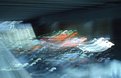
Critique By:
penelope jayne (K:121)
11/24/2003 3:10:19 PM
I can see you have use hand held, long exposure, probably in a tunnel with car lights. To me it's an interesting experimentation although something that we all have played with in uni, so I don't find that very exciting. If there was more centre of interest I would say it rises above the rest. I like the movement, not a bad attempt.
|
| Photo By: charlie f. kohn
(K:25919)
|
|
|
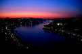
Critique By:
penelope jayne (K:121)
11/24/2003 7:27:47 AM
I love the rich colors, keep up the great work!
|
| Photo By: A Brito
(K:10699)
|
|
|
Critique By:
penelope jayne (K:121)
11/24/2003 6:48:26 AM
Nice affect, did you use the alfa channel in PhotoShop?
|
| Photo By: Giorgio Cardoni
(K:2191)
|
|
|
Critique By:
penelope jayne (K:121)
11/24/2003 6:46:10 AM
Keep up the good work
|
| Photo By: Charles Beck
(K:256)
|
|