|
|
Critique By:
Gayle's Eclectic Photos (K:91109)
1/22/2004 3:11:43 AM
You will laugh when see similar shot in my portfolio...am brand new to paint pro and thought something different was in order back in Dec....yours is cool with the bright blue sky...Gayle
|
| Photo By: James P. Watt
(K:5)
|
|
|
Critique By:
Rawabi Al-Nuaimi (K:15659)
12/23/2003 8:23:48 PM
very nice composition and effect 
|
| Photo By: James P. Watt
(K:5)
|
|
|
Critique By:
Dr@gon's Baby (K:1011)
9/10/2003 10:53:34 PM
nice tulips...nice shot
|
| Photo By: James P. Watt
(K:5)
|
|
|
Critique By:
Gerry Vincent (K:3154)
6/3/2003 7:40:37 AM
Very well composed James. I especially like the reds against the blue sky.
|
| Photo By: James P. Watt
(K:5)
|
|
|
Critique By:
Bob Tomerlin (K:5460)
4/16/2003 2:30:10 PM
Very sharp - but the lighting makes it look flat. What kind of lighting did you use? I think a light background (to show a cast shadow) and off camera lighting to put a shadow on the apple would bring out the shape more.
|
| Photo By: James P. Watt
(K:5)
|
|
|
Critique By:
CJ McKendry (K:1388)
2/23/2003 5:17:40 PM
I think it has a lot of potential, but because of the back lighting you've lost a lot of your foreground detail.
Perhaps some fill flash would counteract this.
|
| Photo By: James P. Watt
(K:5)
|
|
|
Critique By:
Adam E. J. Squier (K:9803)
12/18/2002 5:48:40 PM
I always seem to comment on bold-shaped images and this one is no exepetion (obviously).
The orange looks good, but do I see a little pixelization going on there? Was this upsampled at all.
I don't really like the bevelled edge and drop shadow, as it immediately make me wonder what other digital manipulation was done on it. I assume the black was added in digitally. If not, you've done a great job getting it so uniform.
|
| Photo By: James P. Watt
(K:5)
|
|
|
Critique By:
Anindya Maity (K:7880)
12/18/2002 10:10:05 AM
1)The orange colour contrasts well against the black BG
2)Is the red tinge at the border natural?
3)Some of the orange fibres appear too shiny to me
4)I'd have liked a drop of juice to add interest(or maybe I'm too conditioned by ad images)
|
| Photo By: James P. Watt
(K:5)
|
|
|
Critique By:
Kim Culbert (K:37070)
12/3/2002 8:22:28 AM
Was a tripod used for this shot? I ask because it seems a bit soft, or that your DOF is too short and you've lost some detail in the fur from it. I am disturbed by your "Who Cares" on the aperture setting comment because as a learner I like to know how people take their shots, and to see by their settings if I can recognize something that could have been done differently to make an image stronger. I am pleased though, that you took the time to add in what camera you use and the film... some people don;t even do that.
Was it possible to take a few steps to your left? I find that the white rock jetting out into the right hand side polar bear is distracting and it would be a better shot with the rock either eliminated completely, or moved to the right a bit more.
Okay, those are just my thoughts! (5)
|
| Photo By: James P. Watt
(K:5)
|
|
|
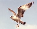
Critique By:
Andy Eulass (K:13435)
11/30/2002 3:38:56 PM
I wish it was a bit larger to see more detail in the photo. The colors and tones look wonderful. I like the eagle in the frame. Was the eagle captured in this shot?
|
| Photo By: James P. Watt
(K:5)
|
|
|
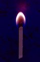
Critique By:
Fed Sanchez (K:10)
3/12/2002 5:51:57 PM
Very nice picture. How did you do it? I can't see how you got the match to stand up while burning. Any hints?
|
| Photo By: James P. Watt
(K:5)
|
|
|
Critique By:
Bonnie Shedd (K:174)
11/26/2001 5:34:42 AM
This is a beautiful crisp flower image and the light is lovely, but I too find my eye going to the background. Environmental photography is just what it means and sometimes things just get in your way!
|
| Photo By: James P. Watt
(K:5)
|
|
|
Critique By:
Gary Nguyen (K:349)
8/13/2001 10:40:20 AM
Wow..this is a beautiful shot i think.. I love the three dominant colors. Blue, red and green. All bright and pure.
Love it!
|
| Photo By: James P. Watt
(K:5)
|
|
|
Critique By:
Artie Colantuono (K:12275)
6/27/2001 8:02:34 AM
good capture..nicely framed and good light....nice job James
|
| Photo By: James P. Watt
(K:5)
|
|
|
Critique By:
Artie Colantuono (K:12275)
6/27/2001 8:02:34 AM
clever idea James and executed well......
no Vlad not an XRAY of an EGG
|
| Photo By: James P. Watt
(K:5)
|
|
|
Critique By:
Debbie Groff (K:9569)
6/26/2001 7:43:19 AM
This is beautiful, was your filter a magnifying, or color? I like the close-up as well as the colors. Is the background the match box? Just commenting to say I like this picture.
|
| Photo By: James P. Watt
(K:5)
|
|
|
Critique By:
James P. Watt (K:5)
6/26/2001 1:51:25 AM
Taken using screw on type close-up filter. Non digital.
|
| Photo By: James P. Watt
(K:5)
|
|
|
Critique By:
Jeremy Hood (K:153)
6/26/2001 1:48:31 AM
So.. were you really gast and stealthy, or is it digitally altered? Nice, regardless.
|
| Photo By: James P. Watt
(K:5)
|
|
|
Critique By:
Chris Whaley (K:3847)
6/26/2001 1:26:24 AM
Very cool...nice detail and composistion..little hot on the head but really like this one.
|
| Photo By: James P. Watt
(K:5)
|
|
|
Critique By:
Chris Whaley (K:3847)
6/21/2001 11:22:41 PM
Wow James!...this is cool James....a fantasy.
|
| Photo By: James P. Watt
(K:5)
|
|
|
Critique By:
Artie Colantuono (K:12275)
6/21/2001 8:19:03 PM
colors and shapes are surreal.....well composed..and good lighting.............nicely done
|
| Photo By: James P. Watt
(K:5)
|
|
|
Critique By:
. . (K:2743)
6/21/2001 4:39:39 PM
I like it a lot....great color combination..
|
| Photo By: James P. Watt
(K:5)
|
|
|
Critique By:
Artie Colantuono (K:12275)
6/20/2001 7:31:58 PM
light......light.........light..........this is a 3 dimensional image that is very flat right now due to the lighting......cool subject......good idea.....nicely framed.....missed the light.......wrap the lighting.......engross the subject in light........
|
| Photo By: James P. Watt
(K:5)
|
|
|
Critique By:
Artie Colantuono (K:12275)
6/2/2001 4:05:09 AM
as Nanette stated....nice dof and color is nice but the fence is way to distracting....good attempt and good seeing....just have to think these through more...
|
| Photo By: James P. Watt
(K:5)
|
|
")