|
|
Critique By:
Paul Lara (K:88111)

7/4/2005 4:58:53 PM
wow...stunningly done!
|
| Photo By: Lyza Perrenoud
(K:111)
|
|
|
Critique By:
Ian McIntosh (K:42997)
3/19/2004 10:54:13 AM
Very cool.
|
| Photo By: Lyza Perrenoud
(K:111)
|
|
|
Critique By:
Matej Maceas (K:24381)
1/27/2004 7:59:20 AM
Just curious, why would a cigarette be a problem?
|
| Photo By: Lyza Perrenoud
(K:111)
|
|
|
Critique By:
Marcos Duarte (K:15402)
12/8/2003 6:29:26 AM
Nice shot
|
| Photo By: Lyza Perrenoud
(K:111)
|
|
|
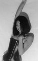
Critique By:
Otto Astorga (K:723)
5/26/2003 10:39:16 PM
If her right arm were bent at 90 degrees it would flow a little bit better. She does look good in that leather outfit (ooops I forgot, it's the picture you want comments on). I think that if the effect is to be dramatic forget the fill flash. The shot has a sensual harshness to it that I think works. What you may want to do after scanning is to convert to Lab mode in PS, select the lightness channel, do unsharp mask on that and go back to RGB. If you added a diffuser you just may have to live with what you see. Nice experiment. Otto
|
| Photo By: Lyza Perrenoud
(K:111)
|
|
|
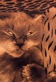
Critique By:
judy ben joud (K:4160)
4/16/2003 1:34:29 PM
very nice cat
|
| Photo By: Lyza Perrenoud
(K:111)
|
|
|
Critique By:
Surajit Mukerji (K:3889)
4/16/2003 11:24:08 AM
Well done
|
| Photo By: Lyza Perrenoud
(K:111)
|
|
|
Critique By:
Lyza Perrenoud (K:111)
8/23/2002 11:03:08 AM
Thanks Marty!
Yes,you are so right, I had no control over the lighting.
As far as cropping it is originally like that..so I am assuming he was totally in my face/camera.
This image has been published in URB magazine already (issue #97). The place was so packed with people outside the Dj'sbooth that I just kept shooting. 'Was a lot of fun.
lyza
|
| Photo By: Lyza Perrenoud
(K:111)
|
|
|
Critique By:
John Doe (K:170)
8/23/2002 10:48:09 AM
Hi Lyza, great capture. The lighting looks really great, especially since I'm guessing you had no control over it. I like the cropping a lot on this as well.
|
| Photo By: Lyza Perrenoud
(K:111)
|
|
|
Critique By:
Kim Culbert (K:37070)
7/4/2002 12:57:19 PM
I like the expression as well.... very natural and at ease. The legs in the bg disturb me as well, but not much you can do, other than photoshop them out. As well, the focus seems a little soft.. her eyes aren't sharp. This could be the scan though.
|
| Photo By: Lyza Perrenoud
(K:111)
|
|
|
Critique By:
Lyza Perrenoud (K:111)
5/30/2002 8:47:11 PM
Hello,
Thanks for the comments you guys..
I had to tighten the crop on the sides 'coz she actually has a cigarette on her right hand (taking a break and I caught this shot ). ANd yes, a little fill may have been better.
I appreciate the all comments.
Lyza
|
| Photo By: Lyza Perrenoud
(K:111)
|
|
|
Critique By:
richard trager (K:111)
5/30/2002 11:43:52 AM
pretty model-i agree with the others about the fill light on the right hand side. i actually like the green and pink combo. i think the crop on both sides is a little tight. i would like to see her whole hand. nice work
|
| Photo By: Lyza Perrenoud
(K:111)
|
|
|
Critique By:
Kim Culbert (K:37070)
5/30/2002 9:16:12 AM
I don't mind the green bg with the pink... it reminds me of the crazy colours that little girls will dress themselves in. It's fun and crazy. But I agree with Phillip that this is begging for some fill.
|
| Photo By: Lyza Perrenoud
(K:111)
|
|
|
Critique By:
Phillip Filtz (K:1792)
5/30/2002 4:04:43 AM
Lyza, I thing the shot needs a bit of fill from her right, and I'm not sure about the B/G color with what she's wearing either. That's a toss up, but the fill is a must, IMO.
Regards,
|
| Photo By: Lyza Perrenoud
(K:111)
|
|
|
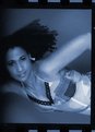
Critique By:
Lyza Perrenoud (K:111)
4/23/2002 9:44:38 PM
Hi Tony,
I ,too agree on all points of your comments.
I'd love to see her with wilder hair.
Thanks.
Lyza
|
| Photo By: Lyza Perrenoud
(K:111)
|
|
|
Critique By:
Toni Martin (K:5092)
4/23/2002 4:40:56 PM
I think she shouldn't be wearing the ring and maybe the hair should be controlled more in a wild way, maybe curls or something. Otherwise, I like it. Blue works for me.
|
| Photo By: Lyza Perrenoud
(K:111)
|
|
|
Critique By:
Lyza Perrenoud (K:111)
4/23/2002 4:07:20 PM
thanks for the comment Moayad.
The client picked the blue since they are going to do some re-touching of sorts.
It would've been green if not the blue so they can add a diff. background.
|
| Photo By: Lyza Perrenoud
(K:111)
|
|
|
Critique By:
Moayad H (K:252)
4/23/2002 2:36:34 AM
I like the total red tone of the model. The blue background... I don't know :-\
|
| Photo By: Lyza Perrenoud
(K:111)
|
|
|
Critique By:
Lyza Perrenoud (K:111)
4/22/2002 11:55:43 PM
took the teal border out...
I'm still not too pleased with the border...oh well,...
Lyza
|
| Photo By: Lyza Perrenoud
(K:111)
|
|
|
Critique By:
Lyza Perrenoud (K:111)
4/3/2002 11:18:04 AM
Hi Guys,
Thanks for the comments.
I posted another one of her too.
|
| Photo By: Lyza Perrenoud
(K:111)
|
|
|
Critique By:
John Doe (K:170)
4/2/2002 7:23:04 PM
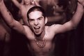
I'm with Charles, I like this. Great lighting. The model's pose makes you wonder what she was thinking.
|
| Photo By: Lyza Perrenoud
(K:111)
|
|
|
Critique By:
Charles Hess (K:-183)
4/2/2002 5:55:48 PM
Kind of an off-beat, but effective image that is hard to critique. I think some will like it, others not. I like it and would love to see other images of this very cute model.
|
| Photo By: Lyza Perrenoud
(K:111)
|
|
|
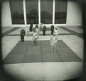
Critique By:
Lyza Perrenoud (K:111)
3/25/2002 4:47:31 PM
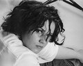
hello Terrence,
Thanks for the comments.
It was exactly my intentions to post this photo the way you describe it.
As this is from a contact sheet. I wanted it more artsy (IMHO) looking than technically anything. I wanted the frames to show the negs.
Your opinion is appreciated, though.
Lyza P.
|
| Photo By: Lyza Perrenoud
(K:111)
|
|
|
Critique By:
Terrence Kent (K:7023)
3/23/2002 8:40:05 AM
Looks interesting in the floating dreamy way it has going for it, tone definitely helps that, but the light fall off on the left side, small display size, and messy presentation make it more difficult to critique
|
| Photo By: Lyza Perrenoud
(K:111)
|
|
|
Critique By:
Kim Culbert (K:37070)
3/20/2002 8:27:04 AM
Unique framing and a great pose. This is an eye catcher! I like the vibrant yellow backgrond! His face seems a tad washed out, though, since his body is quite tanned.
Great shot!
|
| Photo By: Lyza Perrenoud
(K:111)
|
|
|
Critique By:
Samuel Downs (K:7290)
3/17/2002 11:12:30 PM
Lyza, Interesting angle. Great shot! Sam
|
| Photo By: Lyza Perrenoud
(K:111)
|
|
|
Critique By:
Lyza Perrenoud (K:111)
3/11/2002 1:09:42 AM
Hi Alisa,
Thanks so much.
I do enjoy this little camera and don't really feel like it is a toy (as others perceive it to be) 
Yeah, if you can one it can be quite addicting to use it.
Take care.
Lyza
|
| Photo By: Lyza Perrenoud
(K:111)
|
|
|
Critique By:
Lyza Perrenoud (K:111)
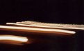
12/4/2001 10:18:50 PM
Thanks Nanette.
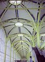
Yes, I may need more DOF , but it is a LOMO I am using here.
I actually have a copy of this which has been cropped at the bottom part to show more of the image as an abstract.
But I preferred to show it as the architecture of the DC airport in a different light and for some reason the yellow showed more that afternoon.
Lyza P.
|
| Photo By: Lyza Perrenoud
(K:111)
|
|
|
Critique By:
Debbie Groff (K:9569)
12/1/2001 6:12:44 AM
I've been reading the comments and have to agree with what has been said. I would like to see that building in the middle of the bolt dead center. What a fun and interesting project to pursue with this eyebolt. Great find Lyza.
|
| Photo By: Lyza Perrenoud
(K:111)
|
|
|
Critique By:
Chelsea Burke (K:5750)
11/28/2001 10:50:21 AM
I can see what you've tried to do with this shot, good idea. But you need to get much closer to the bolt to
make it work. There is far too much out-of-focus foreground and sky for this to be effective. Also, the bolt
needs to be in focus at this range. Perhaps try this again if possible, get much closer to the bolt. Take a lower
perspective, gaze around from different angles and see what is " framed" within the bolt. Lot's of possibilities
here, well worth another try.
|
| Photo By: Lyza Perrenoud
(K:111)
|
|