|
|
Critique By:
Kevin Ost (K:375)
1/2/2006 5:35:22 AM
A piece of art! Excellent use of DOF and great perspective.
Kevin
|
| Photo By: Carsten Nor
(K:794)
|
|
|
Critique By:
Kevin Ost (K:375)
7/16/2005 4:52:54 PM
Truely amazing shot and extreme DOF! The little guy's shop looks great as well! You did buy something didn't you?
|
| Photo By: Jo Dotremont
(K:441)
|
|
|
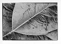
Critique By:
Kevin Ost (K:375)
7/16/2005 4:51:13 PM
Special! Looks like two leafs on each other, but I guess it isn't, crispy detail as well
BTW, I love B&W!
Keep shooting and developping ;-)
|
| Photo By: Geert Vanden Broeck
(K:284)
|
|
|
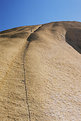
Critique By:
Kevin Ost (K:375)
7/16/2005 4:49:10 PM
Great surface, nice detail of the rock...If the climber would have been a little closer it could have been a much stronger picture imo...
At first I thought it was a crack in stead of a rope! Beal camouflage? ;-)
|
| Photo By: Jo Dotremont
(K:441)
|
|
|
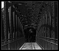
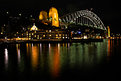
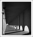
Critique By:
Kevin Ost (K:375)
7/16/2005 4:47:08 PM
Great shot from a great camera! Nice symmetric bridge, strong shadows and good DOF, but it's a bit too dark to be perfect!
ps: you should change the camera's tripod in something more antique ;-)
|
| Photo By: Geert Vanden Broeck
(K:284)
|
|
|
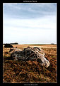
Critique By:
Kevin Ost (K:375)
7/16/2005 4:43:50 PM
Very special structure for Belgian rock, the title reminds me of something else (Fontainebleau?)
The picture itself has something mystique, but could have used a more dramatic sky ;-)
Nice work lately, I need to catch up...
|
| Photo By: Geert Vanden Broeck
(K:284)
|
|
|
Critique By:
Kevin Ost (K:375)
7/8/2005 11:08:07 AM
Excellent silhouette and warm colours, great work!
|
| Photo By: Guido Fulgenzi
(K:6076)
|
|
|
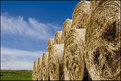
Critique By:
Kevin Ost (K:375)
7/7/2005 2:49:28 PM
Excellent framing!
Why oh why don't they cut the hay over here :-s
|
Photo By: KEVIN TEMPLE
(K:8657)

|
|
|
Critique By:
Kevin Ost (K:375)
7/7/2005 1:46:57 PM
Excellent night shot! Did you use tripod?
|
| Photo By: Mistral Vortex
(K:627)
|
|
|
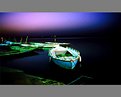
Critique By:
Kevin Ost (K:375)
7/7/2005 12:43:02 PM
Special touch with the ripples. This looks like a very colourful building, maybe you should take an inversed picture of it, combined with the bassin. Could also be a nice picture!
Thank you for commenting my "egg" :-)
|
| Photo By: Kate Tilmouth
(K:112)
|
|
|
Critique By:
Kevin Ost (K:375)
7/7/2005 12:40:33 PM
Beautiful sunset in a great landscape! This will be the first 7 I give to a picture.
Kevin
|
| Photo By: TR
(K:591)
|
|
|
Critique By:
Kevin Ost (K:375)
7/7/2005 12:38:33 PM
Excellent angle, like this more than the othet two. The good contrast and colours of the sky really catch the eye.
Kevin
|
| Photo By: Ciprian Ilie
(K:13571)
|
|
|
Critique By:
Kevin Ost (K:375)
7/7/2005 12:32:12 PM
Quite a perspective and good manipulation in PS, this one of those shots who make you think, I like them :-)
Regards,
Kevin
|
| Photo By: Keith Ruddell
(K:3570)
|
|
|
Critique By:
Kevin Ost (K:375)
7/7/2005 12:29:32 PM
Thank you all for your comments!
After I posted I noticed a glitch in the right side of the picture. On my screen it didn't show up, but with different lightness settings it's there :-S
I guess it's a bad PS retouch, I'm honest enough to admit it ;-)
|
| Photo By: Kevin Ost
(K:375)
|
|
|
Critique By:
Kevin Ost (K:375)
7/7/2005 12:01:36 PM
Nice use of DOF, as I said earlier: the upper right corner is a little overexposed.
Nice detail is the line of shadow cast by the mountain, good job.
|
| Photo By: Nico Wuyts
(K:0)
|
|
|
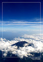
Critique By:
Kevin Ost (K:375)
7/7/2005 10:11:09 AM
Ok, first of all: your plain? :-)
Second: great image. It creates a sense of depth and the clouds make the finishing touch. But I guess it would be better with a different framing, don't know why, but it distracts a little.
|
| Photo By: Carla Ardian
(K:621)
|
|
|
Critique By:
Kevin Ost (K:375)
7/7/2005 9:37:08 AM
Excellent image with great lighting and colours, but you should get rid of the frame or make another one, it distracts!
Regards,
Kevin
|
| Photo By: Kausik Mukherjee
(K:-65)
|
|
|
Critique By:
Kevin Ost (K:375)
7/7/2005 8:39:17 AM
Exellent B&W with nice DOF! How did you get this picture with only the kid in the gallery? Thought more people would show up.
|
| Photo By: Peter De Rycke
(K:41212)
|
|
|
Critique By:
Kevin Ost (K:375)
7/7/2005 8:37:24 AM
Great reflection, it made wonder at first if this were two images combined, but whit a closer view I realised it wasn't. Clear and good colours. Good job!
kevin
|
| Photo By: Raihan Khan
(K:243)
|
|
|
Critique By:
Kevin Ost (K:375)
7/7/2005 8:35:18 AM
Good job! I love the way the dramatic clouds in combination with the clear image of the flower. I wouldn't mind the pillar, it gives the image a different touch.
|
| Photo By: Vasile Florin
(K:3003)
|
|
|
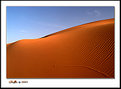
Critique By:
Kevin Ost (K:375)
7/6/2005 4:20:22 PM
Awesome image, never seen sand look so good! It would have better if the sky was without clouds, then you would have had only two colours, which would have made this a beautiful minimalistic shot!
Kevin
|
| Photo By: Ghaffar Mutawa
(K:143)
|
|
|
Critique By:
Kevin Ost (K:375)
7/6/2005 4:18:01 PM
Beautiful work on the sky! It's blue, the way it's supposed to be! Nice and sharp as well..
|
| Photo By: Erdinç KIRATLI
(K:164)
|
|
|
Critique By:
Kevin Ost (K:375)
7/6/2005 11:10:33 AM
First of all, thank you for commenting my work. It gave me the possibility to have a look at your portfolio, which I think is one of the most impressing I've soon here on UF
I took this picture because I like the detail and composition, but I could comment on all your work, it all looks great!
Regards,
Kevin
|
| Photo By: Lukasz Kuczkowski
(K:14687)
|
|
|
Critique By:
Kevin Ost (K:375)
7/6/2005 10:29:04 AM
Actually I would have aimed also lower, but she was sitting on an ugly plastic roof just under the bush. This would have given the picture a whole other feeling to it. It's not always as we see it ;-)
|
| Photo By: Kevin Ost
(K:375)
|
|
|
Critique By:
Kevin Ost (K:375)
7/6/2005 10:10:27 AM
Awesome fireworks! Good job on the handheld work, looks like you've got a steady hand ;-)
Excellent colours as well.
|
| Photo By: Peter Carucci
(K:1672)
|
|
|
Critique By:
Kevin Ost (K:375)
7/6/2005 10:07:18 AM
Great perspective and detail. I love B&W :-)
|
| Photo By: Sigit Prasetio
(K:354)
|
|
|
Critique By:
Kevin Ost (K:375)
7/6/2005 6:48:58 AM
Nice capture! Very sharp and nice colours!
I myself tried this weekend for some fireworks capturing as well, did it with a 200 ISO, 35mm lens, f 2.8 and a shutter of 1/15. They worked out well, only downpart is I let the lab develop my negatives and they cut them...My scanner is having difficulties scanning them...
Rule 1: Don't let them cut the film :-)
I try posting some of my work later on today...
|
| Photo By: Gary Flynn
(K:258)
|
|
|
Critique By:
Kevin Ost (K:375)
7/6/2005 6:40:52 AM
Next year I'll beat him ;-)
Picture is taken against the light, I know, but I think some lightness in the front of the image is missing. It's taken from a different angle wich makes it special. Keep posting!
|
| Photo By: Sofie Lummerzheim
(K:34)
|
|
|
Critique By:
Kevin Ost (K:375)
7/5/2005 6:41:16 AM
Amazing how you captured the atmosphere in the right way, this picture looks like a screenshot from some kind of medieval movie.
Good work!
|
| Photo By: Reza Lisni
(K:73)
|
|
|
Critique By:
Kevin Ost (K:375)
7/5/2005 6:36:36 AM
Great and warm colours, good use of DOF
I want a garden!!! :-)
|
| Photo By: Giovanni Guerrieri
(K:1169)
|
|