|
|
 Jason Hopson
{K:3283} 7/27/2007
|
Hey Pops! (hehe)
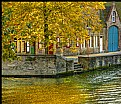
Your crop does feature the colour better. As you can see from comparing the original (if I remember to attach it) I did crop a little off the top already (as well as level the horizon and a slight tweek of the levels in PS.)
The jury is still out on your frame this time. Normally I like the colour you select, and your minimalist width. This time... hmm like I said, still undecided.
|

|
|
|
|
 Jason Hopson
{K:3283} 7/27/2007
|
Thanks Michele, for your encouraging words. I glad you like it.
|
|
|
|
 Matt Hopson
{K:1340} 7/27/2007
|
Hi Jason.
I like this shot, lots of natural colour and the point of view is good.
Depth of field is also good.
I would have cropped the top part off though, because of a lack of colour and the fact that it doesn't add to the photograph.
Here is the cropped version.
I used a little artistic licence and added a bit of a frame.
|

cropped and framed |
|
|
|
 Michele Carlsen
{K:146013} 7/27/2007
|
Nice Lighting Jason - This is one of your best natural light images IMHO --- I like it very much . There is a tranquil & peaceful , calm feeling to this image .... Very well done !
Best wishes,
Michele ~
|
|


