|
|
 Diego Ruggiero
{K:10659} 1/14/2005
Diego Ruggiero
{K:10659} 1/14/2005
|
really nice composition, very well done.
|
|
|
|
|
emily savva
{K:21113} 1/13/2005
|
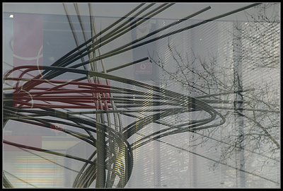
another fantastic reflection shot dear Verena... having to compare the two versions i must admit first that i find both the theme and the overall composition in both of them fantastic... still they are different in their small details... here, the reflected statue is quite clear whereas the background corridor blends very subtly giving a soft result... it would have been more disoriented if the signs weren?t as apparent... has a certain overall smoothness and harmony in the blending of the images...
But.... (continue in Knot I)
|
|
|
|
 Linda See
{K:1672} 1/12/2005
Linda See
{K:1672} 1/12/2005
|
Hi Verena, finally I am back in usefilm again!
I enjoy looking at this series and I like both versions because of the numerous layers of forms.
|
|
|
|
 Peter De Rycke
 {K:41212} 1/8/2005
|
Uh, this one i think .. mainly because of the better composition on the modern art work .. well seen, Verena ..
Peter
|
|
|
|
 Mary Vareli
{K:15826} 1/8/2005
Mary Vareli
{K:15826} 1/8/2005
|
I like this version my friend
I love reflections...
kiss
|
|
|
|
|
K P
{K:3499} 1/8/2005
|
I find all 2 good but this one a little bit more, good work!
Regards
K.
|
|
|
|
 Giuliano Guarnieri
{K:36622} 1/7/2005
Giuliano Guarnieri
{K:36622} 1/7/2005
|
This one!
A prefer this.
The reflected imagine is more dynamic.
|
|
|
|
|
Adelino Barreto
{K:12661} 1/7/2005
|
Excelent photo Verena!
My best regards.
Adelino
|
|
|
|
|
Fabio Keiner
{K:81109} 1/7/2005
|
love it
|
|
|
|
 NN
{K:26787} 1/7/2005
NN
{K:26787} 1/7/2005
|
Prefer this one ... what a symphony of lines! :)
|
|
|
|
 Jan Symank
{K:22030} 1/7/2005
Jan Symank
{K:22030} 1/7/2005
|
Very nice reflections and contrast beetween tree and statue lines
Regards
Jan
|
|
|
|
 Sam Andre
{K:12484} 1/7/2005
Sam Andre
{K:12484} 1/7/2005
|
i like this one better... somehow it seems to make moere sense
|
|
|
|
 Gregory McLemore
{K:35129} 1/7/2005
Gregory McLemore
{K:35129} 1/7/2005
|
A mesmerizing beauty, creative and well done.
|
|
|
|
 Ian McIntosh
{K:42997} 1/7/2005
Ian McIntosh
{K:42997} 1/7/2005
|
gaudian knot this one.
the banners and the logos really a curve ball and then the venetians.
Really could publish these in a daily somewhere for commuters to distract themselves on their way to work. -Perhaps make them look about the work place a bit queerly too once they're there.
This is the one.
|
|
|
|
 Hugo de Wolf
{K:185110} 1/7/2005
Hugo de Wolf
{K:185110} 1/7/2005
|
Hi Verena, I prefer this version, mainly because the interior of the building plays a less prominent part in the composition, allowing the viewer to focus his / her attention on the curves and lines in the reflection. Very interesting shot, Verena style!
Cheers,
Hugo
|
|

")