|
|
|
nathan combs
{K:2242} 9/11/2006
|
this one has not gotten an award????? i demand a recount! :)
|
|
|
|
 Helen Bach
{K:2331} 1/7/2006
Helen Bach
{K:2331} 1/7/2006
|
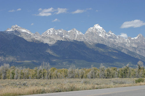
A very fine view of the Grand Tetons. However... I will join the minority who prefer the original version. The original is certainly more natural. The modified version looks kinda theatrical to me - but that might be what you want.
It's the mismatch between the deep blue pure white biting clarity of the ridge with the band of haze that sets off my 'unnatural nature' alarm.
The original version evokes 'strong sun, mountains and clear sky' much more strongly, even though it is a more subtle image.
The other thing I get from the original, probably because it is such a direct evocation of the place itself, is the strong sense of what is outside the frame. That I am in the landscape, not just looking at it. It's all around me, and there's more over the horizon. There's nothing in the way. Maybe the road helps with that.
Of course it all depends on what you wanted to achieve.
Best wishes,
Helen
|
|
|
|
|
Chris Whaley
{K:3847} 10/31/2005
|
this is quite stunning Mary...excellent work...the little bit of orange at the bottom adds to this immensely...I'm glad it wasn't cropped.
|
|
|
|
 Carlos A. Sabillon
{K:2660} 10/9/2005
Carlos A. Sabillon
{K:2660} 10/9/2005
|
I dont know what is that it is tried to be accomplished here.. But I like the Original better...The cluds on this image look little fake too.. and shadows in the middle.. tooo visible... That is just mY opinion.
|
|
|
|
 Roberto Arcari Farinetti
 {K:209486} 7/28/2005
|
AWESOME..
without words for the fantastic colors-contrast and linear composition!!
my bets wishes
roby
cheers..
|
|
|
|
 Lukasz Kuczkowski
{K:14687} 7/11/2005
Lukasz Kuczkowski
{K:14687} 7/11/2005
|
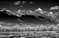
sepia version is just breathtaking, Maty; really like it - totally difrent image than original!
well done, good work
regards
Lukasz
|
|
|
|
|
KEVIN TEMPLE
{K:8657} 7/5/2005
|
looked atyour pictures and was very impressed well done
|
|
|
|
 Sue O'S
{K:12878} 6/29/2005
Sue O'S
{K:12878} 6/29/2005
|
OOOoooo the techniques in that forum submission is going to save a whole group of so-so Utah pictures. I'm very glad you referenced it and showed what your results concluded.
Thanks very much MS!
|
|
|
|
|
Mark Beltran
{K:32612} 6/26/2005
|
The final product is absolutely spectacular! The difference between the original and the final is very dramatic.
A gradient mask taking the place of a transitioning ND filter is a lot more handier than carrying around extra paraphernalia, that's for sure.
I wish Michael had the same tutorial for Photoimpact 7 users like myself. The way I do it is make two separate exposures; one metered for the sky and another one metered for the mountains and foreground. Then I combine the two into one photograph. Excellent work, Mary Sue.
Mark
|
|
|
|
|
Kim Culbert
{K:37070} 6/23/2005
|
Wow, what a difference! A well seen composition in the original, and made even more stunning with the gradient mask... I will have to take a look!
I like all three versions, although being a lover of colour your first post calls to me. Love the burnt orange in the foreground!
|
|
|
|
|
Chelsea Burke
{K:5750} 6/22/2005
|
Love the black and white version, my only nit is that the black on the slopes is a little too dark, makes it look like a hole. Maybe use a layer to soften up that black a bit.
|
|
|
|
|
. .
{K:2743} 6/22/2005
|
too good..... love the B&W version the most..
|
|
|
|
|
Angela Freed
{K:10061} 6/22/2005
|
Wow, another wonderful image. The sky is so blue.
angela
|
|
|
|
 Engy Farahat
{K:11591} 6/21/2005
Engy Farahat
{K:11591} 6/21/2005
|
What a wonderful scene Mary, beautiful colors & tones. I also like the sepia version. it's great!
ng..
|
|
|
|
 Michael Kanemoto
{K:22115} 6/21/2005
Michael Kanemoto
{K:22115} 6/21/2005
|
That's neat. Post the sepia and see if you get a higher response rate - that one seems to pop a bit more.
|
|
|
|
 Guy Dube
{K:6932} 6/21/2005
Guy Dube
{K:6932} 6/21/2005
|
Beautiful picture Mary, a wonderful scenery. Very well done.
Best regards
Guy
|
|
|
|
 Linda Imagefree
{K:72276} 6/21/2005
Linda Imagefree
{K:72276} 6/21/2005
|
Mary this is fantastic, and what a great lesson, thank you so much for the link, I'll definitely look into that. It's always wonderful when other's share their information so that we can all learn, so thoughtful of you..I love your image, it's lovely, and my favorite of all the ones that you posted..the b&w looks kind of flat to me, but I do like the sepia toned one a bit more..but this is really fabulous, very well done....:):)Linda
|
|
|
|
|
Mary Sue Hayward
{K:17558} 6/21/2005
|
The sepia version:
|

|
|
|
|
|
Mary Sue Hayward
{K:17558} 6/21/2005
|
The black and white version:
|
|
|
|
|
|
Mary Sue Hayward
{K:17558} 6/21/2005
|
The original:
|

|
|
|
|
 Paul Lara
{K:88111} 6/21/2005
Paul Lara
{K:88111} 6/21/2005
|
oh my!
I can't wait to see layers.
I'm off to read first...Thanks for tipping me to the article and technique!
|
|