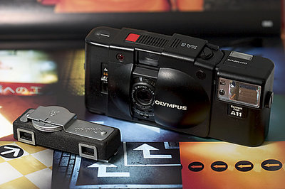
I like this shot Lisa, and I find myself agreeing with Paul. Also, the darker background to the top right seems (to me, anyway) to blend with the camera a bit, reducing the impact of the products that you're trying to illustrate.
I'm no expert at this, so please don't be offended. It's still a fine shot for a foirst effort.
I think your exposure values are great, but the tabletop is WAY too busy and severely distracts from your 'products'. Unlike abstracts or scenics, Lisa, product shots should have very few secondary elements in the shot.