|
|
|
svend videbak
{K:7376} 9/9/2005
|
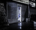
Great photograph, full of a sense of dingy danger.
|
|
|
|
![Nelson Moore [Kes] -](http://images.imageopolis.com/images/5/7/8/7/5787/1481659-micro.jpg) Nelson Moore [Kes] -
{K:20241} 8/20/2005
Nelson Moore [Kes] -
{K:20241} 8/20/2005
|
Angelo -
I wasn't trying to nit-pick this shot (handheld!!!), it carries itself, but rather get a sense of what is the "correct" photo edit etiquette. My take is that rules are made to be broken...
I might even have to get PhotoShop! Sounds like fun!
All the best,
-Keseph
|
|
|
|
 Angelo Villaschi
{K:49617} 8/18/2005
|
Keseph,
I honestly had not noticed those spots until you mentioned them. And I thought *I* had a decent eye for detail! :)
They are just light reflections (in the case of the barrel) or light coming through the shutters.
Lazynes tells me to leave them be...
|
|
|
|
![Nelson Moore [Kes] -](http://images.imageopolis.com/images/5/7/8/7/5787/1481659-micro.jpg) Nelson Moore [Kes] -
{K:20241} 8/18/2005
Nelson Moore [Kes] -
{K:20241} 8/18/2005
|
..cautiously...
I like it! Both the original shot and the subsequent artwork. And the discussion.
My thought; the crooks need a place to go. Or, what Randy said, lol.
It takes a lot of, um, guts, to post a shot like this, and I think also to take the shot.
I'm sort of new to photography...and forgetful of what I once knew about it (and that's ok!). So in a way, "rules" equals a sort of trickery, perhaps. Seems like I go through phases where I throw out the rules...then run back to them.
So, having said that, there are some unidentifiable bright spots here and there in the photo (one - to the right of the door in the shadows above the barrel at about eye level). Some serve as a depth guage, of course, but some seem distracting. Is it better to leave these in the shot or pixel them out/tone them down?
All the best,
Keseph
|
|
|
|
 Hugo de Wolf
{K:185110} 8/18/2005
|
I would just hate it if everybody would agree with me. It would take the whole fun out of such a discussion....:) You bring up some interesting things, Randy!
Cheers,
Hugo
|
|
|
|
 Angelo Villaschi
{K:49617} 8/18/2005
|
Randy,
A photographic discussion on Usefilm??? Whatever next!? :)
Thanks for the excellent comment. I agree with most of your assessment, including the part about Hugo's critiques and their great value. It's also nice to disagree with him sometimes ;)
|
|
|
|
 Randy Lorance
{K:24769} 8/18/2005
|
Yes, a non-political controversy :)
I was drawn to this disscusion when I came across the lengthly comment by Hugo. I read just enough to discern that it was about cropping/composition, so I looked at the picture before reading more to see what occured to me.
While Hugo is one of the most valuable critiquers here to myself and many others, I would disagree with him concerning this image.
When I looked at this photo and the about, what crossed my mind was not so much search for clues as it was apprehension of being in a dangerous situation - no one to be seen, could the culprit still be lurking about? Hiding behind the sign, behind the barrels, or just around the corner?
I think cropping off the corner eliminates an important element that adds to suspense of the 'crime scene'. The low availble light and dark shadows, including the right side, I don't look at as "another way out" as much as it being a potential threat, from where the bad guy could spring forth as he might at any moment from the door itself. I think the element of the sign and the dark corner balance each other.
If it were desired to move the door somewhat from center, I would crop from the left, but not so much as to diminish the element of the sign. As another possibilty to consider, I cropped a bit from the bottom to bring one even closer to the potential danger.
Interesting thought provoking image. I like the low color content as well.
Randy
|

|
|
|
|
 Thilo Bayer
{K:50358} 8/18/2005
|
Hi Angelo,
I heard of that "trick"... PS CS2 has a very smart technique to sharpen as well by default.
thx. thilo
|
|
|
|
 Robert Kocs
{K:89085} 8/18/2005
|
Very striking composition with dramatic shadows dear Angelo! Love the lighting details and reflections.
Nice find and work!
Best wishes!
Robert
|
|
|
|
 John Nobody
{K:4914} 8/17/2005
|
Interessante composição, gostei da iluminação.
|
|
|
|
 Angelo Villaschi
{K:49617} 8/17/2005
|
Thilo,
Smart sharpening in PS 6.0 using LAB colour conversion, "find edges", then USM and back to RGB. I read a tutorial on it and thought I'd try it out. If you want I can give you a link, e-mail me.
|
|
|
|
 Joggie van Staden
{K:41700} 8/17/2005
|
An excellent image Angelo. I really like the contrast between the black walls (gloomy) and the blue and white (hope) of the inside. In a sense it explains your feelings about the those hoodlums. I do feel you could crop out the window and drum to the right as they seem to draw the attention away. A more square format may also be more effective to enhance the dark mood of the image. Thanks for sharing. Regards.
Joggie
|
|
|
|
 Sally Morgan
{K:9219} 8/17/2005
|
I'm far too much of a coward to join in your composition debate (I think pistols at dawn would be more appropriate than a tripod for you and Hugo!). I wanted to say I am impressed by the lack of noise, the colour of the light and the sharpness :)
|
|
|
|
 Thilo Bayer
{K:50358} 8/17/2005
|
Hi Angelo,
something unusual after your macro phase ;-)
well, I like it. always love night shots in streets. this one has a scary, unfriendly mood. selective colors work.
smart sharpening in PS CS2? =)
best wishes,
Thilo
|
|
|
|
 Paolo Corradini
 {K:59552} 8/17/2005
|
It seems a mysterious click, almost the set of a film ....waiting for actors... I like it!
Paolo
|
|
|
|
 Hugo de Wolf
{K:185110} 8/17/2005
|
Good point. Would be nice to hear the opinion of others too.
I agree, it's a minor detail, and my solution is a bit focussed on the RHS. Should've played with the LHS as well, adjusting the contrasts in that area.
No need for an SLR in these cases, I think. The quality of the P&S is good enough, especially as such a shot is more about atmosphere than about details, DOF and such...
Now, Who will pick up the mike on this one?
Cheers,
Hugo
|
|
|
|
 Angelo Villaschi
{K:49617} 8/17/2005
|
Hmmm... don't know, really. It's not that different, but the door is less centered, and it looks a bit unbalanced, towards the RHS, due to the presence of the barrel and the door towards that side, compared with more darkness on the left.
I guess next time I see something like this I should worry a bit less about being late for the 7am shift and explore some more possibilities. Maybe go home, pick up the SLR and tripod :) though I wouldn't know what to say when the owners/police showed up... Hehehe!
Good debate, Hugo. I should now like to open up the mike to the audience. Anyone wanna chime in? (Is anyone even watching?)
|
|
|
|
 Hugo de Wolf
{K:185110} 8/17/2005
|
Hi Angelo,
Thanks for the reply, and I'll gladly "bite" so to say, as I find this always very much fun.
When I'm referring to my solution, please see the attached image.
I agree that the door isn't the main interst in this image, and that the entire setting creates the ambiance, mood and tension. In my solution, I don't think that ambiance, mood and tension has changed (much) either, thus not affecting the overall feel of the photo.
My solution doesn't really follow the "rules" either, but is probably closer to it (I rarely observe those rules, composition is something intuitive for me) I don't think that's the key issue, though.
What I was referring to in my first comment, and I probably need to elaborate on that after reading your reply, is that if we consider the right hand side, the light fades out to near black, which closes, consises or limits the area of interest. But going more to the right, you can literally see around the corner, and the eye meets another brighter spot just off the right edge. I think, this is a bit of a disturbance, as it provides "another way out".
In my solution, I did cheat, by moving / enlarging the utmost right barrel and placing it in the lower right corner. I think it limits the view even more, and creating a virtual line towards the primary subject without changing what you aptly prompted "Urban Decay". It narrows the attention to the theme, I think.
It is not an argument of right or wrong, and I agree on the differences between landscape photography and such themed shots, but in both fields, composition determines part of the overview of an image, and is greatly responsible for creating the feel (appeal, repulsion and such) of the photo itself. the tools a photographer has to build the composition are also different, and need to be handled (applied / treated) accordingly.
In your description, referring to "Here the drama is in the subject, the composition is static to show you that moment, allow you to look for the clues either side of the door." I think the way the compositional tools you had within this shot are handled differently (better, interpreted differently) in both our explanation. Whereas you want to invite the user to look for clues, my interpretation (and my solution based on that) limits that freedom, directing the viewer for clues nearer by, drawning attention more towards the askew door, as I believe that is the biggest clue, and eventhough not the main point of interest, its brightness makes it the primary subject.
Hope this explains my thoughts more thoroughly,
Cheers,
Hugo
|

Minor change in composition: My solution |
|
|
|
 Angelo Villaschi
{K:49617} 8/17/2005
|
Hugo,
I've read your comment repeatedly, and also thought about what you said regarding the composition several times. I tried to visualise what you sugested, because I don't have an alternative composition (and they have long since fixed the door :)
I'm not sure I totally agree. I'll try to explain why. Initially, the idea sounds attractive, and in fact I would be following the "rule" of placing the "main interest" off-center. However, I don't necessarily see the door as being the main interest. I think I see the whole setting and situation as the interest, with the darkness broken only by the dim light coming from the door.
In a way, this is how I tend to approach these "urban decay" and graffiti scenes. The drama is in the subject, not the composition. With a landscape it tends to be different: there is serenity in the scene, so you add drama by the composition. Here the drama is in the subject, the composition is static to show you that moment, allow you to look for the clues either side of the door.
I agree with you that the sign on the left is an important part of the picture, but to me it serves as part frame/part lead-in and would otherwise compete for interest with the slit of light. It's there to set the scene, not feature. I also deliberately darkened and partially blurred the corners of the picture to dim the details there.
As always, I'm open to, and would love to read a counter-argument :)
|
|
|
|
 Hugo de Wolf
{K:185110} 8/17/2005
|
Hi Angelo, the "lack of colour" creates a huge power in this photo. It emphasises the feel of the moment; hoodlums raiding the place. A kind of "Gotham city" look, too. Dark, eerie, unkept and unsafe. Very powerful indeed. Top Notch post processing, IMO.
The only thing I feel is that the centered placement of the askew door slightly reduces the power. I think if you had left out a bit on the right side of the composition, (probably by panning a bit to the left, the sign is a very important element, and including a bit more of it in the composition would be nice) this could've been easily solved.
The barrel on the right would've been cut out too, though, which is a sacrifice, as it does consise the view, preventing the eye from wandering off. Moving it in PS would be cheating, though, although I think the result would be even more powerful.
Cheers,
Hugo
|
|
|
|
 Jeanette Hägglund
{K:59855} 8/17/2005
|
Hi there! I get a feelig that this is a scene from a "criminal" movie - i just except them to run out from there anytime!!!
Jeanette
|
|
|
|
 Brian Fillmore
{K:4016} 8/17/2005
|
nice colours and photograph
|
|
|
|
 Ellen Smith
{K:14418} 8/16/2005
|
Very rich with details, it's a fine shot Angelo.
|
|
|
|
|
Kevin Collier
{K:19076} 8/16/2005
|
Great colors!!! very unique look -- K
|
|
|
|
|
Danny Brannigan
{K:19523} 8/16/2005
|
Amazing detail.
|
|
|
|
 Ameed El-Ghoul
{K:42215} 8/16/2005
|
Angelo this is a wonderful photojournalism capture, I really like it, and the sharpening technique works just fine, the centered composition work just fine in here,
Very well composed and captured,
Regards,
|
|
|
|
 Branimir Fagarazzi
{K:38367} 8/16/2005
|
Nice shot
|
|
|
|
 Angelo Villaschi
{K:49617} 8/16/2005
|
Thanks, Carolyn.
It was actually 0.4 seconds, but this setting isn't available at UF, and neither is 1/2s (the closest.
It's a small camera, without a mirror to cause vibration, so longer shutter speeds are possible without shake.
|
|
|
|
|
Carolyn Wiesbrock
{K:14051} 8/16/2005
|
You must have an incredibly steady hand..1/15 of a second! There is no way I could accomplish this without a tripod. You amaze me, this is wonderful work!
|
|
|
|
|
Chris Spracklen
{K:32552} 8/16/2005
|
A fine documentary shot, Angelo!
Such so-called 'petty crime' is a blight on our society!
Kind regards, Chris
|
|


