|
|
|
Ron Clark
{K:506} 3/6/2006
|
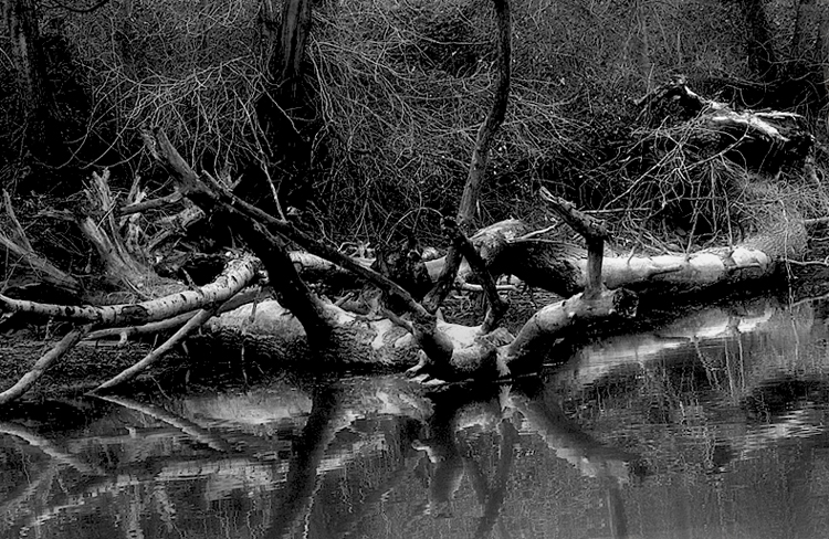
Very nice. There is peace and serenity in this picture. Very quiet but nice. The reflection in the water, the soft focus, and the black and white are all very nice touches.
|
|
|
|
 Ace Star
{K:21040} 2/27/2006
Ace Star
{K:21040} 2/27/2006
|
mysterious scene! Eb grt capture ... good B&W composition and details :)
excellent work
wish you all the best
|
|
|
|
 Eb Mueller
 {K:24960} 2/26/2006
|
Yes it is busy. Paul! Tonal adjustments are not going to change that. I have probably been barking up the wrong tree with that obsession, but learning something. I'm agreeing with you that the photo has its limitations. I will be looking for another opportunity to interpret this type of subject matter. Thanks for your help.
Eb
|
|
|
|
 Paul's Photos
{K:35235} 2/26/2006
Paul's Photos
{K:35235} 2/26/2006
|
love the reflection, good lighting and tones, like the b/w treatment.. the only thing I would say is that it is a bit busy. I think it would be better if you could focus on one area and try to avoid having all the grass in the background. anyway,...good work
|
|
|
|
|
Eb Mueller
{K:24960} 2/25/2006
|
Joggie, I have done more work on this image and made comparison in print form , as well. With the reduced exposure, I found too much blocking of the shadows for my taste. Dodging helped some. I am quite convinced that your cropping and rotation is much better. Thanks for helping me give this image more work and tought!
Eb
|
|
|
|
|
Eb Mueller
{K:24960} 2/25/2006
|
Hi Joggie. Thanks for all the work. I agree with the effectiveness of your recommendations. I replicated them on the full resolution image and it looks even better. Previously, I had played with countless variations of exposure and contrast but had not made any adjustment to the crop as you did. I was not able to settle on any of the variations - so one reason to post for critique. You may have convinced me to go for the darker mood. I may print on paper to make a final determination. The monitor is awkward medium for me, particularly for black & white images, as I never feel satisfied. Thanks!
Eb
|
|
|
|
 Joggie van Staden
{K:41700} 2/25/2006
Joggie van Staden
{K:41700} 2/25/2006
|
Sorry - forgot to attach my version.
Joggie
|
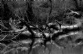
Joggie's version |
|
|
|
|
Joggie van Staden
{K:41700} 2/25/2006
|
Great image Eb - I think the B&W works well and the soft focus ad a bit of mood. I do think the tones are a bit on the light side, dtracting from the mood you wanted to introduce while it also give the photo a somewhat flat appearance.
I downloaded the image and did a few alterations in CS2 (my version attached): Firstly, I tilted the image to the right to create an angular line leading one through the photo up to the bright patch in the top right corner. Secondly, in order to add more mood to the image I adjusted the exposure downwards and also the offset to create more contrast and depth between the different elements. I then did some burning in of the top branches and water areas to place more emphasis on the brigther areas - leading into the focal point. Just my cent's worth - please tell me what you think! Kind regards.
Joggie
|
|
|
|
 Saeed Al Shamsi
{K:47735} 2/25/2006
Saeed Al Shamsi
{K:47735} 2/25/2006
|
Glad to see it in B&W version, it has a nice shape, reflection and contrast, IMHO I would prefer the attachment version where the work darken the image, which eliminate some shiny places and more concentrating on the clear shapes.
Saeed
|
|
|
|
 Dave Stacey
{K:150877} 2/25/2006
Dave Stacey
{K:150877} 2/25/2006
|
Great reflections there, Eb, and the b/w conversion works very well!
Dave.
|
|
|
|
 Kathy Hillard
{K:25721} 2/25/2006
Kathy Hillard
{K:25721} 2/25/2006
|
Good b&w, Eb! Lots of depth here. It looks so detailed...I can't see where you added the soft focus effect. Well done!
Kathy
Ooops! I just saw your additional upload, and there is definitely a difference! I agree with you, I like the soft focus better!
|
|
|
|
|
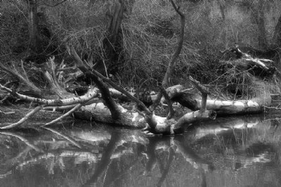
Eb Mueller
{K:24960} 2/24/2006
|
Same image but rendered without soft focus filter. I like both, but the soft focus added a little romantic flair (or flare) which attracted my initial attention.
Eb
|

Sharp Focus |
|