|
|
 Jose Ignacio (Nacho) Garcia Barcia
{K:96391} 5/12/2006
Jose Ignacio (Nacho) Garcia Barcia
{K:96391} 5/12/2006
|
outstanding. marvelous tones. wonderful portafolio.
|
|
|
|
 Mohammad Porooshani
{K:20765} 5/10/2006
Mohammad Porooshani
{K:20765} 5/10/2006
|
Thank you Marek for your attention
|
|
|
|
|
Marek Jakubowski
{K:539} 5/10/2006
|
Excellent composition and lihting, very good tones.
Marek.
|
|
|
|
|
Mohammad Porooshani
{K:20765} 5/8/2006
|
Thank you Mireille,
I'm happy you like it,
Yes, I'm in your side! I like it more!
thank you again.
Wish you Bests,
Mohammad
|
|
|
|
 Mireille Heirendt
{K:7258} 5/8/2006
Mireille Heirendt
{K:7258} 5/8/2006
|
Hi Mohammad,
This is an absolute favourite!
I love it for the monotonous colors, the composition and finally for the details on the one hand and for the amazing softness on the other.
Much, much better than "Alone"! To me the colors are too busy there (only my opinion!)
Thanks for your visits!
Regards, Mireille
|
|
|
|
|
Marwa Assisi
{K:258} 4/3/2006
|
Wow! Very nice old shot i like the mood of the pic. and the sepia tone i'm really impressed.Thank u for ur comment.
|
|
|
|
|
Bart Aldrich
{K:7614} 3/26/2006
|
Beautiful and classic in its simplicity. Love the unique toning also. congrats!
|
|
|
|
 mary karimi
{K:10818} 3/22/2006
mary karimi
{K:10818} 3/22/2006
|
wooooow Mohammad
I love this one....Very dramatic perspective...and the composition and the colors are amazing!
Bravo:)
Mary
|
|
|
|
 Fatemeh Rahimi
{K:13523} 3/18/2006
Fatemeh Rahimi
{K:13523} 3/18/2006
|
so soft! i like the sepia tone in it! my interpretation in loneliness!
bravo Mohammad!
|
|
|
|
|
Mohammad Porooshani
{K:20765} 3/16/2006
|
thank you very much Ray.
You know, good friends like You are the best things in my life that I ever had.
Mohammad
|
|
|
|
 stingRay pt.4 .
 {K:250401} 3/16/2006
|
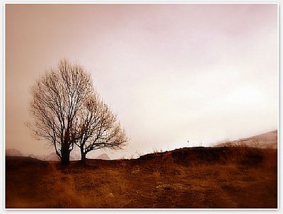
Well, I love the effect you have created here Mohammad and my eye had no difficulty in going straight to the subject. The composition is great and the tones are pleasant to view although I would like to see a fuller sepia toned version. Well done to you my dear friend it is a very beautiful moody and simplistically composed study. My very best wishes to you as always....Ray
|
|
|
|
 masdip group
{K:90} 3/16/2006
masdip group
{K:90} 3/16/2006
|
nice smooth! it seems like really old view!! great job! simply but the best! regards
|
|
|
|
 Giuseppe Guadagno
{K:34002} 3/15/2006
Giuseppe Guadagno
{K:34002} 3/15/2006
|
Impressive for its semplicity and immediate comunication, but not only. I think excellent also the almost dim mood broken by the strong light coming up behind the ill. The half fuzzy front ground helps the colour to create the desired old look.
A splendid work endeed.
Regards.
Giuseppe
|
|
|
|
|
Mohammad Porooshani
{K:20765} 3/15/2006
|
Thank you Shehzaad,
it's a good image but not even comparable with your best of works.
Mohammad
|
|
|
|
|
Mohammad Porooshani
{K:20765} 3/15/2006
|
Dear Hugo,
First I want to thank you very much for your good comment, then
I'm in agree with Melisa and you, but, as I described in the About, I post it just for comparison and as you now, this image had been taken in January this year and after 3 month I took a look back and found this angle very interesting. maybe the dark spot catch eyes but I feel good about it.
you know, some times when you look behind and find some unusual vision, you may like it more than it's alternative version.
I addition that I meant just the upper right corner of image (the bright sky) as the main subject, and as you said, It does not look like so! but anyway I meant so.
And about old look of image, as you know, printed old photos looks like this brown image by just a difference of saturation. I mean these photos has a lighter brown tint, but I didn't mean to make it the exact old look.
Thank you a Bunch,
Your little friend,
Mohammad
|
|
|
|
 Ace Star
{K:21040} 3/15/2006
Ace Star
{K:21040} 3/15/2006
|
a dream? nah ... Magic nah! this is special very special image from my brother :)
what can i say so surreal effect it leaves while looking at it something exraordinary! well done
wish you all the best
|
|
|
|
 Hugo de Wolf
{K:185110} 3/15/2006
Hugo de Wolf
{K:185110} 3/15/2006
|
Hi Mohammad, For the larger part, I agree with Melisa about the dark spot. On the other hand, it not only grabs the eye, but also holds it. Maybe not at the spot you intended (as I think the tree is supposed to be the primary subject here), but it is effective in preventing the eye from wandering off.
I think you succeeded in creating the old look. Maybe a slightly cooler tone of brown could've created an even stronger dated feel, but that's all a matter of interpretation.
I do think that in order to complete the old look, the gradient in the sky, should've been completed on the right side of the photo too. I guess that needs some more explaining. There's a distinct darker tone on the left and top compared to the area around the center / horizon. I think that darker tone should be applied on the right side too, as in the current layout, it seems as if the vignetting is cropped off on the right. Hope you see what I mean.
I like the feel about this photo, well done, and an interesting post processing.
Cheers,
Hugo
|
|
|
|
 Pietro Clarizia
{K:8241} 3/15/2006
Pietro Clarizia
{K:8241} 3/15/2006
|
excellent tones and well composed!!
well done!
ciao!
|
|
|
|
|
Mohammad Porooshani
{K:20765} 3/15/2006
|
thank you Melisa,
you're right, but I just tried to not alter the composition and you won't believe the situation which I shot this Image, that was a real hard work.
And + there is some light imbalanced elements in this photo that make it not a classic one, just an image! I like the lighting.
Thank you again.
|
|
|
|
|
z z
{K:7231} 3/15/2006
|
I love the glowing colors of this piece. The simple layout really brings out the feeling of alone. The only thing I would suggest: While I like the way the tall grass sticks up beyond the hillside. The one dark spot in the middle tends to grab my eye and looks a bit like a flaw. ~ Well composed piece
|
|


")


