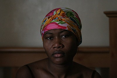
A fantastic intimate portrait, Ray. Super composition, palette, and tones. I kept going back in forth in my mind whether I think it's too dark overall, and I finally decided that it is just a tad too dark. Other than that I love it. Maybe lighten it up as below. Well done! Steve
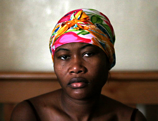
I do agree with them on lifting the hue just a bit I like the dark but not in the turbin or the face. vignetting may get you closer to what you might like.... I don't agree with her crop I'm sure some may not agree with the vignetting but it's keeping the integrity of your original and I'm not big on centering myself.... centering is for photo studios.... then again more and more they don't do it either... In other words I really like your original shot but I went in and basically lit up the levels and then helped it with some brown tone vignetting. Just another version of where you could go with such a nice shot! her emotion is very nicely captured.
I'll just reiterate what Mary and Green have both said. Mary did a wonderful job with the PS editing (something I still have to figure out one day... help Mary!) Although the redo is good, I'm a fan of keeping her a bit off center.... maybe cropping some on the right to get rid of the structure. I love the lighting to left, and how the light comes in. The mood and look of the pic is wonderful, and the contrasting head wrap is a nice touch. I'm way too shy to get into someone's face for pics like this.
I agree with Mary. This is a really nice shot. The DOF is nice too. You may want to watch your lighting though because it is a little dark. With our skin (black folks) you have to be very careful when taking photos so that we will not come out look too dark which tends to hide facial details espcially when shooting against a white or light background. Mary did exactly what I would have done in PS to your photo. Believe me, I am still trying to master the art of lighting photos. Also, almost all of the photos that I posted, I have adjusted in PS. Keep them coming. Holla!
You did a great job capturing her mood. I like the connection you established with your subject. Her direct gaze pulls the viewer right into her world.
I also like the contrast of her colorful headscarf with the drab and simple background. It hints to me that there may be more to her personality than the somber expression she has at the moment.
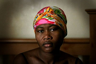
In contrast, the overall muddiness of the image is bothersome to me. Perhaps this was intentional, in which case my comments are not that helpful. I hope you do not mind, but I wanted to illustrate what I mean by offering a different view. On this small attachment, I only did a quick PS levels adjustment, plus I cropped it a bit so that she really was the focus. Otherwise she might get a little lost in her environment. After the crop, I removed a fraction of the structure on the right.
I seriously hope you are not offended that I worked on your image. I just wanted you to have a visual of what I meant.
")