|
|
 Quix Photography
{K:20204} 5/19/2006
|
Bless Keith... only you could get away with sayint that one to me.. lol
|
|
|
|
 Keith Saint
 {K:13784} 5/19/2006
|
I just wonder what was on his mind
I'm suprised at you though Sue never had you down as a voyeur lol
|
|
|
|
 Joggie van Staden
{K:41700} 5/18/2006
|
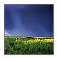
Great colour and light and a peaceful scene well captured. The darkening of certain areas is noticable though in the bright areas between the grass blades. I tend to agree with Hugo on the life buoy although I think a slighly different angle (more to the left) could bring it closer to the couple and still introduce a symbolic element about life. Great work Sue.
Joggie
|
|
|
|
 Quix Photography
{K:20204} 5/18/2006
|
Hi Hugo.. thank you for a most excellent critique... many valid points.
I have this uncanny knack of not noticing the slight tilt in my horizons... must give myself a slap for that one as its about time I remembered to look more closely in that area. Guess the lighting was me trying to create a romantic mood behind this shot.. guess you either love or hate that.. with this I was happy with the result (& must admit I did like that life buoy.. though can see how it is an intrusion on this scene. As for my shadow... I darkend the shot down in the area around it to try & blend it in... quite liked the grass down there, though in insight think a crop would have been the better option.
I do like your version too... draws more to the couple.
Thanks once again... excellent comment... greatly appreciated.
Keep well & bright
Sue x
|
|
|
|
 Hugo de Wolf
{K:185110} 5/18/2006
|
Hi Sue, I like the idea behind this photo; sharing the view with the couple is a very nice touch.
There are a couple of things that reduce the power of that moment and the feeling, IMO.
1. The life buoy adds a diversion in this photo, and to me, reduces the tension by attracting too much attention to it; the tilted structure itself would make a nice subject on its own, but in conjunction with the couple, it's more of a distraction, as it inserts a duality.
2. The horizon has a counter clockwise tilt in it.... Easy to correct, though.
3. The lighting is nice and soft, casting a warm glow over the image, yet the tones look too muted on screen to make that a part of the image. Besides, the muted tones do not quite fit with the feeling and the moment I'm sharing with that couple, I believe.
4. Your shadow in the image creates a feeling of intrusion on an intimate moment in stead of sharing it, if you see what I mean. In the composition, I think you could easily crop it out without disrupting the balance.
With just a tad more effort, I think you could really make something out of this shot. I tried to show you what I have in mind in the attached image. Unless the points I mention were a based on deliberate decisions, then disregard this comment; I don't want to mingle with your creative mind....:)
Cheers,
Hugo
|

|
|
|
|
 Quix Photography
{K:20204} 5/16/2006
|
He he... bless... kids these days eh!
Thanks for all the comments Danny
Hope you're keeping well & bright
Sue x
|
|
|
|
|
Mary Slade
{K:40338} 5/16/2006
|
Brilliant- the textures and colours really make an atmosphere I can feel!
|
|
|
|
|
Danny Brannigan
{K:19523} 5/16/2006
|
Great composition Sue. They do look wrapped up against the elements. Must be Southerners.
|
|
|
|
|
Galal El Missary
{K:84569} 5/15/2006
|
Great mood , Excellent composition & colors , well taken .
Galal
|
|
|
|
|
Dubravko Grakalic
{K:25235} 5/15/2006
|
great momment
|
|


