|
|
 Doyle D. Chastain
 {K:101119} 9/19/2006
|
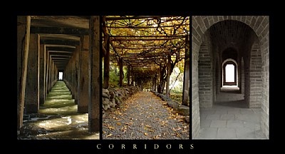
A great collage Jinggoy.
First - The black is ideal for this. Evenly spaced division bars between the images are nicely dividing the shots.
Second - The balance is really good . . . the firmer corridors on the outside edges broken by the light, open and airy Center shot in the center. Outside corridors seem to point outwards . . . where the central seems to go into the distance without turning. This is very good work!
Regards,
Doyle I <~~~~~
|
|
|
|
 Jinggoy Montenejo
{K:7736} 7/14/2006
Jinggoy Montenejo
{K:7736} 7/14/2006
|
hi! thanks for the message. yes, i realize that from an architectural perspective it doesn't go together, this is one of many things i'd like to get more images of.if you do one of these, i would sure like to see your work! take care!
|
|
|
|
 Paul's Photos
{K:35235} 7/13/2006
Paul's Photos
{K:35235} 7/13/2006
|
great concept... I like it... the border is ok as well. If I was going to change something, maybe it would be the middle photo... even though it is a corridor, it does not match the others in an architectural way. or.... I would change out the one on the right to something that has a square style to match the first two images. But, overall.. I like the work. I will have to look at doing something like this... good work
|
|
|
|
 Robert Kocs
{K:89085} 7/12/2006
Robert Kocs
{K:89085} 7/12/2006
|
Absolutely impressive collage and great capture.
Love the great persőective and point of view. Lovely
work, nicely done dear Jinggoy.
Best wishes
Robert
|
|
|
|
 Pablo Dylan
{K:63918} 7/11/2006
Pablo Dylan
{K:63918} 7/11/2006
|
Beautifull composition!!!
Pablo
|
|
|
|
|
Jinggoy Montenejo
{K:7736} 7/10/2006
|
Hi Marcus! I see where you are coming from. Most definitely, I need honest critiques Marcus! This is really appreciated.
You've definitely brought in a different perspective! The first and third image actually work together, I just threw in the middle one to break up the mood.
So to explain why I placed them all together, the common ground among these three images is that obviously they all are real corridors - except for one, but I took into consideration the different materials on the 'paths' - water, rock, sand/gravel and the emotion/feeling of that particular image based on the lighting - for me, in order: happiness, peaceful/serene and sadness. I then arranged just based on what looked balanced.
As I had hoped for, I really did get different perspectives from all the comments here. Your "inflated $0.39" is much appreciated and is actually worth a lot more than you think. :-)
|
|
|
|
 Marcus Armani
{K:36599} 7/10/2006
Marcus Armani
{K:36599} 7/10/2006
|
Hi Jinggoy, A very nice Collage, The presentation Is very nice each shot in itself is with nice compsition, Long DOF which I like, nice perspectives, exposures, ligting and details.. since you put this in the CC area :)
IMO The three togeather though are all nice renditions of your title, do not work great togeather, I think what throws me off a bit is that the center Image really does not fit well with the other two, not having the strong Architectual lines and solid structural look of the other two. The length of depth to daylight in the first and third varies greatly which If they were more closly matched would work better.
Just my 39 cents "inflation", but I do feel each photo in itself would make a excellent post, I dont feel they work great togeather. I have always thought that a collage of three like photos such as the third one with differing degrees of depth would make a great collage as the depth would go from short such as your first shot to a middle distance , then a long distance to daylight? Just a thought. I reall do like what you have done here and am being really picky!
Marcus.
|
|
|
|
 Alessandro Capelli
{K:34805} 7/10/2006
Alessandro Capelli
{K:34805} 7/10/2006
|
Beautiful triptych my dear Jinggoy! Beautiful composition, each photos have great colors and details!
All the best to you my friend..Ale
|
|
|
|
|
Jinggoy Montenejo
{K:7736} 7/10/2006
|
Hi Dave,
Thanks, very good suggestion, I see what you mean. I'll need to start collecting images so I can do this. But yes, definitely will be on my list of TTD. J
|
|
|
|
 Dave Stacey
{K:150877} 7/10/2006
Dave Stacey
{K:150877} 7/10/2006
|
A well done montage, Jinggoy, with each shot very good on it's own merits! Perhaps another way of approaching a project like this would be to have all the shots of the same type of subject matter, such as stone, branches, bridges or whatever. You've shown three excellent examples of perspective though, and I can see what your objective is here.
Dave.
|
|
|
|
|
Jinggoy Montenejo
{K:7736} 7/10/2006
|
Hi Jeanette, thanks for stopping by! Glad that you liked it!
|
|
|
|
|
Jinggoy Montenejo
{K:7736} 7/10/2006
|
Thanks Mary, appreciate your comments!
|
|
|
|
 Jeanette Hägglund
{K:59855} 7/9/2006
Jeanette Hägglund
{K:59855} 7/9/2006
|
Simply excellent!!!!!!!!!!!!!! 7+
Jeanette
|
|
|
|
|
Mary Slade
{K:40338} 7/9/2006
|
I really like this- great idea. To have the three images of perpective together. The lighting, colours and intrigue. So much to see. Wonderful image.
|
|
|
|
|
Jinggoy Montenejo
{K:7736} 7/9/2006
|
Dave, thank your for the valuable comments. This is what I was looking for as well. What visual impact does this image have?
You've verbalized what I could see and feel when I was putting together the collage and it's the reason I decided on this. My mind's eye just seemed to like this arrangement.
Take care,
J
|
|
|
|
 Dave Arnold
{K:55680} 7/9/2006
Dave Arnold
{K:55680} 7/9/2006
|
Jinggoy
I think this works very well and could be a nice framed poster-style print. Your placement of them is perfect. The image on the left slightly takes you to the left. The image in the center seems to take you down the center and the image on the right is slightly angles to the right.
Those three things seem to make it interesting to study, something you want to do. Great idea, great execution.
Best wishes,
Dave
|
|
|
|
 Avi
{K:70138} 7/9/2006
Avi
{K:70138} 7/9/2006
|
Ohhhh !!!!! Absolutely Stunning !!!!!.. Two things:
1. Phil must be absoluetly thrilled today !
2. I am sensing a 3-in-a-row for you !!! :)
all the very best dear Jinggoy !!!
Avi
|
|
|
|
|
Jinggoy Montenejo
{K:7736} 7/9/2006
|
Hi Virgis,
Thanks for the message. Yes, this is really a great place to learn. I've been active only a few months, but my learning curve really has jumped IMHO. I'm new to this myself, but learn from the experts here in UF.
Take care!
|
|
|
|
|
Jinggoy Montenejo
{K:7736} 7/9/2006
|
Hi Phil,
Thanks for much for the message! I actually just read it now, I was working on this collage last night and was not sure when you had responded. I don't get any email alerts when someone responds to my critiques or if I get critiques. There seems to be a problem with my cable provider handling the UF email alerts. So I just go back to the images I had critiqued to check responses.
Re your Workflow - I did approach this image with almost the same workflow as yours. I started with one image and copied the two other images in different layers and just played around with the free-transform tool to get them in the same size. I guess with more practice I can do it a lot quicker and the procedure is smoother.
That was actually my first intention- put the most colorful in the middle, but I will give B&W or sepia another attempt. And the two other images have that 'end' in sight compared to the one in the middle.
Yes, i think putting the title on the border somehow gives it an 'anchor' and you 'persuade' the reader to think about something specific when he looks at the image even though it's abstract.
I'm telling you Phil, you can sell your stuff, it's really very good work.
I do appreciate your comments Phil! Take care!
|
|
|
|
|
Jinggoy Montenejo
{K:7736} 7/9/2006
|
Hi Toshi,
Thanks! I see what you mean. The right side really is bland looking basically from the material - brick. I tried adjusting contrast and saturation but, that's the most I could do without messing up the image. But I have not tried doing all the three imagess in B&W or even sepia. Maybe balancing the other two to be 'like' the one on the right would be good... hmmm... I'll will give this a try.
Thanks so much for your inputs Toshi!
|
|
|
|
 Virgis Dromantas
{K:4212} 7/9/2006
Virgis Dromantas
{K:4212} 7/9/2006
|
Dear Jinggoy,
It's very promising attempt! Nice work, no doubt. I'am surprised how much inspirations we can find on UF. This is a great place to meet friends and to learn a lot.
Cheers
Virgis
|
|
|
|
 Phillip Minnis
{K:13131} 7/9/2006
Phillip Minnis
{K:13131} 7/9/2006
|
Oh, my friend, Jinggoy, this is a great first attempt! Nicely balanced - I like the way you have placed the more colourful, lighter one in the centre. I think it looks great!!!
Now, mate, you are teaching me something! I've never thought to put the title in the border! What a great idea -it looks so classy!
I am glad that my collages have inspired you to do some. Did you read my full commentary (War & Peace style) on how I do it?
Cheers
Phil
|
|
|
|
 Toshi
{K:11924} 7/9/2006
Toshi
{K:11924} 7/9/2006
|
Hi Jinggoy, I really like this triptych! Each has it's own style and atmosphere. The far right photo seems to be a bit bland with color, so maybe putting that in the middle would balance all three images out since the other two are much more colorful. I'm not sure if that would work or not, but just my small suggestion. Great work nevertheless!
|
|