|
|
 Eb Mueller
 {K:24960} 10/10/2006
|
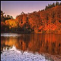
Beautiful dreamy tones, Angela. Certainly cropping out the wall makes for a better composition. The other problem is that the rock is expected to be neutral grey and therefore shows the colour cast.
Eb
|
|
|
|
|
Angela DeLong
{K:3050} 10/5/2006
|
Thanks, Greg. This was actually shot across a small bay, close to dusk, and it was a bit foggy. I don't think I could have gotten it any sharper if I wanted to! :)
|
|
|
|
|
Greg Scott
{K:1990} 10/4/2006
|
I wasn't sure about the soft focus at first, but I really like the dreamy quality it adds, which fits in well with the empty chair. Nicely done!
|
|
|
|
|
Angela DeLong
{K:3050} 10/4/2006
|
I liked the rock wall because it showed how the property went up to the edge of the water, well, low tide in this pic. I cropped as you suggested, and I agree, it's a better shot. Thanks for the tips.
|

|
|
|
|
|
Fernando Simoes
{K:316} 10/4/2006
|
Beautiful picture Angela. I really like the POV and the dreamy like softness and colors
All I would change is too crop jus below the fist rock eliminating the stone wall
|
|
|
|
 Gustavo Scheverin
 {K:164501} 10/4/2006
|
mmm, me parece que la falta contraste. El paisaje, bonito.
Un abrazo!
|
|


