|
|
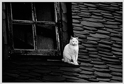
 fokstrot .
{K:6560} 3/2/2007
fokstrot .
{K:6560} 3/2/2007
|
Great b&w. Lovely cat.
I really like your portfolio.
|
|
|
|
 Grzegorz Markowski
{K:6537} 1/18/2007
Grzegorz Markowski
{K:6537} 1/18/2007
|
I like it :) !
|
|
|
|
 txules .
 {K:62768} 1/18/2007
|
yep, you are right, but not sure which i prefer
thanks for your honest critic...jd
|
|
|
|
 Meg Metcalfe
{K:6114} 1/17/2007
Meg Metcalfe
{K:6114} 1/17/2007
|
You already know what I'm going to say JD...
I like the colour version better. In B/W there is quite a loss of detail and the image looks cold.
|
|
|
|
![Nelson Moore [Kes] -](http://images.imageopolis.com/images/5/7/8/7/5787/1481659-micro.jpg) Nelson Moore [Kes] -
{K:20241} 1/10/2007
Nelson Moore [Kes] -
{K:20241} 1/10/2007
|
Hi JD, Yep, more mood here...halloween mood...i prefer the color version..but better drama here...hmmm, now can't decide, lol..
Kes
|
|
|
|
 Billy Bloggs
{K:51043} 1/8/2007
Billy Bloggs
{K:51043} 1/8/2007
|
I prefer the black and white one too.
Regards, Gary
|
|
|
|
 Paolo Corradini
{K:59552} 1/8/2007
Paolo Corradini
{K:59552} 1/8/2007
|
wow i really love this strong BW it's perfect for me!
|
|
|
|
 Pablo Dylan
{K:63918} 1/8/2007
Pablo Dylan
{K:63918} 1/8/2007
|
Beautiful shot in excellent B&W.
Pablo
|
|
|
|
 Jason v.d.Meer
{K:2019} 1/8/2007
Jason v.d.Meer
{K:2019} 1/8/2007
|
superb B&W mate....this one for me.
j.
|
|
|
|
 Gianes Ma
{K:26069} 1/8/2007
Gianes Ma
{K:26069} 1/8/2007
|
Simple and elegant composition that I prefere in b/w version.
Congratulations.
G.
|
|
|
|
|
emiliano chionaky
{K:3135} 1/8/2007
|
I leave comment here because I prefer the b&w image ;)
excellent composition, I love the cat dominating roof, and very beatiful contrast, only little bit low in detail bottom left respect "blue" version, wich was very rich.
congratulations
emiliano
|
|
|
|
 Leonie Fitzpatrick
{K:40551} 1/8/2007
Leonie Fitzpatrick
{K:40551} 1/8/2007
|
Totally different... ~~GRIN~~ Txules...
This cat is a minder of *the territory*... The owner of the roof top... Surveying all, warning all... :)
The *blue* cat was getting some air... :)
Both excellent...:)
Onie...
|
|
|
|
 Patrick Crowther
{K:13393} 1/8/2007
Patrick Crowther
{K:13393} 1/8/2007
|
Not too much, it just looks a little unbalanced at the moment. Just so you can see faint detail... all the best, Patrick
|
|
|
|
|
txules .
{K:62768} 1/8/2007
|
thanks Patrick, i see what you mean. I tried different versions in BW but intentionally i left the that corner darker but may be you are right; kind regrads..txules
|
|
|
|
|
Patrick Crowther
{K:13393} 1/8/2007
|
I much prefer this image in black and white, but I think you could lighten the shadowed area under the left side of the window to bring out a little more detail.
|
|