|
|
 H L
{K:11377} 2/1/2007
H L
{K:11377} 2/1/2007
|
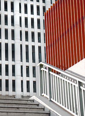
Tony this is great abstract!! I like the way you have it frame...good eye!
Harry
|
|
|
|
 Peter De Rycke
 {K:41212} 1/13/2007
|
Great composition of lines and colours !
Peter
|
|
|
|
 Jan Hoffman
{K:39467} 1/12/2007
Jan Hoffman
{K:39467} 1/12/2007
|
I am sticking to my guns but it looks like I am outnumbered!
:)
--Jan
|
|
|
|
 Marija Ristic
{K:4136} 1/12/2007
Marija Ristic
{K:4136} 1/12/2007
|
Very clever composition. Thumbs up for the colour version :)
|
|
|
|
|
Tony Smallman
{K:23858} 1/12/2007
|
Thanks for commenting A.j.Actually I prefer this one too,the colour provides a vibrancy I find more fun.
|
|
|
|
 AJ Miller
{K:49168} 1/12/2007
AJ Miller
{K:49168} 1/12/2007
|
While I agree in principle with Jan's observations, I do like the idea here of the predominantly B&W image with the localised brown/red.
I've looked at them side-by-side, and have to say that as they are, I prefer this version.
AJ
|
|
|
|
 Shirley D. Cross-Taylor
{K:174199} 1/12/2007
Shirley D. Cross-Taylor
{K:174199} 1/12/2007
|
Love this one, too, Tony...a hard choice for me...they are both excellent!:)
|
|
|
|
|
Tony Smallman
{K:23858} 1/12/2007
|
Interesting!Thanks for the feedback Jan,maybe I'll apply some U.S.M.
|
|
|
|
|
Jan Hoffman
{K:39467} 1/12/2007
|
Tony -- I much prefer the B&W for greater visual impact and it reduces the scene to more elementary components. The color version is a bit soft and does not have as much impact.
--Best to you, Jan
|
|