|
|
 Nick Karagiaouroglou
 {K:127263} 5/27/2008
|
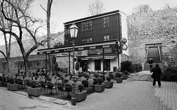
Your crop made that clear too, Visar! They do add much and I guess that this way they are put under "control" with their aesthetics.
A good example about how some available object can be put into integrity of the sense of a photo.
Cheers!
Nick
|
|
|
|
 absynthius .
{K:20748} 5/26/2008
absynthius .
{K:20748} 5/26/2008
|
about the trees Nick, I think they cannot be avoided as the yard of the cafe, the seats of the terrace, stretch all the way to the edge of the canvas on the left- and beside, even though they are not that crucial to the shot i believe they do give some aesthetics to it.
thanks a lot for the thorough comment on this one Nick.
cheers,
v.
|
|
|
|
|
Nick Karagiaouroglou
{K:127263} 5/24/2008
|
Bingo! Much much better, Visar! Not absolutely perfect but lightyears ahead! This one lets the café speak! And somehow it won so much integrity of composition too!
Thanks a lot for the idea! Some things are much clearer in my mind now.
Nick
|
|
|
|
|
Nick Karagiaouroglou
{K:127263} 5/24/2008
|
You are always welcome, Visar! And I thank you for the interesting questions that keep my mind working!
Surely it is hard, but that's why it is good. We see here exactly what a work it can be to have such scenes of wider angles and try to find some solution to the arrising problems. And this is why most "naturally born artists" will not bother to do something else than their flower close-ups, which are piece of cake compared to such cases like this.
What to do, what do.. If you at least had some wall at the right that makes some kind of progression between the "here" and the "over there". Then perhaps the café could gain some credit as its size would be a bit more noticable. Or some other "size/distance marker" at all. You came up with a profi question with this one, Visar!
Or perhaps are the trees at the left kind of lowering the importance of the building?
Cheers!
Nick
|
|
|
|
|
absynthius .
{K:20748} 5/23/2008
|
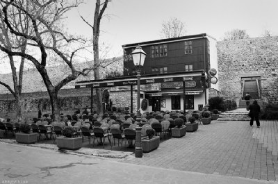
what do you think of this crop Nick, is it!?
|

a dead crop |
|
|
|
|
absynthius .
{K:20748} 5/23/2008
|
Hey Nick, thanks a lot for the everlasting efforts you're taking in responding to the questions i raise about the my shots.
In this shot I was trying to give most of the credits to the cafe building, and then the surrounding area and/ or other elements.
I think that a direct shot, from right in front of the cafe rather than from the sides (as this shot was taken), would be the best choice.
Even though, your crop is slight, I am thinking that cafe is losing a bit of its integrity and the path on the right is gaining more attention.
agrhhhh... just now i am thinking what a hard shot this one is. really really, hard- not even a direct perspective from the front can save this one- the way it is now i think there's depth and much organic feeling to it, and from the front i doubt it will lose that too. (sigh)!!
I am not too sure, but i think the focal length must have been 28 mm- i do not remember, though having in mind the area around the cafe it cannot be less than that for the cafe is quite big (three floors) and let alone that here we also have much of the yard.
thanks Nick,
v.
|
|
|
|
|
Nick Karagiaouroglou
{K:127263} 5/23/2008
|
Again a very good lighting and contrast, which especially on the region of the many chairs in front of the café was surely not a piece of cake. The DoF is simply a perfect utilization of the capabilities of your camera/lens and of that great Ilford! (I am always stunned about the finest brush that the latter seems to have.)
Composition... well, a tough one! What about taking some steps toward the two persons and turning the camera to the left? It would result into something like the attachment, (perspectivic distortion of the original image) and it would also include more of the path that extends to the left.
Or perhaps taking some steps toward the light and keeping the same angle (and perhaps also a bit shorter focal length)? BTW, at which focal length between 28 and 135 were you?
Cheers!
Nick
|

Perspectivic distortion |
|
|
|
 Marian Man
{K:80636} 5/11/2008
Marian Man
{K:80636} 5/11/2008
|
do not know much about "technicalities dear Visar but I think there is nothing wrong with your lines here!!!
lovely place well captured by you!!!!! fine tones!!!!
and so inviting!!!!!
all the best
Marian
|
|
|
|
|
Ahmed Al Marzouqi
{K:948} 5/10/2008
|
great shot,, well done
|
|
|
|
 Burim Luta
{K:5255} 5/7/2008
Burim Luta
{K:5255} 5/7/2008
|
I think that the lines on the wall and on the street combined with the tiles on the right, add a lot to the composition, perspective and shot's atmosphere, I like them a lot dude.
I also like this light pole which a lot of people would find as a distraction but I think that it fits perfect for this shot cause these kind of light poles are as old as the legend of Oliver Twist itself
Regards
B.L.
|
|
|
|
 Paolo Corradini
{K:59552} 5/6/2008
Paolo Corradini
{K:59552} 5/6/2008
|
so ggod BW for this street capture!
cheers
Paolo
|
|