|
|
 Nick Karagiaouroglou
 {K:127263} 4/4/2009
|
Thanks a lot, Diego!
I guess the composition needed more space on the left or the right side, though, as Bubai already said.
Cheers!
Nick
|
|
|
|
|
Nick Karagiaouroglou
{K:127263} 4/4/2009
|
And nice thanks, Claudia!
Nick
|
|
|
|
|
Nick Karagiaouroglou
{K:127263} 4/4/2009
|
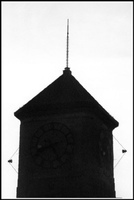
I had better used a stronger exposure indeed, Aziz. I would still keep the tower dark but not as dark as it is now. And as Bubai said, it also needed space either on the left or in the right. The two points taken ogether mean that I'll have to try again.
Thanks once more!
Nick
|
|
|
|
|
Nick Karagiaouroglou
{K:127263} 4/4/2009
|
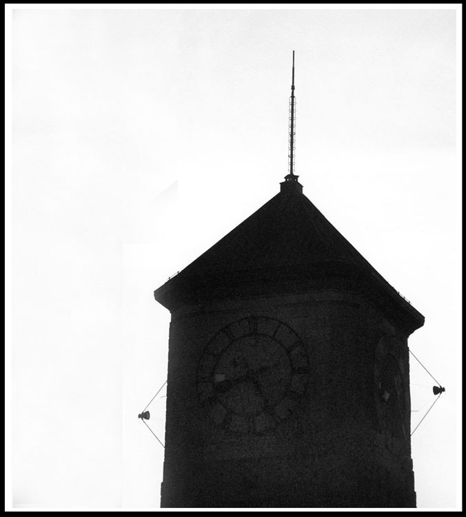
Thanks a lot for the great idea, Bubai! Indeed, it needed some more space on the left of the right! So, because this is so easy to do, we add the space and the image gets much better! (Attachment.)
Thank you very very much!!
Nick
|

Added space to the left according to Bubai's idea |
|
|
|
|
Nick Karagiaouroglou
{K:127263} 4/4/2009
|
I also tend to agree, Marcio. I wanted it to be dark and grainy but this was too much, I guess. A bit better visibility would be better.
Cheers and thanks a lot!
Nick
|
|
|
|
 Diego Bullita
{K:17017} 4/1/2009
Diego Bullita
{K:17017} 4/1/2009
|
hi dear Nick,
minimalist and well composed this tower,
regards my friend
diego
|
|
|
|
 Claudia Perilli
{K:31090} 4/1/2009
Claudia Perilli
{K:31090} 4/1/2009
|
Nice work.
Claudia
|
|
|
|
 aZiZ aBc
{K:28345} 3/31/2009
aZiZ aBc
{K:28345} 3/31/2009
|
I think a bit dodging or lightening by levels alteration on the tower would be more effective.
best
Aziz
|
|
|
|
 Aungsita Chatterjee
{K:19843} 3/31/2009
Aungsita Chatterjee
{K:19843} 3/31/2009
|
well captured but need some white spaces one side of the object..... but this is nice one.
regards bubai.
|
|
|
|
 Marcio Janousek
{K:32538} 3/31/2009
Marcio Janousek
{K:32538} 3/31/2009
|
I liked the two lamps forming a triangulation with the roof...
The outline of the tower is well detailed , but I still would like a better exposure on the clock almost invisible.
I big hug :)
|
|