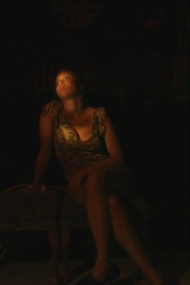
This is on it's way to looking like something from one of the Dutch Masters of a couple centuries ago.(or longer) The pose/expression, though barely visible, is nice. The crop...well, needs more at the bottom to inclued all of the feet and less at the top wouldn't be bad. Only other thing is more light. Not much though. Just looks too dark in important areas such as the face. Color is nice too.
this is very nice , Ms Smith. I cant wait to try some light painting. Very nice. I think I would probably crop a bit off the top. A little too much dead space for me. But otherwise, lovely low lit shot.