|
|
|
Brent Mills
{K:730} 1/7/2004
|
Makes great sense. Its an amazing image. The composition is beyond great as is the shading. And the idea itself is marvelous. It turned out great. What an excellent shot. Great job!
-Brent
|
|
|
|
|
Piers Erbsloeh
{K:824} 11/1/2003
|
you have some exelent photography here, but especialy love zhis one, for the grain, and the light and well it?s simply wonderfull.
|
|
|
|
|
Hakan Aker
{K:14146} 10/2/2003
|
It 's a good one Ursula...
|
|
|
|
|
elizabeth thompson
{K:258} 9/30/2003
|
very well done, Ursula. the grain works very very well, and especially in b/w. love the contrast as well.
|
|
|
|
|
Julie Buckwald
{K:526} 9/30/2003
|
I've tried this shot and it never turned out as well as yours has - and since my photos were of the exact same buildings i am really jealous
|
|
|
|
|
Debra Griffin-Ibrahim
{K:7119} 9/30/2003
|
Beautiful Image!!!
|
|
|
|
|
Brian T. Ach
{K:1742} 9/30/2003
|
Nice, nice. Yes, I understand what you are saying, sometimes you don't need to say anything; rather you just need to look at a shot like this for a minute...that explains everything. Kevin- while your critique is quite on the money at times and thorough, I would caution about getting caught up in trying to dissect and explain everything. The best shots I have ever seen are not always in focus or toned just right, they just are. Regards...
|
|
|
|
|
Gregory Fiedler
{K:15439} 9/30/2003
|
I personally find this to be fantastic, such works! The ONLY thing I don't like, is the fact that I will be up all night trying to get this effect down..Fine, fine work! Congrats! oh ya! It makes great sense........
|
|
|
|
|
Ross Fox
{K:18} 9/30/2003
|
Moving through a city creates a myriad of shots, angles, reflections that combine to form images exactly like this one - great!
|
|
|
|
|
Tobiah Deutsch
{K:2432} 9/30/2003
|
I think the second try is MUCH more powerful, however it doesn't leave as much to the imagination as to what it is... it takes a while to see the buildings in the original. In the second, its right there... in your face. I LOVE this crop and re work though.
|
|
|
|
|
Ursula I Abresch
{K:6515} 9/30/2003
|
I'm just not doing this right. Third try:
|

|
|
|
|
|
Ursula I Abresch
{K:6515} 9/30/2003
|
SORRY!!! Forgot to add the file. Here it is:
|
|
|
|
|
Ursula I Abresch
{K:6515} 9/30/2003
|
I've reworked this picture, here is the second version:
|
|
|
|
|
dwight Marshall
{K:326} 9/30/2003
|
Nice shot... busy but beautiful
|
|
|
|
|
Gabriele Pfund
{K:11745} 9/30/2003
|
Wonderful capture!!!
|
|
|
|
|
Terry McCully
{K:9221} 9/29/2003
|
Very nice looking shot here.... I ike this one... Lookis like art for sure ! ! !
|
|
|
|
 PK- Photos
{K:13099} 9/29/2003
PK- Photos
{K:13099} 9/29/2003
|
Hello Ursula, I have only a "short" comment for you (sorry) :)) = I am impressed, very creative work & idea, I like it very much!
best regards, Pia :)
|
|
|
|
|
John Strazza
{K:11535} 9/29/2003
|
yes yes, it's makes sense to me, and it's a wonderful image ... absolutley wonderful feelings, tones, shapes, and all the goodies that a rich image could have .. i love this image!!!
|
|
|
|
|
Tobiah Deutsch
{K:2432} 9/29/2003
|
Ursula,
Thats wonderful... I was not trying to state that this is bad form, merely wondering what the "deal" was. Kevin's critique was quite good. I only hope for the type of constructive criticism that he gave in my own future.
Props to Kevin
Tobiah
|
|
|
|
|
Tomo Radovanovic
{K:12788} 9/29/2003
|
great work
regards
|
|
|
|
al shaikh
 {K:15790} 9/29/2003
|
Apologize? Are you kidding, we love this sort of critique here on usefilm. Do it again!
|
|
|
|
|
Richard Thornton
{K:26442} 9/29/2003
|
Well, you attempted to be creative and you succeeded! I like your reflections better than my own. One thing I would like to see is the verticals straightened and aligned with the edges of the frame. This can be done rather easily in PS and perhaps other applications, too.
|
|
|
|
|
Eric Goldwasser
{K:4294} 9/29/2003
|
Ursula and everyone,
I'm afraid i must get into this to once again point out that usefilm is a LEARNING site. That said, Kevin's comment is spot on to the spirit of this site. Who cares what his karma is? Who cares if he has any photos uploaded? I would welcome a critique of that nature on ANY of my photos.
I hope that Kevin will continue to be a member of this community. I also hope that people that worry about their karma will see that this site is not about getting the biggest numbers.
Now, onto the image! I LOVE it! The harsh light in the upper section works well for me in this. The glass refraction is also very cool. VERY well seen.
Don't ask Kevin to do anything more than to please continue to visit and participate. Thanks!
|
|
|
|
|
Ursula I Abresch
{K:6515} 9/29/2003
|
It was not a setup, but it was a mistake. A couple days ago, and through a different website (DPChallenge), Kevin and I agreed to critique each other's pictures. He asked where my pictures were, and I pointed him to my portfolio here at Usefilm. He was not a Usefilm member at the time. He signed up, and left a long, wonderful critique for my picture. I imagine that it is because of his long critique that my picture got posted as a "featured critique". I did not know that this would happen, I really hadn't thought about how the "featured critique" worked.
I apologize if this caused anyone a problem. I will ask Kevin to please not leave any more long critiques on my pictures here at Usefilm.
Ursula
|
|
|
|
|
Tobiah Deutsch
{K:2432} 9/29/2003
|
Ursula,
Who is Kevin Riggs?!? Just curious... He seems like he's making a classroom type critique here... just wondering if this was a random critique or set up. Lots to say with a Karma of only 8
-Toby
|
|
|
|
|
MaryBell
{K:32791} 9/29/2003
|
I agree with Jim - this image has an incredible impact and is very creative in addition - I think it squares with what you say about city life...
|
|
|
|
|
Perestrioika R
{K:440} 9/29/2003
|
i love this shot. and u've done it brilliantly. good going.
luck to u
|
|
|
|
|
Jim McNitt
{K:11246} 9/29/2003
|
Hi Ursula:
I think you're breaking out of the boredom. It seems Kevin has said everything there is to say -- and then some. The only thing to add is that I don't see this as an attempt at being "creative." Any time you push beyond the obvious and cliched, you're stoking the fires of creativity. It may not be in the most acceptable taste (this obviously IS), but if it breaks the bonds of "reflexive" thinking an acting -- it's creative... --Jim
|
|
|
|
|
Pedro Beça Múrias
{K:2076} 9/29/2003
|
If you say it's an attempt, I wonder what a masterpiece wil look like. Beacause this is very good!!!
|
|
|
|
|
Tobiah Deutsch
{K:2432} 9/29/2003
|
I think your right on... but don't get caught up in trying to make an explanation for everything. Sometimes the photo is what it is. I LOVE the tones here. It looks wonderful. I would like to see the windows of the other building running straight up and down rather than skewed a little. I also think the grain works great here, I'd like to see a version without it too though. Great capture.
|
|
|
|
|
B:)liana
{K:30945} 9/29/2003
|
Absolutely wondeful. great work. Bravo Ursula. Kiss, Biliana
|
|
|
|
|
Salvo Valenti
{K:17038} 9/28/2003
|
QUESTA SI CHE E' ARTE.................
CIAO
|
|
|
|
|
- simos -
{K:9354} 9/28/2003
|
Good, I like it......regards, simo
|
|
|
|
|
Amna Al Shamsi
{K:21795} 9/28/2003
|
creative, excellent photo.
|
|
|
|
|
al shaikh
{K:15790} 9/28/2003
|
Kevin your critique was a breath of fresh air.
|
|
|
|
|
Kevin Riggs
{K:47} 9/28/2003
|
Ursula,
This is Kevin. This image displays an artistic eye that is difficult to develop. I wonder if this is exactly as you shot it or if its been cropped.
Composition -
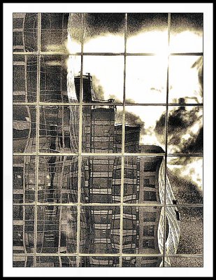
The elements in this composition work well but I think you could have selected the actual artistic expression from within this photo and given it a little more punch. The main elements I see are the near-duotone color scheme, the contrasts, the parallel and perpendicular lines and the distortion of the reflection. The color scheme will be discussed in the Color section so on to the Contrasts. While contrast can refer to lighting you've found a subject and built a composition that includes many more areas of contrasts. You included the coulds in the upper right as slmost organic, living objects that contend with the manmade buildings. The texture in the clouds allows for varying levels of light and the uneven edges reinforces some of the ideas of the distortions that occur in any medium to large city. An ironic sidenote is that the uneven, unkempt, unruly clouds can only be viewed via the straight-edged, mathematically aligned glass of the building you pointed the camera at as your canvas. That is a useful element in this composition and one that I would suggest to cultivate in anyone that does not naturally capture such images (Good Job for you). This leads us into the next Composition consideration. That of the parallel and perpendicular lines. The absolute precision of these lines create an impact for viewers regardless of your intentions or efforts. Almost any person when confronted with something so rigidly laid out as the lines in this photo will begin to overlook them and use them as a grid. I know I did the first several times I saw this. As a matter of fact, if you make it to some of my suggestions later in this epic, you'll find that I use these lines to delineate what I find as necessary and useful to the photo and what I think you could lose without damaging the impact of this photo. That subconcious acceptance of a predominate theme within your composition allows you to sneak up on viewers and throw them a curve or confuse them with more subtle items or views within your picture. In this case, you did well in choosing this subject and photographing it the way you did because the original light colored lines nearest the viewer are reinforces (although distorted) by the lines in the buildings farther away. This sets my perspective (and I'll be other viewers, too) just a little off. I begin to take a second look. The lines not only draw me in with their uniform display and easy-to-see gridwork, they give me one subconcious idea about the photo and when I notice the lines of the buildings in the reflection I have to question my initial feelings about what I'm seeing as a viewer. Finally, the slope of the reflected building in the bottom right truly exaggerates and extends this for me (and again I bet for other viewers). My mind has adjusted to accepting the mechanically "perfect" lines in the nearer building and somehow matching up the lines from the reflected building but then I notice the distorted perspective on the side of the building at the bottom right and off I go again looking into the photo to "figure it out". I think you have a subject that is both easy to look at with the elements you've included and one that exists on multiple levels so that as a viewer begins to engage the elements of the photo, they will find this picture rewarding intellectually and, for many, emotionally like you seem to.
Lighting -
The lighting intrigues me. You got a great exposure of the nearest building, the reflection and the clouds. The one trouble spot is the top right corner with all the light. This is the one section I would spend time rethinking if this was my photo. The light source (looks like the sun) is so overpowering it actually bisects two of the lines causing a different effect. I'm sure you could create a whole other composition about continuity and crop out about 70% of the photo and just keep those lines and the light source in the top right and it would be intriguing, too. Here, I don't like the way this works and think that you might consider cropping down about 1/5 of the distance from the top. If you find the vertical line that is closest to the right side of the photo (the vertical line the light bisects) and follow it from the top of the photo down. Crop out everything above where that line disappears into the light source. I think you'll still get the lighting effect as well as the vertical effect that both the building that is your canvas and the buildings that are your subject. That is the only thing I think I would care to change on this photo. It does appear to me that you might have gotten a little bokeh towards the bottom left of the image. If you start off looking at the bottom left corner and move your eye diagonally up into the first square created by the building you aimed at, then look in the top righthand corner of that sqare and you may see a little glare there. It looks like a slightly lighter smudge or ghost image. I don't think that's too distracting but depending on how you have the original you might be able to edit that area if you're so inclined.
Color -
Whether you edited the colors or used a camera setting to generate this color scheme, I believe this works well for the photo you shot. This provides an artistic, edgy feel (which I'm sure was the goal of the exercise you were doing as well). Nice choice and good execution on the duotone effect.
Focus -
The focus is just fine for this shot. I think the coloration and the "grainy" feel you were trying to achieve give you a little leeway in how sharp this photo needed to be (not that it would have looked OK if it was blurry but you're going to lose a little with the grainy texture you were trying to generate). Regardless I think you got a good, steady focus and I like it. Was this AF or MF?
Overall -
Overall I like this photo. It's an above average without considering how it fits the project you were shooting for. In my opinion this has an artistic feeling to it and is a good example of both your eye for artistic shots and the quality of composition you can produce. With all the typing about the one element I found distracting, I still feel that this composition has numerous elements to commend it as an artistic photograph. Good job.
|
|
|
|
|
Ragnhildur Ragnars
{K:1573} 9/28/2003
|
Very creative image and it makes perfect sense. Excellent work.
|
|
|
|
|
Donna Devine
{K:2885} 9/28/2003
|
Wonderful effect! Good work, Ursula.
|
|
|
|
|
ellen
{K:669} 9/28/2003
|
Excellent creativity, this is a perfect depiction of 'life in the city'....added to my favorites!
|
|
|
|
|
Anna Dill
{K:3872} 9/28/2003
|
Makes perfect sense to me Ursula. The image really does say city life to to me. Excellently done.
|
|