|
|
|
Rose Martin
{K:4696} 10/31/2004
|
I also thought it was fire at first. Very strong color and contrast here. I like it
|
|
|
|
|
Jeff Cartwright
{K:52046} 5/20/2004
|
Hi!....Hugo: Nice Photograhic Scene!...I Agree with the Other Comments! Too Much Black Foreground!....You Know By Now!...Teunis! has made a Nice Compromise Improvement!!!
REgards:
Jeff.
|
|
|
|
 Emgy Massidda
{K:60358} 5/19/2004
Emgy Massidda
{K:60358} 5/19/2004
|
Dear Hugo. As usual I am pretty late in commenting on photos but...as we say in Dutch "beter laat dan nooit" (better late than never).
I like this shot a lot, not only for the beauty of the subject but also and especially for the way you captured it. Apart from being original on account of the black top and bottom parts, I believe that, particularly de dark bottom - which so many of us seem to desperately see it cropped - adds to the image. Moreover it form a perfect contrast with the rich colours of the illuminated fountain. Cropping the bottom as to make it as large as the top, hence add some symetry, would make this image too perfect, less original and even, in my opinion a little dull. A drammatic cropping, as suggested by Maria Luisa would take away the beautiful contrast with the colours of the water. I wouldn't touch the image also for anothr reason: the asymmetry top/bottom is in perfect harmony with the asymmetry right/left. I don't like Teunis version either cause it makes a completely different imge with not the same nice nightscape atmosphere that characterizes the original
Hehe.....I always talk too much and this time, AGAIN, I couldn't help myself.
To me, a wonderful shot, without any doubt
My congratulations
Emgy
|
|
|
|
|
Tiro Leander
{K:19060} 5/17/2004
|
wow... i like the framing here... great work indeed!
|
|
|
|
Raamses Ortiz
 {K:4408} 5/16/2004
|
Hi Hugo,
Very nice long exposure. The water looks like fire on the small tumbnail. Is excellent!!!
Congrats,
Be seeing you...
Raamses.
|
|
|
|
|
Lori Stitt
{K:75282} 5/12/2004
|
Hugo, this is beautiful! Such a bold composition, I like it. Very nice exposure on the building, great coloring!!! Not always easy to expose for a bright fountain at night and still get nice detail in other points of interest, however, you have done it nicely!!
I also like the amount of dark area in the lower portion, it really adds depth to this image!
Very nice work indeed!
Lori :)
|
|
|
|
|
Tim Bronkhorst
{K:9391} 5/12/2004
|
Hi Hugo,
De vakantie is voorbij weer terug naar de serieuse zaken. Inmiddels een jaartje ouder (en hopelijk foto-technischer :)
Een erg mooie nacht scene. Ik heb het zelf wel geprobeerd maar kreeg veel bewegingsonschepte en de juiste belichting vinden is ook niet altijd even makkelijk als het te donker is om af te lezen waar je wijzer nou eigenlijk naar toe wijst.
Ik vind het trouwens verbazingwekkend hoe sommige stukken van het vallende water stil hangen met zo'n lange sluiter tijd.
Ik kan niet anders zeggen, dan top werk.
Groeten Tim.
|
|
|
|
 Ozjan Yeshar
{K:15239} 5/12/2004
Ozjan Yeshar
{K:15239} 5/12/2004
|
Brilliant shot and great frame but Hugo the frame could have been adjusted more at the right side. Nevertheless, Still a great shot. Cheers.
|
|
|
|
 Roger Williams
{K:86139} 5/12/2004
Roger Williams
{K:86139} 5/12/2004
|
An excellent start to what I assume will be another three-some. Must have been a difficult exposure to judge. Well done--I can't imagine it being done better.
|
|
|
|
|
Jason Wiggins
{K:405} 5/11/2004
|
Hugo,
Personally, I like the photo the way it is. If you lighten up the black any it will detract from the fiery glow of the flame. As for the cropping, the photo is vertival in composition. If you crop too much it will stop the viewer's eye from following the flame and the elaborate architecture upward.
Great Job as always and thanks for the comments
Jason
|
|
|
|
|
Antonella Nistri
{K:21867} 5/11/2004
|
Excellent composition,Hugo,great perspective and colors,magnificent the whole representation,cheers,Antonella
|
|
|
|
|
jon parsons
{K:13639} 5/11/2004
|
Dear Hugo, spectacular image my dear friend!!!!....jon
|
|
|
|
|
Kristina Kohut
{K:49990} 5/11/2004
|
Oh Hugo, this looks fantastic! So extremely wonderful mood, and great interesting composition! Very original!
About crop at bottom... To be honest, my first impression when I clicked in to this was that it's a bit to much ground. But as I looked longer I changed my mind, and I actually think it's very good having it there. If you crop, you will have a picture of the place, but if you don't crop you will have an interesting depth kind of leading one in to the place instead of just seing a picture. Haha... sorry if you don't understand how I mean, it's so hard to explain in words.
Screens are so different... I think many people just see a pitch black ground. On my screen I can see the light reflect in it.
|
|
|
|
 Hugo de Wolf
{K:185110} 5/10/2004
Hugo de Wolf
{K:185110} 5/10/2004
|
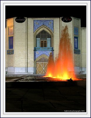
Hi Tom, Thanks for your comment. I think the blurred detail is caused by a combination of factors. First, I had no tripod with me that night, and I had to wedge my camera in a dustbin once again....;o) Secondly, Looking at the original, the blurry effect is also created by the pattern of the bricks; those walls are not perfectly layed....
Cheers,
Hugo
|
|
|
|
|
Hugo de Wolf
{K:185110} 5/10/2004
|
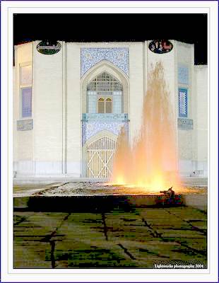
Hi Maria, Thanks for your comment. You have a point; a crop would benefit the photo, but I think the optimal cut-out is somewhere your version and mine.... Another option, pointed out by Carlheinz is to dodge the foreground.... I think I'd settle for that...
Cheers,
hugo
|
|
|
|
|
Hugo de Wolf
{K:185110} 5/10/2004
|
Hi Carlheinz, I should also pay a bit more attention to post processing.... I know the techniques, and I frequently comment others on failing to do so...;o) Thanks!
Cheers,
Hugo
|
|
|
|
|
Hugo de Wolf
{K:185110} 5/10/2004
|
Dag Teunis, Dank je voor je commentaar. Er zijn er meer die over de donkere voorgrond vallen. Ik ben heb er wel aan gedacht daar iets aan te doen, maar zoals je weet hou ik wel van zware, gesatureerde kleuren en tonen. Bovendien was het ook erg donker.... Qua compositie moet daar wat mij betreft wel wat zijn, maar eerlijk gezegd vind ik jouw versie veel te licht. De kleuren in de foto zijn nauwelijks bijgewerkt, de muur had die warme toon....
Ben benieuwd wat je van m'n volgende vindt (morgen ochtend) Dit was een inkomertje, en wat mij betreft de minste van de serie.
Groeten,
Hugo
|
|
|
|
|
Telmo Domingues
{K:9639} 5/10/2004
|
Hi Hugo, dear Hugo!!!!!!
Miss you man!!!!!!!!
My life is a mess right now! Too much work! I took 5 minuts to tell you all how much I miss you, guys! I've been watching you!!!!!!!!
Hugs!
I'll be back to torture you! LOL!
|
|
|
|
|
Carlheinz Bayer
{K:14220} 5/10/2004
|
Hey Hugo! No big deal to expose the foreground with PS. I personnaly like it the way it is and wouldn't crop. Good one. Cheers! Carlheinz
|
|
|
|
|
Hugo de Wolf
{K:185110} 5/10/2004
|
Hi Richard, That would be cheating, as I don't have a Hasselblad (yet)....;o) I do agree on squaring this image, though. This one is only a prelude to numbers II and III, and although the inclusion of the lower part is a deliberate choice, I feel a bit ambiguous about the composition and the lack of details in the lower third too. Thanks for your frequent comments, I always find them very constructive and they tend to confirm most of my prejudices. Very much appreciated!
Cheers,
Hugo
|
|
|
|
|
Richard Thornton
{K:26442} 5/10/2004
|
You must have had a good time there. This is really interesting, but perhaps you would not need quite so much black foreground at the bottom. In fact, it would probably do well as a square image. You could tell everyone that you shot it with your Hasselblad! I love to see straight verticals in architectural images.
|
|
|
|
 Walter Scarella
{K:19671} 5/10/2004
Walter Scarella
{K:19671} 5/10/2004
|
Another great work Hugo ! Splendid effect, vivid colours.
A very beautiful scene.
Regards
Walter
|
|
|
|
|
B:)liana
{K:30945} 5/10/2004
|
Beautiful architecture dear Hugo. well presented!
Kiss, Biliana
|
|
|
|
|
Stephen Bowden
{K:64141} 5/10/2004
|
Great photo Hugo
|
|
|
|
|
Maria Luisa Vial
{K:36017} 5/10/2004
|
Hi Hugo,
Great picture!!! I love the composition!!!
The only thing is that the dark area below it seems to distract the attention... I cropped it a little... Hope you like the effect... Sorry for the frame, but I could not save it!!! :) Nevertheless as always, it is stunning!!!!
Sincerely,
Maria
|
|
|
|
|
 tom rumland
{K:14874} 5/10/2004
tom rumland
{K:14874} 5/10/2004
|
hugo, beautiful! i love the orange water. i think that the black and dark areas are fine. i wouldn't change a thing. i can't understand what teunis said in his comment but i certainly don't think his version is an improvement in any way. the only issue i see here is the blurred detail on the mosque. not sure where it comes from... scanner? handholding? wind? beautiful photo regardless.
take care,
tom
|
|
|
|
|
Getulio Melo
{K:6481} 5/10/2004
|
Wonderful colors and beautiful composition! Mood very well captured. Congrats, Hugo.
|
|
|
|
|
Dan Lightner
{K:12684} 5/10/2004
|
I love the way you composed this shot and your use of color is excellent.
Regards Dan
|
|
|
|
 Ursula Luschnig
{K:21723} 5/10/2004
Ursula Luschnig
{K:21723} 5/10/2004
|
Strong colours,and atmosphere...I like it ,as ist is and think,the colours must be like this,and i think,you have not choosen it by accident! Otherwise it looses atmosphere . With kind regards,Ursula
|
|
|
|
|
Roger Cotgreave
{K:15892} 5/10/2004
|
great hugo maybe I would of been tempted to do a tighter crop..rog
|
|
|
|
|
Ahmet Baki Kocaballi
{K:13618} 5/10/2004
|
hi Hugo,
very nice shot and composition,
effect of fire and dark areas at up and downside of the photo created very interesting picture,
Regards
Baki
|
|
|
|
|
John Griep
{K:2521} 5/10/2004
|
Burning Water?
Very moody on monday morning.
Groet John
|
|
|
|
 Bobby Mun
{K:3709} 5/10/2004
Bobby Mun
{K:3709} 5/10/2004
|
Nice composition and lighting... I think The bottom has too much black area, cropping a little bit may help.
Sorry... sometime I see soft/off focus :> Like what you mentioned... time to get a scanner :>
Cheers ! Bobby
|
|
|
|
 Saeed Al Shamsi
{K:47735} 5/10/2004
Saeed Al Shamsi
{K:47735} 5/10/2004
|
To me the dark area in foreground and background of great choice, `cos in between it comes the excellent contrast "the fire light fountain", the beautiful mosaic building, more light will definitely spoil the whole image, a good poster for the Iranian tourism Board, great job, Saeed
|
|
|
|
|
Chris Spracklen
{K:32552} 5/10/2004
|
Great colour and detail, Hugo.
A little more light in the foreground would have been nice, but I guess that would have meant over-exposing the rest.
Good shot.
Kind regards, Chris
|
|
|
|
 Teunis Haveman
{K:53426} 5/10/2004
Teunis Haveman
{K:53426} 5/10/2004
|
Hugo, ik heb heel lang naar dez efoto gekeken voordat ik ging lezen wat je uitleg was.
Ik dacht eerst aan brandjes en relletjes
Zwarte onderkant en rand aan de bovenkant gaven te denken aan het nemen van deze foto vanuit een raam of deur. Iets geheimzinnigs tenminste.
Maar na jou verhaal te hebben gelezen is de panning er wat af en zie ik prachtige verlichtige fontijnen, blijf ik nog zitten met de donkere onderkant. Ik zal hem opslaan en kjke wat ik hier kan veranderen tenminste voor mijn PC
Tot Straks
Teunis
Nu dan krijg ik de betegeling te zien en het scherpe contrast verdwijnt
|

|
|
|
|
 Roberto Arcari Farinetti
{K:209486} 5/10/2004
Roberto Arcari Farinetti
{K:209486} 5/10/2004
|
Hi Hugo..
A great composition optimal the colors but I believe that the dark part is too much...
excellent documentray shot of iranian history!
roby
|
|
|
|
|
WALT MESK
{K:10691} 5/10/2004
|
it's not a fire but water....incredible!great effect...very interesting....
ciao.....
walt.
|
|
|
|
|
Carmem A. Busko
{K:48785} 5/10/2004
|
Hi, Hugo, another beautiful and illustrative picture showing iranian culture.
I don?t know if the dark area bellow isn?t a bit large or not.. but it?s my taste. Maybe I would crop it a little.
Cheers!
Carmem
|
|