|
|
|
matthew hoffman
{K:658} 7/19/2004
|
Thanks for your comments here, Greg.
It may just be my inexperience, but I like the slight difference in the window level and the frame level. It adds some tension for me, and reinforces the decaying quality.
The colour work was badly needed. See my above post for a re-worked picture, and my lamentation on my oh-to-rapid posting of images!
Thanks
Matt
|
|
|
|
|
matthew hoffman
{K:658} 7/19/2004
|
I have played with the image more, and tried a square crop. I don't know if I like a square crop, but it may grow on me.
I need to be more rational with my images. I see an element I like and quickly post it with little editing. I am going to force a rule on my self: no posting without at least 24 hours to think about it! That is what I meeant when I said I should not have posted it.
Thanks as always!
Matt
|

|
|
|
|
|
Greg Urban
{K:224} 7/19/2004
|
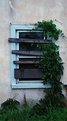
Matt, I agree with Matej that the photo looks better with levels adjusted. I do like the image, or the idea of it. There is a lot of texture in the wall, the boards and the ivy. I normally do not crop, but I can see where cropping might help, also slight rotation to the right (maybe 1 or 2%) to make the window edge parallel to the border of the image.
|
|
|
|
 Matej Maceas
 {K:24381} 7/18/2004
|
OK, well first of all, I don't see why this image probably should not have been posted, the idea of this site is to get feedback on images and this image qualifies as much as any other.
I guess from your reply that you wanted to get the overcast mood across, which is fine. Does it enhance the subject? How does the darker rendering change the impression the viewer gets? For some it might work, for me it's still too dark. If, for example, there was some kind of light coming from inside the room, I would perceive it as a "night" photo, and the darkness in the rest of the image would make sense.
I made a small adjustment to Levels to lighten up the image and reduce the blue cast. In the resulting image, I was attracted by the soft pastel colour of the wall. Do you think that this aspect of the subject would be worth exploring more? Perhaps in combination with a different crop - have you tried square? The current crop follows the shape of the window and the direction the creeper is growing, which makes sense - but maybe a crop with different proportions would introduce the right amount of tension. What do you think?
|
levels adjusted |
|
|
|
|
matthew hoffman
{K:658} 7/18/2004
|
This picture was taken near dusk on a very overcast, rainy day. My picture "boarded window" was taken at the same time, but I edited it in PS. This picture probably should not have been posted.
Thanks Matej, as always, for your comments!
Regards
Matt
|
|
|
|
|
Matej Maceas
{K:24381} 7/17/2004
|
I disagree with Laurie, to me the "shadow over the entire photo" looks simply like incorrect exposure. There's nothing in 'About' so I don't know if you did it intentionally or not...
|
|
|
|
|
Laurie Solis
{K:317} 7/15/2004
|
This photo is wonderfully moody! I love the shadow over the entire photo with the creeping vines. Great composition and mood.
Laurie
|
|


")

")


