|
|
|
Mitchell Miller
{K:3009} 3/21/2005
|
very surreal!! well done!!
|
|
|
|
 Ella Budzynski
{K:192} 2/8/2005
Ella Budzynski
{K:192} 2/8/2005
|
this one I take to my favorites ! love it :)
|
|
|
|
|
Ashley Brown
{K:75} 2/4/2005
|
very dramatic! good job
|
|
|
|
|
Mark Beltran
{K:32612} 1/18/2005
|
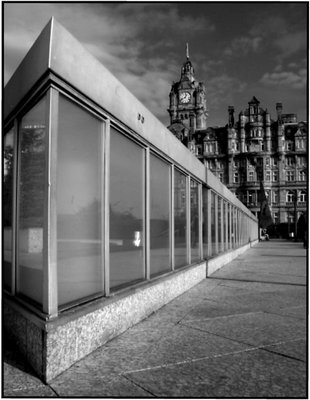
It certainly is shocking to see it against the Balmoral. Princes reminds me of the Bauhaus style.
|
|
|
|
|
Gaja Snover
{K:4462} 12/6/2004
|
Wow, this is beautiful. The composition and perspective are perfect. There a great contrast between the simple geometry and the older architecture. I am putting this in my favorites. Congrats!
Regards,
Gaja
|
|
|
|
|
Kadri
{K:2720} 11/17/2004
|
absolutely wonderful, intriguing composition with old and new building. This contrast speaks volumes!
|
|
|
|
 Jim Greenfield
{K:5172} 11/15/2004
Jim Greenfield
{K:5172} 11/15/2004
|
I like the perspective and the juxtaposition of modern and old. It looks soft to me too but it gives it a vintage look. That look would be better if it was just the old building. Some sepia toning could be interesting.
|
|
|
|
 Phil M
{K:11526} 11/14/2004
Phil M
{K:11526} 11/14/2004
|
Of course, if you know me (as you do) you'd know it couldn't possibly be a photoshop job given my complete absence of skills in that department! AS for the title, it was a rare moment of inspiration while uploadin a shot; normally I can't think of anything remotely interesting. This could easily have ended up being called 'Balmoral Hotel from Princes Mall'; maybe my subconsious hates the name Princes Mall so much it produced another title?...
|
|
|
|
|
Jorge Garcia
{K:8733} 11/14/2004
|
Good angle. Very interesting perspective. Nice job.
Enjoy
|
|
|
|
|
baYu6wqlPP vH612wLkPsS
{K:2519} 11/14/2004
|
This made me laugh, after our discussion of 'composite images', if you didn't know this was a real place, you'd think it was a 'Photoshop' tour de force. Great title, too, sums up the image perfectly, rather than (as some) trying to import significance into an indifferent image.
|
|
|
|
|
Keith Banham
{K:1306} 11/13/2004
|
Beautiful vision of geometry. Great shot Phil
|
|
|
|
 Lukasz Kuczkowski
{K:14687} 11/13/2004
Lukasz Kuczkowski
{K:14687} 11/13/2004
|
like the perspective here and the lack of sharpness in the background;
well done
|
|
|
|
|
Peter Godden
{K:745} 11/13/2004
|
Wonderful composition
regards
Peter
|
|
|
|
 Mark Kresl
{K:9434} 11/13/2004
Mark Kresl
{K:9434} 11/13/2004
|
This is composed really well, Phil. I like your choice of B&W as well.
Mark
|
|
|
|
 luis pereira
 {K:26013} 11/13/2004
|
I assume you got trough the Cocacolasation fase ok. Great image and fine point of view and thank you for a good laugh even though it's not that funny when you think about it.
|
|
|
|
|
Terry Ward
{K:-926} 11/13/2004
|
A cool shot Phil. T
|
|
|
|
 Stuart Mackay
{K:4551} 11/12/2004
Stuart Mackay
{K:4551} 11/12/2004
|
Very nice ... love the old and new .. and the B&W is great. Thanks for sharing.
sm..
|
|
|
|
|
Phil M
{K:11526} 11/12/2004
|
Thanks Howie. The softness is just a digital compression issue of some kind; perhaps I could resize the images in a better way so as not to lose so much quality. The original file looks much sharper :)
|
|
|
|
 Howie Mudge
{K:27933} 11/12/2004
Howie Mudge
{K:27933} 11/12/2004
|
I like the light and tones here Phil, just looks a little on the soft side though.
|
|


")

")


