|
|
|
Shane O'Neill
{K:3054} 4/15/2005
|
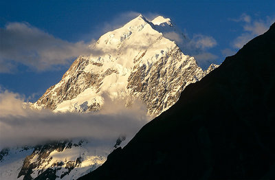
I think it works very well .. you are right not to stick rigid to a textbook compositional agenda, I am always looking to break the rules myself .. but as far as I am concerned this is superb
|
|
|
|
|
Gary Prebble
{K:1168} 4/15/2005
|
The image as is stands is very eye catching; from the thumb nail I wanted to open it. In my opinion it adds much in potraying the shear magnificence of the area. I have seen Mt Cook and (many shots of it). This rates with best
|
|
|
|
 Andre Denis
{K:66327} 4/14/2005
Andre Denis
{K:66327} 4/14/2005
|
It's funny, I didn't notice just how much black there is until you pointed it out. Now I can't stop thinking about it. I had a similar situation on one of my shots "Seen Better Days" I didn't like so much shadow in the lower right corner. But some people liked it that way.
Personally, I think the black dominates a little too much. But then, I thought that about my own picture as well.
Andre
|
|
|
|
 Ian Cameron
{K:1163} 4/14/2005
Ian Cameron
{K:1163} 4/14/2005
|
I can't argue with that I guess i tried to make the best of the circumstances I was confronted with. The graphic nature of the image does it for me and somehow makes that mountain just a little bit more inaccessible.
|
|
|
|
|
Ehdae (Abullha AL Hazza)
{K:4725} 4/14/2005
|
nice
|
|
|
|
|
David Hofmann
{K:22223} 4/14/2005
|
Very beautiful colors and view. I see your point with the forground. But then if it had not been there you would probably not have put it in.
I agree it adds some tension to the shot, but at least to me it takes away more of the overall impression than it adds. Just MHO
|
|