|
|
|
Lydia Dotto
{K:694} 11/2/2005
|
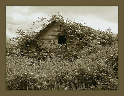
Kathy, I just discovered this picture of your and I had to comment. I think it's superb. I definitely prefer the sepia version - it just creates a perfect mood. The colored version is nice too, but this one is the winner in my view. Excellent work.
Thanks so much for your comment on my Rose and irises picture.
|
|
|
|
|
Thomas P
{K:1732} 9/15/2005
|
Hello Kathy. I wish to thank you for your comment;which I concur fully. I took the liberty to browse your portfolio, and this photo is very good. The aged look is perfect to depict time. Another thing you do very well is photographing people. Good work.
Regards,
Tom
|
|
|
|
 Anthony Lound
 {K:6661} 9/14/2005
|
Kathy, this is a hard call - the subject is everything I like in photography (as you must know by now) - organic, worn, textural, with mood. The colour version has the better sky of course. Had you brought out the sky more in the sepia version I think it would win the day :)
|
|
|
|
|
Kim Culbert
{K:37070} 9/14/2005
|
Surprisingly I like the sepia toned one... usually I always favour the colour, but in this instance I think the colour distracts from the great lines and hidden mystery.
I like how the foreground in the sepia toned one is so strong and really commands focus... I love these overgrown shacks... this one sure has character!
|
|
|
|
 Sheila Carson
{K:5924} 9/13/2005
Sheila Carson
{K:5924} 9/13/2005
|
This is a great photo. I like it in black and white with the warm tones. Great capture Kathy!
|
|
|
|
|
Sarah Per Lee
{K:2477} 9/13/2005
|
The sepia tones already give the impression that the building is old and well worn with a sense of mystery (and history, lol). The sepia tones also draw your eye right to the building Kath and they present the subject quite well. The texture and lighting are great, but I would like to see just a hair more of contrast...but, that's just me! Great comp too! Best regards.
Sarah
|
|
|
|
|
Chris Spracklen
{K:32552} 9/12/2005
|
I very much prefer the toned version, Kathy ~ beautifully done.
Best regards, Chris
|
|
|
|
 Sam Graziano III
{K:14064} 9/12/2005
Sam Graziano III
{K:14064} 9/12/2005
|
I Like them Both Kathy...But I would say the Duo-tone by a smidge....To me the duo-tone adds more charater to the shot and gives it that classic Feel to it...Well seen and done!
Best Regards
Sam III
|
|
|
|
 Kenneth Roine
{K:3538} 9/12/2005
Kenneth Roine
{K:3538} 9/12/2005
|
Kathy,
Both are good photos however, I prefer the sephia. The tones and image evoke a melancholy mood. Well done.
Ken
|
|
|
|
 Kathy Hillard
{K:25721} 9/12/2005
Kathy Hillard
{K:25721} 9/12/2005
|
Thanks for taking a look Jude!
Kathy
|
|
|
|
|
Kathy Hillard
{K:25721} 9/12/2005
|
Thanks for your comment, Sammy! I tried matting this in black the first go round, and it really didn't work. I like this color, too. I wasn't aware that there is any kind of limit to mat sizes on UF.
Thanks again!
Kathy
|
|
|
|
|
Darlene Boucher
{K:15739} 9/12/2005
|
Gorgeous image Kathy, the color version is very pretty also but I think I like this one better. Beautiful.......
|
|
|
|
 Caterina Berimballi
{K:27299} 9/11/2005
Caterina Berimballi
{K:27299} 9/11/2005
|
Oh yeah! I'm liking this one best Kathy. But then I'm partial to the tones you've used ;). It's great how the mood of a scene can differ so dramatically simply by changing colour.
I really really like this!!
Cheers
Rina
|
|
|
|
 Tracey Main
{K:7290} 9/11/2005
Tracey Main
{K:7290} 9/11/2005
|
I can't make up my mind I love them both but I am a big fan of sepia, good one Kathy..Trace
|
|
|
|
 Linda Imagefree
{K:72276} 9/11/2005
Linda Imagefree
{K:72276} 9/11/2005
|
I like the toned one better Kathy, but they are both beautiful, I can see why you had a problem deciding. I love this kind of stuff, great eye and a great capture...nice tones and depth, almost a 3D look around the window...wonderfully done...Linda
|
|
|
|
|
jude .
{K:14625} 9/11/2005
|
For me, no contest, Kathy...it's the duotone all the way. Beautiful tones, very nicely done.
|
|
|
|
 sammy -
{K:4108} 9/11/2005
sammy -
{K:4108} 9/11/2005
|
Beautiful image.
I too prefer the monochrome version.
The mat works here because of its medium tone and matching color. Would like to see the option for much larger mats on UF.
|
|
|
|
|
Elizabeth O'Neal
{K:4436} 9/11/2005
|
I like the sepia image better. It almost has an infrared quality to it. IMO it makes the image more dramtic and interesting than the color version. One thing, and it is purely personal opinion - I like a thinner frame so as not to take away from the image. Very nice shot!
|
|
|
|
|
ricardo longhi-frantz
{K:9628} 9/11/2005
|
lovely shot Kathy!!!! loved the delicate textures created by the plants all around, the play of light and shadows on them make this picture very charming. the balance and the crop are really fine!!!
the color version is good too, but IMO it's a bit too much dark and needing some contrast enhancing. or maybe that could be resolved with a change in the frame's color.
|
|
|
|
 Susie OConnor
{K:34798} 9/11/2005
Susie OConnor
{K:34798} 9/11/2005
|
You know it's almost a split decision with me. I think the sepia for UF snd the color for the cover of a greeting card. Very nice Sissy! I love them both. Great PS work.
Suz
|
|
|
|
|
John Test
{K:1956} 9/11/2005
|
to me this one add more to the feeling and appearance of the subject.i like it.xo
|
|
|
|
|
Kathy Hillard
{K:25721} 9/11/2005
|
Here's the color version.
|

|
|