|
|
Critique By:
Mark Longo (K:12760)
4/13/2009 1:43:24 AM
Wonderful shot and mood! The belltower (?) in the background brings a wonderful detail and also structral and textural contrast to this composition. Bravo!
Regards,
Mark
|
Photo By: Roberto Arcari Farinetti
(K:209486)

|
|
|
Critique By:
Mark Longo (K:12760)
4/13/2009 1:41:27 AM
Roberto, how very nice to hear from you. Thank you for the compliment. I have been away from Usefilm for a few years but have just looked in again on your wonderful portfolio. Nice to see your artistry is alive and better than ever!
Regards,
Mark
|
| Photo By: Mark Longo
(K:12760)
|
|
|
Critique By:
Mark Longo (K:12760)
4/13/2009 1:39:21 AM
Thank you for your kind remarks, Barbara. The cat in the shot is Emily, who is a Bengal. She has a long slender tail that goes with her svelt body. I was lucky to get a nice sharp rendering of her here which showa her striking markings. Love that "L" glass!
Regards,
Mark
|
| Photo By: Mark Longo
(K:12760)
|
|
|
Critique By:
Mark Longo (K:12760)
5/31/2008 2:16:00 PM
Thank you very much for your generous remarks, Andy. Also, I have looked through your portfolio and see that you are making good improvements in your development of a "photographers eye" as your work continues. Keep shooting!
Regards,
Mark
|
| Photo By: Mark Longo
(K:12760)
|
|
|
Critique By:
Mark Longo (K:12760)
2/9/2007 4:05:07 PM
Nicely arranged composition and I like the sun rays in it.
|
| Photo By: Amy Astolfi
(K:160)
|
|
|
Critique By:
Mark Longo (K:12760)
2/9/2007 4:03:52 PM
Like this one. The placement of the barn to the right of center is a good choice, creating a nice balance. Great colors! late afternoon or early morning shot too.
Mark
|
| Photo By: Amy Astolfi
(K:160)
|
|
|
Critique By:
Mark Longo (K:12760)
2/3/2007 7:11:39 PM
Fantastic collage of textures and geometry! The color of the weathered copper details of the building in the foreground work marvelously with the window colors of the building in the backdrop. The long focal length has foreshortened the space between the buildings, integrating the geometry beautifully.
I have not been back to look in on your portfolio since shortly after you came back to UF. MAN are you ever back! Your Toronto architecture work is nothing short of dazzling, Ina. I suggest you do some high quality prints of your faves and show them around at in-city galleries. This stuff is DEFINITELY saleable. For real. Consider it.
Very best,
Mark
|
| Photo By: Ina Nicolae
(K:44481)
|
|
|
Critique By:
Mark Longo (K:12760)
2/3/2007 6:58:38 PM
You are too kind, Moshen! Thank you!
|
| Photo By: Mark Longo
(K:12760)
|
|
|
Critique By:
Mark Longo (K:12760)
1/9/2007 3:30:24 AM
Once again, fantastic urban geometry! There is a glowing translucent quality to the tree decorated tress that you have captured beautifully and in beautiful counter point to the geometric buildings. Very lovely. Funny story too! And I thought you were a professional! ;-)
Very best,
Mark
|
| Photo By: Ina Nicolae
(K:44481)
|
|
|
Critique By:
Mark Longo (K:12760)
1/9/2007 3:26:51 AM
Thanks Ina! You one of the few folks that seems to "get" this pic. I think the difficult in part is the white Usefilm page the image is viewed upon. It makes the picture appear darker than it actually is and the dark details get lost on the white page. Viewed larger in higher resolution on my monitor with a mid-gray neutral background it has plenty of light.
Also, the differences in monitor color and brightness can be a real obstacle to online photo display. None of us are seeing prcisely the same thing. These same shots viewed on my monitor at work look a little murky. Oh well. Anyway, thanks for looking and taking the time to comment. It's always fun to read your right-on observations and benefit from your subtle eye!
Best,
Mark
|
| Photo By: Mark Longo
(K:12760)
|
|
|
Critique By:
Mark Longo (K:12760)
1/4/2007 3:31:30 AM
Many thanks for your kind word and careful observation, I'm pleased that you like it. I have done very few still lifes in the last year and also intend to get back to them very soon. I find it's not broadly appreciated, and that's perfectly fine, but it's nice sharing it with someone who likes and understands still life as well as yourself! I hope you find your way back to more of it, you're still life work is nothing short of fantastic!
Best,
Mark
|
| Photo By: Mark Longo
(K:12760)
|
|
|
Critique By:
Mark Longo (K:12760)
1/4/2007 3:22:44 AM
Bravo! This is the sort of high contrast geometric effect I was thinking of in my comment on your other B&W shot in this series. It almost looks like scattered pieces of a 3D puzzle! And the contrast and retro toning bring a sort of 60's film look to the shot that seems to enhance the subject matter and it's scattered geometry look. Yet in spite of the scattered nature of the "pieces" the perspective (nicely enhanced by short focal length) brings all the pieces together in a harmony of thematic movement toward the left. This is a very, very good work Ina, one of your very best IMHO, and one I'd love to have hanging on my wall, something I rarely say. Perhaps my fave of yours since the Brooklyn Bridge shot I loved! Fabulous!
Very best,
Mark
|
| Photo By: Ina Nicolae
(K:44481)
|
|
|
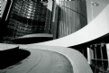
Critique By:
Mark Longo (K:12760)
1/4/2007 3:13:26 AM
Beautiful, Ina! Your use of this new wide angle lens is fantastic. The abstract qualities of converging curves in the roadway with the strong verticals is masterful. I think the choice of B&W here is excellent as it allows the lines to stand on their own as abstract elements. The bold aspects of geometry in this are powerful.
As suggested alternative possibilities in this shot, It might work well to show more of the verticals to balance the strength and broad lines of the roadways by choosing a slightly lower perspective closer to the road and angling upward slightly. That would also give the flag a bit more open field around it, which may or may not look better. Also, it might be interesting to experiment with greater contrast in this image, which would further accent the lines, making them a little bolder yet. These are merely alternatives to what is a well balanced shot as currently presented, not critique per se.
I must add though that you have a great eye for this wide angle architecture work. I have dabbled a bit with a wide angle lens I got a while back, but have not yet found the "handle" on using it and haven't used it much. Yet. There is definitely a wide angle technique, and I have not yet found the right inspiration for it myself, though I'm sure will come, perhaps from your own excellent use of wide angle. Great stuff Ina!
|
| Photo By: Ina Nicolae
(K:44481)
|
|
|
Critique By:
Mark Longo (K:12760)
1/3/2007 1:17:44 AM
Thanks for your useful comments Ina, very observant and insightful, as usual. I so enjoy your comments to myself and to others as well.
BTW, I got a Canon 85mm f/1.2 L prime lens for Xmas (from my VERY generous wife!). It's my first use of non-zoom in years and so takes a little getting used to again, but WOW, the clarity, bokeh, and color are to DIE for. I hope this doesn't mean I'll need "L" glass from now on, I can't afford it!
All the best!
Mark
|
| Photo By: Mark Longo
(K:12760)
|
|
|
Critique By:
Mark Longo (K:12760)
12/26/2006 10:08:56 PM
Thank you Daniel. The lighting in this shot is natural. A light source from above right is indirect sunlight and the source to the left is outdoor light from a nearby north facing window. The background is a plain light brown wall that seemed rather dull so using Photoshop lighting effects I darkened the background progressively from right to upper left. I'm glad you like it!
Regards,
Mark
|
| Photo By: Mark Longo
(K:12760)
|
|
|
Critique By:
Mark Longo (K:12760)
11/6/2006 11:09:07 PM
Roby, it is far too long since I have looked at your excellent work. This one in particular is very amazing. I love the way the ragged line of clouds mirrors the lines of mountain ridges. It has a fin layered look, And the long panoramic crop is excellent in how it emphasized the long lines of ridges. First rate! Be well my friend!
Mark
|
| Photo By: Roberto Arcari Farinetti
(K:209486)
|
|
|
Critique By:
Mark Longo (K:12760)
11/1/2006 3:08:01 PM
Nice framing/cropping of this image positioning the dark band in the vertical center of the image. Sometimes it's best not to place the horizon in the vertical center but to offset it higher or lower according to the "rule of thirds", though rules were made to be broken! In this case, the dark band consumes the middle third of the image and it balances nicely. The reflection in interesting and adds something to the shot. Good work.
Mark
|
| Photo By: joey s_nburg
(K:1679)
|
|
|
Critique By:
Mark Longo (K:12760)
10/30/2006 10:11:25 PM
I understand Anna. I actually *painted in* some of the clouds seen on my "Times Square Before Dark" image you commented on. The sky was pretty blown and when it's one of those gray days there's not a lot you can do. It's a great image you have here regardless.
Mark
|
| Photo By: Anna Schulz
(K:1186)
|
|
|
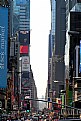
Critique By:
Mark Longo (K:12760)
10/30/2006 6:57:49 PM
I like this shot of Times Square. It is original and does a nice job of communicating the impression of Manhattan's vertical landscape. It looks a bit over exposed as the sky is completely blown out. you might be able to bring some of that back using Photoshop's Image->Adjustments->Shadow/Highlight tool, but maybe not. In any event, I like the compositional effect of the long vertical lines soaring above the street. It is very effective!
Mark
|
| Photo By: Anna Schulz
(K:1186)
|
|
|
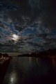
Critique By:
Mark Longo (K:12760)
10/30/2006 6:53:21 PM
Hi Joey, thanks for taking the time to critique this picture. What you thought was a spotlight reflection really screwing up the focal point of the picture is the reflection of the moon. I included it in the picture intentionally, showing the water surface a bit and balancing the sky. I think your point about cropping off (some) of the black sky at image top is a good one. I would leave some of it in in order to not place the moon too high in the frame, but some of that could go.
Thanks again,
Mark
|
| Photo By: Mark Longo
(K:12760)
|
|
|
Critique By:
Mark Longo (K:12760)
10/15/2006 3:15:20 PM
Thank you so much, Jose!
|
| Photo By: Mark Longo
(K:12760)
|
|
|
Critique By:
Mark Longo (K:12760)
9/16/2006 3:41:15 AM
Beautiful Alicia! And interesting and unusual angle of sunlight give this a beautiful and unique look. Wonderful colors! Lovely!
Best regards,
Mark
|
| Photo By: Alicia Popp
(K:87532)
|
|
|
Critique By:
Mark Longo (K:12760)
9/14/2006 6:55:42 PM
I love the lines and shapes in this on an abstract level. The low viewpoint and angle and use of the horizon line define nice negative spaces as well and the pose is a major factor in creating the great balance seen here. Great depth of field use here too. As with so many other of your shots, your signature color and soft finish are in pleasing evidence. Wonderful mood. Excellent work, good doctor!
Regards,
Mark
|
| Photo By: Jacek Gasiorowski
(K:-2226)
|
|
|
Critique By:
Mark Longo (K:12760)
9/11/2006 10:06:17 PM
Thanks Bob. And yes, the name of the foreground boat "Ugly Anne" is a grabber and brings a smile. It is a for-charter deep sea fishing boat. I though of titling the image "Ugly Anne", but thought it was too obvious. I don't know how many folks picked up on it, but at least you did!
Mark
|
| Photo By: Mark Longo
(K:12760)
|
|
|
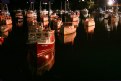
Critique By:
Mark Longo (K:12760)
9/11/2006 10:04:12 PM
Thanks Randy. The orange cast was caused by the bright parking lot lighting next to the cove. I was tempted to try to correct it in photoshop to make the hulls white, but I decided that the cast was more interestiong to look at.
And I agree with your sentiment that the boats look "lifelike" like they are giving me their attention. My own private lobster boat army (navy?). 
|
| Photo By: Mark Longo
(K:12760)
|
|
|
Critique By:
Mark Longo (K:12760)
9/10/2006 12:57:07 AM
Thank much, Adrienne! I was facinated in shooting these boats. Night shooting is new to me. I shot several shots of the moon behind clouds. ALso other subjects but these boats and the moon worked best. I see from your portfolio you have also done some successfull night work (great Tampa nighttime shot).
Mark
|
| Photo By: Mark Longo
(K:12760)
|
|
|
Critique By:
Mark Longo (K:12760)
9/10/2006 12:52:18 AM
Lovely work. Color pallette is beautiful and you deftly walk the line between reality and abstract. Facinating shot.
Mark
|
| Photo By: James Cook
(K:38068)
|
|
|
Critique By:
Mark Longo (K:12760)
9/10/2006 12:51:11 AM
Facinatin work here! I love the colors and also the asymetirc lines created here. The color and line here is very well executed. Congrats!
Mark
|
| Photo By: James Cook
(K:38068)
|
|
|
Critique By:
Mark Longo (K:12760)
9/10/2006 12:40:37 AM
A beautiful still life! Very well aranged and well lit too. This creates a great mood! The use of the mirror was very clever here Amy. It adds a lot of visual interest and also lends dimension to the photo in a subtle way. One of your best yet!!
Mark
|
| Photo By: Amy Astolfi
(K:160)
|
|
|
Critique By:
Mark Longo (K:12760)
9/1/2006 6:04:25 PM
Great passion! The rough look to the lighting and exposure, the B&W, and also the odd angle add a lot of emotion and action to the shot. Very good work!
Mark
|
| Photo By: chris d
(K:3046)
|
|