|
|
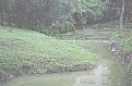
Critique By:
Frank Verheij (K:734)
3/8/2007 1:02:00 PM
Always nice,this. I love the flow of the water trough the picture. A very balanced composition.
|
| Photo By: arijit(ratul) talukder
(K:6029)
|
|
|
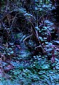
Critique By:
Frank Verheij (K:734)
3/8/2007 11:45:13 AM
I like the color in this picture.
It's great to still see some detail in the bench, too. The composition is nice, as are the silhouettes.
|
| Photo By: Marco Pesce
(K:99)
|
|
|
Critique By:
Frank Verheij (K:734)
3/8/2007 11:41:11 AM
I see that all your picture have some sort of haze over them. Something wrong with your camera, maybe or with your pc(program)
|
| Photo By: Marian Calago
(K:18)
|
|
|
Critique By:
Frank Verheij (K:734)
3/8/2007 8:46:45 AM
Danke. And that's about all the German I can write ;-)
|
| Photo By: Frank Verheij
(K:734)
|
|
|
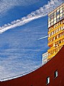
Critique By:
Frank Verheij (K:734)
3/8/2007 8:30:36 AM
Into my favorites! Great picture and great composition. The contrast between the bulky part on the left and the more slender part of the building to the right is very wel seen.
I like the way the subtle colors change from top to bottom.
|
| Photo By: Ralf Denguth
(K:3353)
|
|
|
Critique By:
Frank Verheij (K:734)
3/8/2007 7:41:44 AM
I like the original better, too.
You could bring in more contrast the next time, by turning the light onto the most important part of your picture (the front) and have the shadows on the far side.
|
| Photo By: Gilbert Laraque
(K:784)
|
|
|
Critique By:
Frank Verheij (K:734)
3/7/2007 7:09:24 PM
I like the shot, but I think it would work a little better if you light up the shadows. At this point the most important part of the scene is, in my opinion, to dark.
You could for instance try a piece of white paper.
|
| Photo By: Gilbert Laraque
(K:784)
|
|
|
Critique By:
Frank Verheij (K:734)
3/7/2007 10:28:48 AM
Have I missed something?
I think it's dark and muddy and the colors are not really interesting. Not that much composition, either.
Maybe it's the title?
|
Photo By: Shirley D. Cross-Taylor
(K:174058)

|
|
|
Critique By:
Frank Verheij (K:734)
3/5/2007 6:46:45 AM
thank you so much,Daffy :-)
|
| Photo By: Frank Verheij
(K:734)
|
|
|
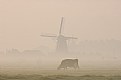
Critique By:
Frank Verheij (K:734)
3/1/2007 9:34:39 AM
To me, this is not o very interesting picture. I think you might have seen other things then we are seeing.
The colors are a bit dull/gray.
Maybe another standpoint would have brought out the blue in the lake.
light form the side could have brought out the texture of the water and the rocks.
The composition adds to the overall gray impression. Maybe going down on your knees would help.
|
| Photo By: Roger Skinner
(K:81846)
|
|
|
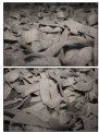
Critique By:
Frank Verheij (K:734)
2/26/2007 4:22:19 PM
In my opinion food works better in color, unless you want to emphasize a texture.
I see no texture here, and I think the lighting is poor.
|
| Photo By: Simone Tagliaferri
(K:28180)
|
|
|
Critique By:
Frank Verheij (K:734)
2/26/2007 12:19:54 PM
Beautiful high key shot. I love the contrast between the hair and the face.
Maybe just a little over-exposed on the nose...?
Very nice classic compositioning.
|
| Photo By: Antonio Torkio
(K:5592)
|
|
|
Critique By:
Frank Verheij (K:734)
2/26/2007 12:08:10 AM
I see you are an nurse: so am I.
I work at an ambulance sevice.
|
| Photo By: Frank Verheij
(K:734)
|
|
|
Critique By:
Frank Verheij (K:734)
2/26/2007 12:06:05 AM
He sees no fear what so ever and he loves all kinds of extreme sports (for an 8 year old!).
He jumped of a garbagebin, by the way.
|
| Photo By: Frank Verheij
(K:734)
|
|
|
Critique By:
Frank Verheij (K:734)
2/23/2007 3:12:55 PM
Thank you! I'm pleased with the result myself.
It took me a while to find the right angle and lighting, though.
I shot this for my father in law who builds and races oldtimers and classics.
|
| Photo By: Frank Verheij
(K:734)
|
|
|
Critique By:
Frank Verheij (K:734)
2/22/2007 7:31:44 PM
I see what you mean.
I did boost the colors a little. Maybe not enough.
|
| Photo By: Frank Verheij
(K:734)
|
|
|
Critique By:
Frank Verheij (K:734)
2/21/2007 4:47:40 PM
Uit de losse hand, volgens mij. Ik weet het niet helemaal zeker meer.
|
| Photo By: Frank Verheij
(K:734)
|
|
|
Critique By:
Frank Verheij (K:734)
2/21/2007 1:03:11 PM
Yours are better then mine!
Did not try to copy you, though, but I will go back for a second try.
Are they in the wild or in a zoo?
|
| Photo By: Nilanjan Mitra
(K:12955)
|
|
|
Critique By:
Frank Verheij (K:734)
2/21/2007 12:53:22 PM
What a great black and white! Great tones throughout. Should look great on a wall.
I like the composition.
|
| Photo By: maciek duczynski
(K:129)
|
|
|
Critique By:
Frank Verheij (K:734)
2/21/2007 10:26:18 AM
I like your picture very much too. The country you live in has a strange appeal to someone from far away.
|
| Photo By: Frank Verheij
(K:734)
|
|
|
Critique By:
Frank Verheij (K:734)
2/20/2007 2:26:26 PM
What do you teach?
|
| Photo By: Frank Verheij
(K:734)
|
|
|
Critique By:
Frank Verheij (K:734)
2/20/2007 10:42:13 AM
Very nice how the colors change throughout the picture. Well seen and captured!
|
| Photo By: Simone Pallesi
(K:3586)
|
|
|
Critique By:
Frank Verheij (K:734)
2/19/2007 12:15:34 PM
Very nice shot and composition. Great tones.
I love b&w! Love the way the clouds take you into the picture.
|
| Photo By: john conway
(K:1751)
|
|
|
Critique By:
Frank Verheij (K:734)
9/7/2006 1:13:13 PM
Wonderful colors and composition. Good detail and contrast. Very nice picture.
|
| Photo By: Babur Bilgili
(K:42)
|
|
|
Critique By:
Frank Verheij (K:734)
9/7/2006 1:10:51 PM
I think a lower standpoint could put the bridge against the sky, providing a higher contrast and a more interesting picture. Also the girl has the bridge comming out of her ear.
|
| Photo By: Carlos Gutierrez
(K:1805)
|
|
|
Critique By:
Frank Verheij (K:734)
9/7/2006 1:08:15 PM
I can only agree with all the other comments: great shot and composition.
|
| Photo By: Dmitry Shamin
(K:165)
|
|
|
Critique By:
Frank Verheij (K:734)
9/7/2006 1:06:38 PM
Maybe you could have used spot-metering. In my opinion the picture is over-exposed.
|
| Photo By: aly nelson
(K:704)
|
|
|
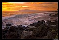
Critique By:
Frank Verheij (K:734)
9/7/2006 1:02:17 PM
Wondeful color, great composition, great detail and contrast. Love the white line of the waves "fading" through the picture.
|
| Photo By: Scott Tylor
(K:407)
|
|
|
Critique By:
Frank Verheij (K:734)
9/7/2006 12:53:58 PM
To you this might be a great memeory, but the black lump to the right is hardly a human. Also the background is not very interesting.
Maybe you could have taken some more distance or another angel.
|
| Photo By: mosti Farahat
(K:696)
|
|
|
Critique By:
Frank Verheij (K:734)
9/5/2006 7:44:38 PM
Very interesting picture. Looks almost like scifi to me. The lack of DOF works great. Great background colors.
I had a look at your portfolio and saw a lot of beatiful pictures. Interesting choice of subject. Love the glass pictures. Great colors and structure.
No time to comment on them all. Sorry!
|
| Photo By: Radmila Gorjanovic
(K:3113)
|
|