|
|
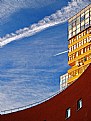
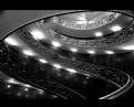
Critique By:
Frank Verheij (K:734)
9/7/2006 1:13:13 PM
Wonderful colors and composition. Good detail and contrast. Very nice picture.
|
| Photo By: Babur Bilgili
(K:42)
|
|
|
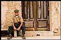
Critique By:
Frank Verheij (K:734)
9/7/2006 1:10:51 PM
I think a lower standpoint could put the bridge against the sky, providing a higher contrast and a more interesting picture. Also the girl has the bridge comming out of her ear.
|
| Photo By: Carlos Gutierrez
(K:1805)
|
|
|
Critique By:
Frank Verheij (K:734)
9/7/2006 1:08:15 PM
I can only agree with all the other comments: great shot and composition.
|
| Photo By: Dmitry Shamin
(K:165)
|
|
|
Critique By:
Frank Verheij (K:734)
9/7/2006 1:06:38 PM
Maybe you could have used spot-metering. In my opinion the picture is over-exposed.
|
| Photo By: aly nelson
(K:704)
|
|
|
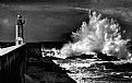
Critique By:
Frank Verheij (K:734)
9/7/2006 1:02:17 PM
Wondeful color, great composition, great detail and contrast. Love the white line of the waves "fading" through the picture.
|
| Photo By: Scott Tylor
(K:407)
|
|
|
Critique By:
Frank Verheij (K:734)
9/7/2006 12:53:58 PM
To you this might be a great memeory, but the black lump to the right is hardly a human. Also the background is not very interesting.
Maybe you could have taken some more distance or another angel.
|
| Photo By: mosti Farahat
(K:696)
|
|
|
Critique By:
Frank Verheij (K:734)
9/5/2006 7:44:38 PM
Very interesting picture. Looks almost like scifi to me. The lack of DOF works great. Great background colors.
I had a look at your portfolio and saw a lot of beatiful pictures. Interesting choice of subject. Love the glass pictures. Great colors and structure.
No time to comment on them all. Sorry!
|
| Photo By: Radmila Gorjanovic
(K:3113)
|
|
|
Critique By:
Frank Verheij (K:734)
9/4/2006 10:16:02 PM
Maybe that's because she's a he?
|
| Photo By: Frank Verheij
(K:734)
|
|
|
Critique By:
Frank Verheij (K:734)
9/4/2006 9:00:29 PM
Sorry, but in my opion there is to little contrast in the picture. Even the yellow sunflowers cannot draw real attention to themselfs.
|
| Photo By: Violetta Tarnowska
(K:24497)
|
|
|
Critique By:
Frank Verheij (K:734)
9/4/2006 8:54:23 PM
Very well taken. Great impression of movement and speed, well captured. Love the reflections in the tram. Great composition too!
|
Photo By: AJ Miller
(K:49168)

|
|
|
Critique By:
Frank Verheij (K:734)
9/4/2006 8:52:23 PM
This is an amazing shot with beautiful colors.
Blue and yellow make a wonderful contrast.
|
| Photo By: flotti francesco
(K:103)
|
|
|
Critique By:
Frank Verheij (K:734)
9/4/2006 8:46:31 PM
In my oppinion this picture is a bit muddy. I do not see a lot of detail. Also I don't like the crop. There's must be more to this.
Maybe it would look better when shot with sun from one side or as a silhouet.
|
| Photo By: v i k t o r h u g o
(K:562)
|
|
|
Critique By:
Frank Verheij (K:734)
9/4/2006 8:43:17 PM
Great shot. Love the beautiful rich colors and the composition. Dof also adds to the picture.
|
| Photo By: ardarda ardarda
(K:424)
|
|
|
Critique By:
Frank Verheij (K:734)
9/4/2006 8:41:47 PM
stupid assumptions!Do get photoshop. You're worth it!
|
| Photo By: Jan Hoffman
(K:39467)
|
|
|
Critique By:
Frank Verheij (K:734)
9/4/2006 8:36:18 PM
You could try to enhance the colors in photoshop.
|
| Photo By: Jan Hoffman
(K:39467)
|
|
|
Critique By:
Frank Verheij (K:734)
9/4/2006 8:25:36 PM
Why have you turned this into a painting?
Wouldn't it have been better if you had left it untouched?
|
| Photo By: Jan Hoffman
(K:39467)
|
|
|
Critique By:
Frank Verheij (K:734)
9/4/2006 8:14:25 PM
Very nice, almost monochrome/duotone, color, but still enough contrast.
Did you use a filter?
|
| Photo By: Giuseppe Violetta
(K:156)
|
|
|
Critique By:
Frank Verheij (K:734)
9/4/2006 7:54:21 PM
Great shot. Love the composition. Lovely tones.
|
| Photo By: Manuel Almeida
(K:60)
|
|
|
Critique By:
Frank Verheij (K:734)
9/3/2006 12:57:09 PM
Great colors, great idea. (Might give it a try too!)
|
| Photo By: Doyle D. Chastain
(K:101119)
|
|
|
Critique By:
Frank Verheij (K:734)
7/5/2006 7:33:32 AM
Grar promo-shot or great postcard.
|
| Photo By: Scott Tylor
(K:407)
|
|
|
Critique By:
Frank Verheij (K:734)
7/5/2006 7:32:39 AM
Why is the front of the car not in the picture?
You had some room to spare at the back-end.
|
| Photo By: Dave Arnold
(K:55680)
|
|
|
Critique By:
Frank Verheij (K:734)
7/5/2006 1:01:45 AM
You should't mistake someone short of time and limited only by his imagination for a beginner.
|
| Photo By: Frank Verheij
(K:734)
|
|
|
Critique By:
Frank Verheij (K:734)
7/4/2006 2:02:37 PM
What would you have liked to see in the background?
The background in this case was a white piece of paper.
|
| Photo By: Frank Verheij
(K:734)
|
|
|
Critique By:
Frank Verheij (K:734)
7/4/2006 1:59:09 PM
Could you be more specific as to what mistakes you see in the method used and how to improve them?
|
| Photo By: Frank Verheij
(K:734)
|
|
|
Critique By:
Frank Verheij (K:734)
7/4/2006 8:41:39 AM
This one is much nicer then the one I commented on earlier: looks like 3 happy-faces.
Nice colors.
|
| Photo By: Aliihsan Pinçe
(K:5485)
|
|
|
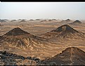
Critique By:
Frank Verheij (K:734)
6/29/2006 9:41:57 AM
Maybe this picture would benefit from some light from one side. It brings out the structure in the mountains and the sand.
Cropping the skye out also makes the picture more interesting in my view.
|
| Photo By: Mieko M
(K:179)
|
|
|
Critique By:
Frank Verheij (K:734)
6/29/2006 9:35:35 AM
In my opinion the green is a bit to dark. Maybe you could have taken the shot at a bigger angle to bring out the green more.
Also I think the large black area to the right doesn't add to the composition. This could also be solved with a bit more angle.
|
| Photo By: Aliihsan Pinçe
(K:5485)
|
|
|
Critique By:
Frank Verheij (K:734)
6/28/2006 8:34:58 AM
Happened upon this photo through the forum: love the music.!
Sometimes it is hard to criticise ;-)
|
| Photo By: Paul's Photos
(K:35235)
|
|
|
Critique By:
Frank Verheij (K:734)
6/25/2006 8:55:52 PM
Sorry, ate them all myself. I'm a sucker for these things.
|
| Photo By: Frank Verheij
(K:734)
|
|
|
Critique By:
Frank Verheij (K:734)
6/25/2006 8:54:08 PM
they really are floating in a bowl of water on a blue table!
|
| Photo By: Frank Verheij
(K:734)
|
|