|
|
Critique By:
Erbil Dabağlar (K:1142)
10/18/2005 2:20:51 PM
Hi Kim its vonderful work.
Erbil
|
| Photo By: Kim Culbert
(K:37070)
|
|
|
Critique By:
Stefan Engström (K:24473)
10/17/2005 4:20:08 PM
Perfect relaxation. I think a little more room at the bottom would be a good thing.
|
| Photo By: Kim Culbert
(K:37070)
|
|
|
Critique By:
Dirck DuFlon (K:35779)
10/17/2005 2:41:09 PM
Beatufiul shot, Kim! Stefan already said what stood out most for me, too - the wonderful layers of purple haziness that give this scene a great sense of depth! I can't even tell that you used a grad filter, which means you used it expertly 
|
| Photo By: Kim Culbert
(K:37070)
|
|
|
Critique By:
Kim Culbert (K:37070)
10/17/2005 3:13:57 AM
Hi Stefan...
Thanks for the comment... it could have been me leaning, or the buildings... not quite sure! *grin*
For this shot I was using Sensia... some that Becky V gave me now that she's using digital... but I have to say that I really like the saturation of the 50 better for Velvia... but I haven't tried the NEW 100... but the old 100F was not quite as good. I've heard great things about the new 100 though, and look forward to burning through a few rolls soon!
Cheers!
|
| Photo By: Kim Culbert
(K:37070)
|
|
|
Critique By:
Stefan Engström (K:24473)
10/17/2005 2:48:23 AM
Great layering - I can't recall seeing a lot of that in cityscapes before. I get a sense of slight lean to the left but it could be that is off :-) What is you opinion on the Velvia 100 vs. the 50? Seems like the higher speed version didn't do any damage to this particular shot! Great sky and good balance to the city.
|
| Photo By: Kim Culbert
(K:37070)
|
|
|
Critique By:
Jorg Reif (K:16020)
10/16/2005 8:37:23 AM
Nice and moody, reminds me of my vacation in this interesting City last year. Very good memories. Regards Jörg
|
| Photo By: Kim Culbert
(K:37070)
|
|
|
Critique By:
Kathy Hillard (K:25721)
10/15/2005 3:28:15 PM
Long time no post, Kim! Nice silhouette and beautiful colors!
Kathy
|
| Photo By: Kim Culbert
(K:37070)
|
|
|
Critique By:
Gary Dyck (K:12834)
10/15/2005 6:51:11 AM
awesome colours!! Nice work. cheers, gary
|
| Photo By: Kim Culbert
(K:37070)
|
|
|
Critique By:
Eleisa Martin (K:2569)
10/15/2005 5:19:19 AM
Great job Kim. I love the dark city against the beautiful colors.
Nice work!
Eleisa
|
| Photo By: Kim Culbert
(K:37070)
|
|
|
Critique By:
Megan Bull (K:627)
10/15/2005 4:58:13 AM
beautiful sunset.
the colors are amazing
|
| Photo By: Kim Culbert
(K:37070)
|
|
|
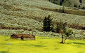
Critique By:
Colin Cartwright (K:15699)
10/8/2005 12:09:46 AM
Unusual and effective look at a Canadian landscape. Satisfying subject placement, between the light-green rough tufts, and the vivid and spurious yellow. I might have been tempted to go all the way, and convert this to a watercolour. Or leave in it's 'raw' form.
Regards
Colin
|
| Photo By: Kim Culbert
(K:37070)
|
|
|
Critique By:
Ivan Jimenez (K:9078)
10/3/2005 7:33:50 AM
Dreaming of long lost... sticks!
|
| Photo By: Kim Culbert
(K:37070)
|
|
|
Critique By:
Ivan Jimenez (K:9078)
10/3/2005 7:30:16 AM
It really doesn't get any cuter than that...
|
| Photo By: Kim Culbert
(K:37070)
|
|
|
Critique By:
Matt Pals (K:1722)
10/1/2005 6:15:55 PM
This is a very powerful image. The DOF and angle are perfect. I cant say i find this eerie... The child seems so comfortable and at peace. Truly a lovely shot.
Thanks for sharing,
Matt
|
| Photo By: Kim Culbert
(K:37070)
|
|
|
Critique By:
Becky V (K:9699)
10/1/2005 3:53:25 PM
Well, I like the pink, but that's probably because I'm a girly girl. :P Your ability to colour B&W amazes me . . . I studied the baby's skin for awhile, wondering if it could have more or less colour, or perhaps colour in more concentrated areas (the cheeks, for example). But in the end, I think it's quite alright as is.
About the gauze, I certainly like it more than the floweryobjectthingie. I think the foreground gauze in the bottom right hand corner could probably go, but it's so light and soft that it doesn't distract too much. My biggest issue with it (and this is less an objective, technical comment as it is a personal "thing" with me) is the texture. It appears a bit rough to me . . . although I admit it makes an interesting contrast. Still, I keep thinking "Loofah Baby!". Perhaps play with softening or even smudging a bit if you're feeling experimental.
I really like how, when you have a subject, whether it be puppies or babies (or ducks!), you use all kinds of props . . . it produces some really great results!
|
| Photo By: Kim Culbert
(K:37070)
|
|
|
Critique By:
Dirck DuFlon (K:35779)
9/26/2005 2:04:26 PM
This is wonderful, Kim - what a great perspective and use of DOF! I see what Alison is saying about being just a little eerie, too - maybe the way the eyes look sort of 'empty'. Made me think of the end of 2001:A Space Odyssey!
|
| Photo By: Kim Culbert
(K:37070)
|
|
|
Critique By:
Roberto Arcari Farinetti (K:209486)

9/26/2005 12:40:06 PM
marvellous and delicate.. tender loveliness..
cheers
roby
|
| Photo By: Kim Culbert
(K:37070)
|
|
|
Critique By:
Kathy Hillard (K:25721)
9/26/2005 3:35:14 AM
I just love this, Kim!!! You did a great job of focusing on the hand and that wonderful dof makes this a very unusual shot! Really well done!
Kathy
|
| Photo By: Kim Culbert
(K:37070)
|
|
|
Critique By:
Alison DuFlon (K:36566)
9/25/2005 10:48:21 PM
Wonderful perspective and dof, although it has a very bizzare feel to it, a mixture of soft and sweet and also a bit scary. Alison
|
| Photo By: Kim Culbert
(K:37070)
|
|
|
Critique By:
Becky V (K:9699)
9/25/2005 6:34:36 PM
This is a photographic side I've never seen from you and I like it! The choice to go with black and white is a wise one (just because baby skintones seem to be so overtly pink), as is the soft contrast - what kind of lighting did you use?
Okay, about the thingie . . . well, that's just it. I had no idea it was a rose until you pointed it out. Because the object is kind of shapeless and because it occupies a lot of foreground, it really distracts. I suppose it lacks motivation, but at the same time, if it was something definitive, like a teddy bear, I could see that being alright.
That said, you did a really great job of colouring the object (and a doubly good job with the red & green edit). At first, I thought this was a colour photo converted to black and white, and then partially restored. Fool me once!
|
| Photo By: Kim Culbert
(K:37070)
|
|
|
Critique By:
Stefan Engström (K:24473)
9/23/2005 3:06:45 PM
If could change the setup here, I wonder if pushing the foreground gauzy material to the side to avoid having it obscure the face at all and not have the defocused foreground? It is a fine looking baby and I do like the idea of the natural frame.
|
| Photo By: Kim Culbert
(K:37070)
|
|
|
Critique By:
Dirck DuFlon (K:35779)
9/23/2005 2:15:06 PM
I love the softness and low contrast in her face (as in the previous one), but I have to say I'm not crazy about the pink - but then, I'm a guy
Maybe it's just that there's too much of it? For my taste maybe a tighter crop with the pink mesh just around the edges as a gentle frame would work better.
And make it burlap! (just kidding!) 
|
| Photo By: Kim Culbert
(K:37070)
|
|
|
Critique By:
Alison DuFlon (K:36566)
9/23/2005 12:35:15 AM
So soft and femenine, you are great at baby portraits Kim. Beautiful.. Alison
|
| Photo By: Kim Culbert
(K:37070)
|
|
|
Critique By:
Dirck DuFlon (K:35779)
9/22/2005 7:04:55 PM
Aww, what a sweet expression you captured, Kim - pure innocence! I love the softness in this, both from the gentle tones and from the short DOF (well, it says f/5.6, but the focus does seems to drop off pretty quickly - whatever brought that about, it works wonderfully!)
I prefer the B&W version - I think the color detracts too much from the softness and the low contrast that I find so appealing in this shot.
How about B&W with the rose lightened a little to come closer to the other tones?
|
| Photo By: Kim Culbert
(K:37070)
|
|
|
Critique By:
B Hawkins (K:1529)
9/22/2005 5:29:55 PM
Beautiful composition and colors on this one. I wish that we had more time when we had come through Vancouver. That is Vancouver, right?
I agree that cropping the foreground some might be worth a shot.
|
| Photo By: Kim Culbert
(K:37070)
|
|
|
Critique By:
Kim Culbert (K:37070)
9/22/2005 2:05:20 PM
And the last option.... (I just figured out how to colour different parts of the image on a B&W ... at least this exercise has taught me something!!!)
Made to look more like a rose, as per Ryan's suggestion... more suggestions are welcomed!
|
| Photo By: Kim Culbert
(K:37070)
|
|
|
Critique By:
Kim Culbert (K:37070)
9/22/2005 1:45:22 PM
Thanks Trish... I didn't even notice the shadow on her chest! Always helps to have more pairs of eyes looking at stuff!
Cheers
|
| Photo By: Kim Culbert
(K:37070)
|
|
|
Critique By:
Trish McCoy (K:15897)
9/22/2005 6:11:43 AM
spectacular clarity. love the colors.
|
| Photo By: Kim Culbert
(K:37070)
|
|
|
Critique By:
Trish McCoy (K:15897)
9/22/2005 6:11:20 AM
beautiful soft pink. what an angel. if you can I would get rid of the shadowing on her chest. other than that this is gorgeous.
|
| Photo By: Kim Culbert
(K:37070)
|
|
|
Critique By:
Alison DuFlon (K:36566)
9/21/2005 10:47:04 PM
Your Niece is a very beautiful baby Kim, I love the way you have isolated the color, which gives the object warmth and texture against the soft B/W of the babies image. Alison
|
| Photo By: Kim Culbert
(K:37070)
|
|