|
|
Critique By:
jan martin petersen (K:356)
2/8/2003 4:18:50 PM
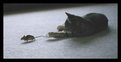
Many things can be said about this image; slightly blurred, off levels, a bit too dark ... But - WOW!!! - it's a great portrait!
|
| Photo By: Sandra Engman
(K:1231)
|
|
|
Critique By:
Clara Showalter (K:663)
2/8/2003 12:20:52 PM
Nice composition. It's a bit fuzzy (no pun intended) but understandable given the difficulty of catching a cat in motion! It's also a bit off level. I'd recrop using the eyes to get the image straight. I think that would increase the impact.
|
| Photo By: Sandra Engman
(K:1231)
|
|
|
Critique By:
Lisa Howeler (K:3706)
1/29/2003 12:31:52 PM
This is such a unique capture and a nice one. It is too bad it wasn't a little brighter, I think that would help make it even better, but there is nothing you can really do about it now. It is such a great moment to get.
|
| Photo By: Sandra Engman
(K:1231)
|
|
|
Critique By:
Andy Eulass (K:13435)
1/2/2003 9:57:06 AM
I guess I'll be the first to take a shot at this. I think its certainly a portrait but a stylistic one. I couldn't call it a candid because it has a feel of preparedness to it. I think style strikes me as the correct category due to her dress and the way her hair flows out from under her cap, telling me that there is an element of appearance that either the photographer or the subject is trying to convey.
Its a wonderful portrait that conveys both a mood of ease and the subject's beauty quite nicely. I like the line of the cap particularly as it serves as a point of emphasis for the subject's really striking eyes. The light seems a bit sharp but I think it fits well into this shot. Good work.
|
| Photo By: Sandra Engman
(K:1231)
|
|
|
Critique By:
Sandra Engman (K:1231)
1/1/2003 8:52:21 PM
Lighting was 3 studio flash units. With modeling lights.
|
| Photo By: Sandra Engman
(K:1231)
|
|
|
Critique By:
Sean Fitzgerald (K:310)
12/31/2002 3:47:14 PM
Sandra, this is really great! This is one of my favorite flower shots ever. This one, along with 'Lavender' and 'Purple Petals'. I can't decide if I like it better with the lighter center or not. However, either way its fantastic! All of them are.
|
| Photo By: Sandra Engman
(K:1231)
|
|
|
Critique By:
Sandra Engman (K:1231)
12/30/2002 1:44:47 PM
I was aiming for a slightly grainy soft focus and a timeless feel.
True her dress is too big and her wistfulness is that of innocence. A young teen girl looking forward to her future as a woman of elegance and vurtue.( fitting into the dress ) I agree that she could be looking more into the frame. I will add another version, similar, less cropping and slightly differnt tone.
|
| Photo By: Sandra Engman
(K:1231)
|
|
|
Critique By:
Loyce D. Hood (K:1859)
12/28/2002 3:58:31 PM
The pose is nice, but I'd like to have seen her looking into, rather than out of the frame. Also, the lighting is very harsh, and her dress looks too big. I love the tone of this, though.
|
| Photo By: Sandra Engman
(K:1231)
|
|
|
Critique By:
Sue O'S (K:12878)
12/28/2002 3:45:48 PM
*The uncouth "0 rater" strikes again.* Ignore it.
Sandra, I'm not the best judge of Fashion (or Portraits, either - ask anyone) but I really like this. It has a certain style to it that takes it out of the realm of the average. The soft focus and the high-key brown tones are kinda cool. However, to me, this model looks almost too young to be trying for such a sensual expression. That would be my only nit pick and it's so minor as to totally ignorable. All in all, good job.
|
| Photo By: Sandra Engman
(K:1231)
|
|
|
Critique By:
James O'Donnell (K:28)
12/28/2002 3:11:42 PM
a little grainy, but that might be the look you were going for. I love the tone of the photo!
|
| Photo By: Sandra Engman
(K:1231)
|
|
|
Critique By:
John Doe (K:170)
12/23/2002 6:44:50 AM
I like the composition and the subject has a very happy expression. Nice shot. Is it just me or does her skin look a little odd, sort of blotchy?
|
| Photo By: Sandra Engman
(K:1231)
|
|
|
Critique By:
Anindya Maity (K:7880)
12/21/2002 11:42:56 AM
LOvely smile,sparkling eyes and great framing and exposure.I appreciate the difficulty in capturing such a mood in a baby as I have been trying to freeze the smile on my 5 mth old daughter unsuccessfully for the last 3 rolls.She always gets conscious of the flash and gives an 'intrigued' expression ,smiling beatifically again as soon as my frustrated face peeps out from behind the camera! Btw,what was your light source?
|
| Photo By: Sandra Engman
(K:1231)
|
|
|
Critique By:
Elangovan S (K:10675)
12/21/2002 11:34:44 AM
Excellent capture I guess nice timing. getting such a expressions are very tough.
This looks like a flower picture with the frame of fethers/shawl. Nice job.
|
| Photo By: Sandra Engman
(K:1231)
|
|
|
Critique By:
Loyce D. Hood (K:1859)
12/19/2002 5:29:04 PM
I like the dark blue and the composition. The lower left is a bit dark, however.
|
| Photo By: Sandra Engman
(K:1231)
|
|
|
Critique By:
Elangovan S (K:10675)
12/19/2002 5:10:29 PM
Beautiful. Nice and controlled shot to get the sky. Well done.
|
| Photo By: Sandra Engman
(K:1231)
|
|
|
Critique By:
tess campbell (K:515)
12/19/2002 4:40:32 PM
beautiful saturated sky Sandra and I like the highlights of the yellow flowers in the foreground...
|
| Photo By: Sandra Engman
(K:1231)
|
|
|
Critique By:
Sandra Engman (K:1231)
12/19/2002 3:42:59 PM
Peter yes this picture is blurred. Being schooled in photography. one of the first lessons taught is to make images pin sharp. So when I first saw it I nearly tossed it away. But my fellow photographer told me it was a outstanding shot so I thought I would put it up here and see what comments came in. Over time it has grow on me. Trying to break free of the rules and technical perfection and see and create art can be rewarding. I agree with Christopher the blur adds to the mood and creates atmosphere.
|
| Photo By: Sandra Engman
(K:1231)
|
|
|
Critique By:
Christopher Brunn (K:36)
12/18/2002 2:23:45 PM
What an 'outstanding' picture! You really 'captured the moment' or is that too trite. The softness really adds to the mood.
|
| Photo By: Sandra Engman
(K:1231)
|
|
|
Critique By:
Peter Caracappa (K:119)
12/18/2002 2:06:26 PM
I can't tell if the picture is blurry, or if it is just my screen... otherwise, I like the composition - if anything, the whole thing could be moved a tad to the left, revealing just a bit more of the helper and a bit less of the veil... but this works, too...
|
| Photo By: Sandra Engman
(K:1231)
|
|
|
Critique By:
Kim Culbert (K:37070)
12/17/2002 8:43:21 PM
I like how she fades into the background, yet has enough skin showing to have a nice glow. The one thing that bothers me about this though, is her necklace. In the soft light it looks almost like a weird bump on her skin... smooth would be best, I think. Nice catchlights in the eyes.... really makes her face stand out. (7)
|
| Photo By: Sandra Engman
(K:1231)
|
|
|
Critique By:
Kim Culbert (K:37070)
8/16/2002 10:18:27 AM
This does have wonderful soft edges which really makes the image... it's so delicate feeling. I just wish there was a little bit more light in the centre of the flower to have something to hold my eye. I feel like the soft edges pull me into the flower, but there isn't enough to hold me there.
Have you ever thought of using a maglite flashlight as a snoot to light the centre of your flowers? I use this technique quite often and it works quite well. Here is an example:
http://www.usefilm.com/showphoto.php?id=19335
It just adds a little more light to the flower, givng the eye somewhere to land to appreciate the rest.
|
| Photo By: Sandra Engman
(K:1231)
|
|
|
Critique By:
Sandra Engman (K:1231)
8/16/2002 9:06:51 AM
Kenneth, Thank you for your comments and showing me the brighter yellow centered version, your right it does change the feel of the picture. It make the original center not seem very yellow at all. I think I would like somewhere between the two. slightly more light and yellow in the direct center but not too much which could distract from the petals.
|
| Photo By: Sandra Engman
(K:1231)
|
|
|
Critique By:
Autumn Ruhe (K:993)
8/15/2002 12:56:44 PM
ohh this is a very pretty shot, great style.
|
| Photo By: Sandra Engman
(K:1231)
|
|
|
Critique By:
Kenneth Kwan (K:3084)
8/15/2002 10:13:27 AM
Cool! I really like how it looks like fire. Especially that piece at the top. I like the back light. This is a successful shot. Lighting the centre would make a different shot. Maybe something like this.
|
| Photo By: Sandra Engman
(K:1231)
|
|
|
Critique By:
Nancy Hartzog (K:25)
8/14/2002 7:13:43 PM
WOW !! What beautiful eye popping color !!! I also like the yellow center as it kinda grabbed my eye first and then directed my gaze upward.
Nancy
|
| Photo By: Sandra Engman
(K:1231)
|
|
|
Critique By:
Sandra Engman (K:1231)
8/14/2002 3:19:14 PM
Thank you Carl. I agree on all points it is one of my favorite images I have taken.
|
| Photo By: Sandra Engman
(K:1231)
|
|
|
Critique By:
Sandra Engman (K:1231)
8/14/2002 3:10:50 PM
Larry,
I wanted to tell you thank you for your comments, and also say that I do appriciate any and every comment. I do not think of myself as above anyone at all. The only difference is we all have more or less time and experience and practice in phtography then others. One of my goals in life is to never stop learning until I die and show marked improvment year by year. I try to be my own worst critic but I still need to see through others eyes also. I agree the yellow center of the flower could either be shown more of or eliminated altogether. Dont compare yourself to others but rather to yourself and how much you have learned and how far you have come and that in itself will help you grow.
|
| Photo By: Sandra Engman
(K:1231)
|
|
|
Critique By:
Carl Beihl (K:357)
8/14/2002 1:08:24 PM
On a random walk through the archives, I stumbled onto this. It's really quite extraordinary, both in its uniqueness and its execution. I like the subtle colors, the rain-like gestures, the soft light.
The secret is not in the accident. The secret is in knowing to do with the accident.
Thanks.
|
| Photo By: Sandra Engman
(K:1231)
|
|
|
Critique By:
Larry Edwards (K:843)
8/14/2002 12:23:55 PM
My first reaction was "very nice -- but crop the distracting little spot of color out of the lower right hand corner." Then I read your profile, and decided that would be like Donny Osmond criticizing Beethoven's work. So now opinion is "perfect!"
|
| Photo By: Sandra Engman
(K:1231)
|
|
|
Critique By:
Chris Moore (K:5591)
8/9/2002 4:05:52 PM
Hi Sandra,
This is a really interesting shot. My only tiny concern is that the usefilm frame you have chosen made me think "hmm, could be cropped tighter for better effect"... but the actual image you have uploaded is the crop I had in mind... I'd dump the black frame or massively reduce it as it just makes the interesting bits of the shot seem smaller.
really interesting shot though... looks like a 4 point star to me, though I've had little success in limiting the effect of that filter to such a subtle touch...
Great result
Chris
|
| Photo By: Sandra Engman
(K:1231)
|
|