|
|
Critique By:
Russell Love (K:7006)
8/9/2002 2:34:47 PM
Sandra,
Cool effect! Did you use a star filter?
Russ
|
| Photo By: Sandra Engman
(K:1231)
|
|
|
Critique By:
Julie Ross (K:143)
8/8/2002 2:26:21 PM
As a redhead with many a sunburn behind me, I don't need to see the difference, I can feel it without - ouch! It's too bad her bum, fingers, and toes were cut off. Otherwise, I really like it.
|
| Photo By: Sandra Engman
(K:1231)
|
|
|
Critique By:
Dawna G. (K:7709)
8/8/2002 11:38:58 AM
You're right Sandra, good ad as to how "avoidable" sunburn should be - seeing this tho really burns me up 
|
| Photo By: Sandra Engman
(K:1231)
|
|
|
Critique By:
Sue O'S (K:12878)
8/7/2002 4:52:33 PM
Sorry, Sandra, I should have been more constructive, but when I'm looking at the website while at work, I have these relapses (?) into immaturity. :^D I do like the picture very much and find it very creative. Her expression does look slightly annoyed, IMHO, like a teenager having to listen to a grandfather's oft-repeated joke. She's a lovely young woman, and if you rearrange the lighting with Kim's suggestions, maybe you can plant a thought in your model's mind that will enliven her expression a little. Nice catchlights in the eyes, BTW.
|
| Photo By: Sandra Engman
(K:1231)
|
|
|
Critique By:
Dawna G. (K:7709)
8/7/2002 4:38:05 PM
Hi Sandra, hmmm, no title suggestions but I do like this, you have created a very soft, contemplative mood here. I agree the shadow on the forehead is just a little distracting.
haha Sue - you crack me up!
|
| Photo By: Sandra Engman
(K:1231)
|
|
|
Critique By:
Kim Culbert (K:37070)
8/7/2002 2:25:12 PM
Nice use of light... I like the way her body comes up out of the darkness. The shadow on the forehead is a little too prominent, maybe moving the spotlight more to the side with the candles so it looks more like she is illuminated by the candles themselves?
What about "Waiting in Darkness" or "Out of the Light"
|
| Photo By: Sandra Engman
(K:1231)
|
|
|
Critique By:
Sue O'S (K:12878)
8/7/2002 1:49:26 PM
"I Wish Father Would Pay The Electric Bill". :-D
|
| Photo By: Sandra Engman
(K:1231)
|
|
|
Critique By:
Ned Lofton (K:19)
8/6/2002 12:55:19 PM
Lips like rosebuds. Excellent!
|
| Photo By: Sandra Engman
(K:1231)
|
|
|
Critique By:
jeff lynch (K:4770)
7/27/2002 10:59:01 AM
Funny how that works isn't it? Nice tones in this photo. I like the perspective here.
|
| Photo By: Sandra Engman
(K:1231)
|
|
|
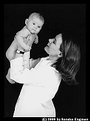
Critique By:
Barry Tipping (K:959)
7/20/2002 5:03:58 AM
Agree with Scott..watches...scourge of the universe....
With so much of the mother's blouse visible, the intense "whiteness" tends pull the viewers eyes away from the baby, which I can only assume is the intended focal point.
Nice composition and exposure!
|
| Photo By: Sandra Engman
(K:1231)
|
|
|
Critique By:
Scott Sarver (K:178)
7/19/2002 5:03:06 PM
Sandra-
I like the image, framing, lighting, etc. The only thing that really jumps out at me is the watch, seems a bit out of place in the photo.
Scott
|
| Photo By: Sandra Engman
(K:1231)
|
|
|
Critique By:
Ted Williams (K:324)
7/17/2002 2:24:18 PM
I think this is really beautiful: composition and color. I was wondering how you acheived the color?
|
| Photo By: Sandra Engman
(K:1231)
|
|
|
Critique By:
Mary Sue Hayward (K:17558)

6/1/2002 3:35:06 PM
Clever set-up. Interesting abstract too!
|
| Photo By: Sandra Engman
(K:1231)
|
|
|
Critique By:
Stephen Laszlo (K:2086)
5/31/2002 3:56:25 PM
I like it. Dali-like... Nice work.
|
| Photo By: Sandra Engman
(K:1231)
|
|
|
Critique By:
Suha Derbent (K:514)
5/31/2002 3:44:01 AM
Nice shot!
|
| Photo By: Sandra Engman
(K:1231)
|
|
|
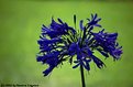
Critique By:
Marc Robin (K:3385)
5/30/2002 8:50:06 AM
Great colours, the backround is nice. You can't tell it's grass at all, except for the colour. I wisht that the front petals were lit a bit better though. To me it seems like the petals that are out of focus have the better lighting?? just my opinion. What do you think?
Cheers,
Marc
|
| Photo By: Sandra Engman
(K:1231)
|
|
|
Critique By:
Sandra Engman (K:1231)
5/28/2002 2:38:50 PM
John,
Thank you for you comment. One time I accidentally had the scanner set for color negative when I was scanning slides. Most of the images just looked wrong this one turnned out looking great because the leaves already had soft variety pallet of pastel colors.
|
| Photo By: Sandra Engman
(K:1231)
|
|
|
Critique By:
Sandra Engman (K:1231)
5/28/2002 2:31:05 PM
Thank you everyone for the comments, it is greatly apperciated.
Yes, I do agree that the eyes should be the focus point in a portrait, and you are correct that the full attention is not brought to them. The lighting I used was simply a Britex flash set on half power and pointed directly at the ceiling, stand was behind her feet. Then of course the light given off by the candle and for the face I simply shown a everyday flash light direct on it. I agree it is too hot and I should of used a sheer cloth or such to soften and diffuse the light. I have several other images that were taken at this same sitting I will load more soon.
Thanks Again.
Sandra
|
| Photo By: Sandra Engman
(K:1231)
|
|
|
Critique By:
Raymond Bliss (K:3182)
5/28/2002 11:55:36 AM
Hi Sandra.
This is my favorite type of portrait. Simple and elegant. The compostion is great, but I would like to know how you lit the face. The shadow cast on the wall conflicts with the locations of the candelabra. You have a circular hot spot that centers on the nose, and radiates up and out. Leaving the outside corners of the eyes and lips in relative darkness. This draws attention to the nose and forehead and away from the lips and eyes, where the view should be led to. The eyes are the most important element for this type of photo, in my opinion. Still this is a great image.
Ray
|
| Photo By: Sandra Engman
(K:1231)
|
|
|
Critique By:
. . (K:2743)
5/28/2002 11:44:52 AM
Hello,
I have very recently come across your portfolio.
Though, your images do not have too many comments, I believe its some of the best work I have seen on Usefilm recently.
The one above, the snail and the eucalytus are my personal favourites
|
| Photo By: Sandra Engman
(K:1231)
|
|
|
Critique By:
John Charlton (K:5595)
5/27/2002 4:47:19 PM
I love this. I find it unique, playful and refreshing. Great job.
Was the scan as a negative deliberate or a happy mistake?
|
| Photo By: Sandra Engman
(K:1231)
|
|
|
Critique By:
Chris Moore (K:5591)
5/26/2002 2:42:46 PM
Hi Sandra,
This looks like a great shot - the wild red background really makes the "bug" look menacing and unpleasant. I'd love to see a bigger uploaded image - it's such a striking shot!
Chris
|
| Photo By: Sandra Engman
(K:1231)
|
|