|
|
Critique By:
Steve Shuey (K:-415)
9/5/2008 11:32:32 PM
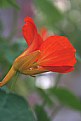
Nicely done. The exposure is spot on and so even. Really works well by making the colors pop. The composition is also nice. I guess my only problem is the little thread like looking stuff in the top flower.
|
| Photo By: Greg Sava
(K:11999)
|
|
|
Critique By:
Steve Shuey (K:-415)
8/15/2008 9:19:54 PM
Very cool shot. The shutter speed to get some blur in the people really make this shot. The colors are awesome. Super shot.
|
| Photo By: Bandar Yousef
(K:174)
|
|
|
Critique By:
Steve Shuey (K:-415)
4/30/2008 2:54:03 AM
I like it. I really like the way the flash caught a few raindrops. I'm sure they'll like it as well.
|
| Photo By: Paolo Cardone
(K:1161)
|
|
|
Critique By:
Steve Shuey (K:-415)
4/30/2008 2:48:45 AM
It is a good start. Good exposure and the composition is good but needs a little tweaking. The little leaves on the right edge are distracting. The biggest problem is the focus. The areas of sharp focus are so small that they are inconsequential. This needed to be shot at a higher f-stop to get more DOF. I think that would make it really nice.
|
| Photo By: Gay Jacobs
(K:414)
|
|
|
Critique By:
Steve Shuey (K:-415)
1/27/2008 5:19:33 PM
Very very nice shot. Spot on focus on the head and good composition. This is a dragonfly.
|
| Photo By: Mohammed AL- Khabbaz
(K:126)
|
|
|
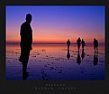
Critique By:
Steve Shuey (K:-415)
1/25/2008 4:29:03 AM
Hi Rob, You've got this one nailed. Great exposure. Particularly like the reflection on the beach. Nice composition and I like seeing the Bay Bridge all lite up just underneath the GG. What are those white specs in the sky? Stars, airplanes? Nice shot.
|
Photo By: Rob Graziano
(K:6678)

|
|
|
Critique By:
Steve Shuey (K:-415)
1/24/2008 3:48:25 PM
Hi Sam, yes, I've been to Sedona and much of the southwest. I know what you are saying about losing pop when you post to here so understand your comment. I'll bet the print looks great. Hopefully I can get to Havasu falls one of these days.
|
| Photo By: Sam Graziano III
(K:14064)
|
|
|
Critique By:
Steve Shuey (K:-415)
1/24/2008 4:39:49 AM
I like the mood of the shot and her pose but I think she is too much in the center. If she were off to the right and facing left a bit, like she is here, I think this would be stronger
|
| Photo By: Pawel Pyrz
(K:86)
|
|
|
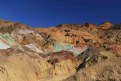
Critique By:
Steve Shuey (K:-415)
1/24/2008 4:32:23 AM
Such a great spot but it just looks like the photo has been overworked. Too much "pop". THe white of the water both big falls and the very small one mid left are blown out and the color of the red rocks just don't look real. Maybe that was your intent??? Composition works well.
|
| Photo By: Sam Graziano III
(K:14064)
|
|
|
Critique By:
Steve Shuey (K:-415)
1/24/2008 4:25:50 AM
Hey Rob, it's nice but you've got better. The light on El Cap is great, but really that's about it.
|
| Photo By: Rob Graziano
(K:6678)
|
|
|
Critique By:
Steve Shuey (K:-415)
2/28/2007 2:16:17 AM
One of my all time favorite places, Death Valley. This is a great spot but hard to shoot. You got the colors OK but because it is so in the middle of the day the light is harsh. ALthough some feel middle of the day is the best time for these colors. Did you use a polarizer? I think I might suggest tightening the composition a bit by zooming/cropping into the colors in the middle of the frame some.
|
| Photo By: Melinda Martin
(K:698)
|
|
|
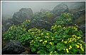
Critique By:
Steve Shuey (K:-415)
2/25/2007 4:38:03 AM
Hey David. I like this shot. Good job on the composition with all these seed pods. Good exposure also. Would really lie to see them all in focus so stopping down a bit more might have worked.
|
| Photo By: David Lockwood
(K:977)
|
|
|
Critique By:
Steve Shuey (K:-415)
2/22/2007 5:14:58 AM
I like this as well. Very good composition and I like the blurred leaves. Exposure generally good but hot on the white part of the flower and it loses detail that I'd like to see.
|
| Photo By: Morgan Estill
(K:3786)
|
|
|
Critique By:
Steve Shuey (K:-415)
2/14/2007 2:33:15 AM
Wow, nicely done. i think this is the stronger of the two. Nice colors and the composition just flows better than the other. My guess is you had to use a split ND filter here? I like it!
|
| Photo By: Rob Graziano
(K:6678)
|
|
|
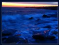
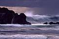
Critique By:
Steve Shuey (K:-415)
2/13/2007 5:13:09 AM
What a nice capture. Perfect shutter speed and combination of waves. A soothing shot for sure. Well done.
|
| Photo By: p e t a .
(K:18700)
|
|
|
Critique By:
Steve Shuey (K:-415)
2/11/2007 5:58:53 AM
Fine image here. Catching the last rays of light on the rocks works very well here. Good overall composition except the horizon has a noticeable tilt to the right. I also like the shutter speed as it gives just a bit of motion to the water.
|
| Photo By: Ingrid Mathews
(K:7277)
|
|
|
Critique By:
Steve Shuey (K:-415)
2/9/2007 6:22:02 AM
Where's the lava lamp??????????
|
| Photo By: ppdix
(K:17069)
|
|
|
Critique By:
Steve Shuey (K:-415)
2/8/2007 4:04:07 PM
This is nice. Good exposure and composition. I like the shadows moving up to the left. What kind of gets me a little bit is that I want to see the top of the reeds. Nice shot.
|
| Photo By: Joe Brown
(K:23213)
|
|
|
Critique By:
Steve Shuey (K:-415)
1/30/2007 6:07:06 AM
St. Marks Square? Brings back memories. I like this shot a lot. The exposure is well done, long enough for ghosting, short enough to tell it is people. The warm light works well also. i guess my only nit pic is that the foreground really is't interesting to me. I might crop it. Well done.
|
| Photo By: t marie
(K:302)
|
|
|
Critique By:
Steve Shuey (K:-415)
1/23/2007 3:14:01 AM
Hi, a good concept that needs a little work. The horizon is tilted first off and that detracts a lot. I really want to see the rest of the tree trunk. I don't think cutting it in half lengthwise worked here. I think the lighting is on the harsh side and would be really good at sunrise/sunset. I like the way you framed the top with the branches.
|
| Photo By: Janos Jasko
(K:117)
|
|
|
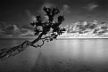
Critique By:
Steve Shuey (K:-415)
1/9/2007 7:05:43 AM
This is a wonderful photo. The exposure is right on and the black and white really works. The sense of motion from he clouds and the smooth water from the long exposure add a lot. I wish maybe the tree was not so in the center, but that is a nit pic. Very well done.
|
| Photo By: Moises Levy
(K:782)
|
|
|
Critique By:
Steve Shuey (K:-415)
1/6/2007 5:16:12 PM
Great shot. The focus is so clear and the sense of motionis terrific. You've got panning don well. Vivid colors also. Well done.
|
| Photo By: Gennaro Manna
(K:21301)
|
|
|
Critique By:
Steve Shuey (K:-415)
1/3/2007 4:00:08 AM
Roland, nice shot. Having grown up in the bay area I know this scene. I like the concept but because the train is going so fast and the shutter was so long, it is blurred so that it looks like a wall and the illusion of motion is almost gone.
|
| Photo By: Roland Lacson
(K:12214)
|
|
|
Critique By:
Steve Shuey (K:-415)
12/21/2006 11:10:32 PM
Well done. I like the lighting and the composition as the colors pop nicely. I like the inclusion of th egreen grass to offset the golden rocks. I wonder if you took any with a longer shutter speed to make the water look more silky. Also, please tell me the tall pine tree that used to be on you left, part way down the trial is still there.
|
| Photo By: Aaron Doss
(K:121)
|
|
|
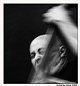
Critique By:
Steve Shuey (K:-415)
10/21/2006 5:10:54 PM
Well done. I like the energy from the shot. You can tell how much he is into it. Good choice of slow shutter speed. Nice shot.
|
| Photo By: Roberta A.
(K:976)
|
|
|
Critique By:
Steve Shuey (K:-415)
9/6/2006 3:50:24 AM
Hi John, Nice shot with a lot of potential. Such a great place. I think it's a little dark and without that one thing that grabs interest. Also would love to see it bigger to get a better feel for it. Thanks for sharing.
|
| Photo By: John Navarrete
(K:80)
|
|
|
Critique By:
Steve Shuey (K:-415)
8/18/2006 6:09:10 AM
This is really nice. To be able to convey the feeling of the weather means you did something right. I like the progression of saturation from front to back and the overall general composition works very well. Nice shot, well seen and definitely worth the effort.
|
| Photo By: David Lockwood
(K:977)
|
|
|
Critique By:
Steve Shuey (K:-415)
7/1/2006 10:32:09 PM
At first I wasn't sure about all the noise/grain that is visible but the more I look at it, the more I like it. It really gives it a painterly look that works very well in my opinion. The composition is very nice also and you caught the waves at a really nice point. I thik this would very nice on a wall.
|
| Photo By: Shirley D. Cross-Taylor
(K:174040)
|
|
|
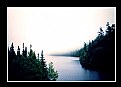
Critique By:
Steve Shuey (K:-415)
6/9/2006 1:12:18 AM
Hi Kim,
I think you have a really nice overall composition here but the whole image is soft and that takes away. The fog is also blown out but I know it would be very hard to get it less and still keep detail in the trees.
|
| Photo By: Kim Flowers
(K:770)
|
|
|
Critique By:
Steve Shuey (K:-415)
5/29/2006 1:19:58 AM
Hi Alicia, you are right, intense color. You nailed the flower but the overall composition needs a little work. I suggest cropping bottom and trying to remove the bright white object in the background.
|
| Photo By: Alicia Popp
(K:87532)
|
|