|
|
Critique By:
Steve Shuey (K:-415)
1/3/2007 4:00:08 AM
Roland, nice shot. Having grown up in the bay area I know this scene. I like the concept but because the train is going so fast and the shutter was so long, it is blurred so that it looks like a wall and the illusion of motion is almost gone.
|
| Photo By: Roland Lacson
(K:12214)
|
|
|
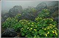
Critique By:
Steve Shuey (K:-415)
12/21/2006 11:10:32 PM
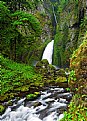
Well done. I like the lighting and the composition as the colors pop nicely. I like the inclusion of th egreen grass to offset the golden rocks. I wonder if you took any with a longer shutter speed to make the water look more silky. Also, please tell me the tall pine tree that used to be on you left, part way down the trial is still there.
|
| Photo By: Aaron Doss
(K:121)
|
|
|
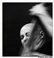
Critique By:
Steve Shuey (K:-415)
10/21/2006 5:10:54 PM
Well done. I like the energy from the shot. You can tell how much he is into it. Good choice of slow shutter speed. Nice shot.
|
| Photo By: Roberta A.
(K:976)
|
|
|
Critique By:
Steve Shuey (K:-415)
9/6/2006 3:50:24 AM
Hi John, Nice shot with a lot of potential. Such a great place. I think it's a little dark and without that one thing that grabs interest. Also would love to see it bigger to get a better feel for it. Thanks for sharing.
|
| Photo By: John Navarrete
(K:80)
|
|
|
Critique By:
Steve Shuey (K:-415)
8/18/2006 6:09:10 AM
This is really nice. To be able to convey the feeling of the weather means you did something right. I like the progression of saturation from front to back and the overall general composition works very well. Nice shot, well seen and definitely worth the effort.
|
| Photo By: David Lockwood
(K:977)
|
|
|
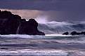
Critique By:
Steve Shuey (K:-415)
7/1/2006 10:32:09 PM
At first I wasn't sure about all the noise/grain that is visible but the more I look at it, the more I like it. It really gives it a painterly look that works very well in my opinion. The composition is very nice also and you caught the waves at a really nice point. I thik this would very nice on a wall.
|
Photo By: Shirley D. Cross-Taylor
(K:174058)

|
|
|
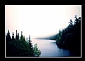
Critique By:
Steve Shuey (K:-415)
6/9/2006 1:12:18 AM
Hi Kim,
I think you have a really nice overall composition here but the whole image is soft and that takes away. The fog is also blown out but I know it would be very hard to get it less and still keep detail in the trees.
|
| Photo By: Kim Flowers
(K:770)
|
|
|
Critique By:
Steve Shuey (K:-415)
5/29/2006 1:19:58 AM
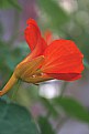
Hi Alicia, you are right, intense color. You nailed the flower but the overall composition needs a little work. I suggest cropping bottom and trying to remove the bright white object in the background.
|
| Photo By: Alicia Popp
(K:87532)
|
|
|
Critique By:
Steve Shuey (K:-415)
5/25/2006 3:26:42 AM
Really strong image. Very nice exposure and the composition works very well. Using the stem to lead into the flower even though the stem is out of focus works. Doesn't say what aperture you used but it was a nice choice to keep the flower sharp but the rest falling off. Well done.
|
| Photo By: Kenneth C. Long, Sr.
(K:4245)
|
|
|
Critique By:
Steve Shuey (K:-415)
5/22/2006 12:10:49 AM
Vertical version is stronger than this one. The out of focus flowers don't work as well here serving as more of a distraction than anything.
|
| Photo By: narabia
(K:9563)
|
|
|
Critique By:
Steve Shuey (K:-415)
5/22/2006 12:09:26 AM
Very nice. I like this one better. Just wish the white wall wasn't so bright but you did a fine job on the composition and letting the other flowers fall out of focus. Nice shot.
|
| Photo By: narabia
(K:9563)
|
|
|
Critique By:
Steve Shuey (K:-415)
5/15/2006 2:22:37 AM
Really nice. Great colors and overall composition. I like the big palm leaf on the top. It's a little crooked (tilted to the left) and that is a bit distracting, but nice sunset for sure.
|
| Photo By: Decio Hoffmann
(K:12)
|
|
|
Critique By:
Steve Shuey (K:-415)
5/14/2006 2:34:45 AM
Very nice image. I like very much that you used a fast shutter to stop the water. it works well. I am curious how this would look with slower shutter to make water silky though. Great colors and glad you didn't center the fountain.
|
| Photo By: Ciprian Ilie
(K:13571)
|
|
|
Critique By:
Steve Shuey (K:-415)
5/13/2006 5:07:18 PM
I like this shot. Great backlighting and good composition. I think zooming in on the flower itself and making it a bigger part of the photo would work well also. I guess it's one way to say I think there is some wasted space on the left.
|
| Photo By: narabia
(K:9563)
|
|
|
Critique By:
Steve Shuey (K:-415)
5/12/2006 5:40:23 AM
Very nice. Great exposure and nice composition. A lot of it looks soft to me (the green foliage in front particularly) but it may be due to uploading. Nicely done.
|
| Photo By: Paul Harrett
(K:791)
|
|
|
Critique By:
Steve Shuey (K:-415)
5/12/2006 5:37:45 AM
You know, not fair! These are my favorite and now I'm probably going to have to go out and buy a bunch. Nice photo, welll exposed but maybe could use a little more DOF.
|
| Photo By: Mary Therese Marie's Photos
(K:2174)
|
|
|
Critique By:
Steve Shuey (K:-415)
4/29/2006 1:24:27 AM
Don, nice shot. A spot I've always wanted to visit. I love the exposure here as you have great color. I think there is just too much sky here. I really want to se a little more of that dune in the middle
|
| Photo By: Don Martel
(K:551)
|
|
|
Critique By:
Steve Shuey (K:-415)
4/23/2006 4:02:49 PM
Hi Don, as ususal an interesting image. I very much like the composition and 3D quality it has. It suffers from the wrong light though. It looks overexposed but even more so, it looks to have been taken in the middle of the day. It's crying for the warm light of sunrise/sunset
|
| Photo By: Don Loseke
(K:32503)
|
|
|
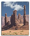
Critique By:
Steve Shuey (K:-415)
4/22/2006 4:23:24 PM
Ah, such a nice shot of an icon near my hometown. This is really great and not a view normally seen. Super exposure and composition. I can only hope that I can use my new 5D to get such good results. You got a lot out of your trip, nice.
|
| Photo By: p e t a .
(K:18700)
|
|
|
Critique By:
Steve Shuey (K:-415)
4/22/2006 4:18:11 PM
Very nice. Seen similar images, but this one is clear, well exposed and has a very graphic quality to it. I like that it gives me the feeling of looking down the barrel of a gun or through the eye that is always seen in the opening of the Bond movies. Nice shot.
|
| Photo By: Lotta Soderberg
(K:69)
|
|
|
Critique By:
Steve Shuey (K:-415)
4/20/2006 4:01:00 AM
Wow, this really has potential. The color layers are great but the yellow in front is so blown out that it nearly destroys the image. What ever you can do to bring those flowers down will help a lot.
|
| Photo By: toru kona
(K:984)
|
|
|
Critique By:
Steve Shuey (K:-415)
4/19/2006 4:47:12 AM
Very very nice. I like the shutter speed to make the water nice and silky. I think there are just too many rocks, on the left especially. The stream kind of gets lost in them all. Thanks for sharing a nice photo.
|
| Photo By: Bill Ciavarra
(K:10216)
|
|
|
Critique By:
Steve Shuey (K:-415)
3/28/2006 1:17:53 AM
Really nice shot. The colors are great and it's obvious that the Golden Gate looms large, but the big area of black in the bottom right corner really distracts me. Still growing up in that area, I like the shot.
|
| Photo By: Nicole Marcisz
(K:10268)
|
|
|
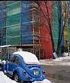
Critique By:
Steve Shuey (K:-415)
3/24/2006 8:21:01 PM
I like this urbanscape. The colors work really well due to good exposure. Compositionally I would have left a little more room in the foreground, just under the rear bumper of the car.Nice shot.
|
| Photo By: Lotta Soderberg
(K:69)
|
|
|
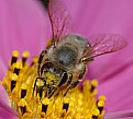
Critique By:
Steve Shuey (K:-415)
3/7/2006 2:53:57 PM
Wonderful shot. The exposure and composition are spot on. I really like the pollen on the bee, nature at work here. Thanks for sharing.
|
| Photo By: fahad alfahad
(K:483)
|
|
|
Critique By:
Steve Shuey (K:-415)
3/7/2006 1:39:11 PM
This is a great attempt at landscape with a lensbaby. Cool place to try it but I just think the effect is too great here. I love the scale of the person but the upper areas and right side are just to much abstract for this to really work for me. Fun shot for sure.
|
| Photo By: Hugo de Wolf
(K:185110)
|
|
|
Critique By:
Steve Shuey (K:-415)
3/6/2006 12:48:58 AM
I do like this shot. Moody and it makes me feel the cold. I like the composition, the reflections, and the exposure. I guess the only thing that I don't really like it that I can barely see the snow flakes and, to me, since I can only barely see them, they kind of distract me. Maybe a longer shutter speed would get rid of them, but not sure. Over all really well done.
|
| Photo By: Iltcho K
(K:984)
|
|
|
Critique By:
Steve Shuey (K:-415)
2/27/2006 3:12:50 AM
Very nice capture. Good exposure and the waves caught just right. Wish the horizon was straight and without, what looks to be, just a bit of pincushion distortion, but strong image for sure.
|
| Photo By: Anson Moye
(K:3480)
|
|
|
Critique By:
Steve Shuey (K:-415)
2/15/2006 9:53:03 PM
Really nice. The exposure is right on as it give great color and a moody feel. The right side seems to be a little wasted as there isn't much there. Would a better composition be with the camera moved left a bit, which would also move the sun to the right a little? Thanks for sharing.
|
| Photo By: Cavedoni giordano
(K:26)
|
|
|
Critique By:
Steve Shuey (K:-415)
1/29/2006 12:25:40 AM
What an expressive face. A nice capture of his, what I see as, love of life. Must be fun to shoot with him but I would love to see him in a non-distracting background.
|
| Photo By: Efisio Mureddu
(K:13104)
|
|