|
|
Critique By:
Steve Shuey (K:-415)
1/8/2006 8:10:11 PM
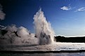
This is nice and it makes me want to go. Great capture of the moment, exposure works, but I think the overall composition is bit off. Wasted space on the right takes away from the image. I think a vertical making the fountain the subject would have worked better here.
|
Photo By: Dennis Hendricksen
(K:4817)

|
|
|
Critique By:
Steve Shuey (K:-415)
1/4/2006 9:05:36 PM
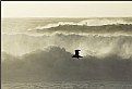
Wow, at first glance I would say it's over exposed and that detracts, but in this case I think it works here. I like the way you go tthe waves at a good break. Well done.
|
| Photo By: Gil Draper
(K:3194)
|
|
|
Critique By:
Steve Shuey (K:-415)
1/4/2006 9:00:11 PM
I actually like the thumbnail better because it makes the flower look sharp. I think you were going for abstract type thing with the grain and harsh light but I just don't think it works here. I like the composition but really think this would be much stronger if there were no grain and with more diffuse light.
|
| Photo By: bob zuber
(K:185)
|
|
|
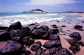
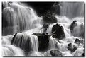
Critique By:
Steve Shuey (K:-415)
1/2/2006 8:33:32 AM
Super shot. The composition is really nice but I think the foreground is a little too prominent. I might try cropping out some of it, almost to where it touches the rocks on the right. Great exposure. Nice to look at in the new year.
|
| Photo By: eric schneider
(K:1318)
|
|
|
Critique By:
Steve Shuey (K:-415)
1/1/2006 9:38:20 PM
I like the capture here, Al. Great use of the mist and the rays of light. I wish the small branches on the left could be gone.
|
| Photo By: A.L Carter
(K:567)
|
|
|
Critique By:
Steve Shuey (K:-415)
1/1/2006 9:30:26 PM
I really like the idea here but when I open the thumbnail and see the out of focus front of the leaf it loses some of the strength. I like the background a lot. Really good idea that a smaller aperture would improve.
|
| Photo By: Piero Toffano
(K:703)
|
|
|
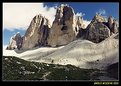
Critique By:
Steve Shuey (K:-415)
12/21/2005 7:08:31 AM
Nice shot. Did you use a polarizer? Even though the lighting looks like it is in the middle of the day, I think it works here with the nice blue background. Pity about the contrails but nothing you can do about that short of some PS work. I need to get there one day.
|
| Photo By: Paolo Nobili
(K:143)
|
|
|
Critique By:
Steve Shuey (K:-415)
12/20/2005 7:56:55 AM
I like the overall composition but I thik the choice of shutter speed doesn't quite work. A longer shutter speed to make the water look more silky would have worked better here in my opinion. I like the fall colors.
|
| Photo By: Nandor Lang
(K:1257)
|
|
|
Critique By:
Steve Shuey (K:-415)
12/20/2005 7:54:03 AM
This is very nice. The composition is great as is the exposure. I also think the f-stop choice works well by letting some of the edge fall out of focus. Very well seen. Congrats.
|
| Photo By: Rick X
(K:455)
|
|
|
Critique By:
Steve Shuey (K:-415)
8/5/2005 11:55:56 PM
Well Done. This is really lovely, as you say. I like the composition and the exposure. Very nice and thanks for sharing
|
| Photo By: Khaled Mursi Hammoud
(K:54005)
|
|
|
Critique By:
Steve Shuey (K:-415)
5/22/2005 3:53:44 PM
Glad to see someone still using film, adn a nice new camera. This is a nice shot but the light is not great. Too harsh. I think this would look a lot better taken earlier or later in the day when the light is nice and warm instead of bright and harsh. Thanks for sharing.
|
| Photo By: Andreas Haralambopoulos
(K:462)
|
|
|
Critique By:
Steve Shuey (K:-415)
4/22/2005 2:08:55 AM
I like this but sure wish the back one was more in focus. Would love to see them both as sharp as possible with the same exposure. I really like the composition.
|
| Photo By: Glenn R. McGloughlin
(K:3716)
|
|
|
Critique By:
Steve Shuey (K:-415)
3/18/2005 10:15:19 PM
Hi Laurie, This is my favorite of your images. You really found some good stuff and you captured it very well. Thanks for sharing.
|
| Photo By: Laurie J. Herndon
(K:5338)
|
|
|
Critique By:
Steve Shuey (K:-415)
3/15/2005 7:19:18 PM
Just a super composition. Well done. It's soft but you may be doing that on purpose. You have some nice stuff in your portfolio.
|
| Photo By: Laurie J. Herndon
(K:5338)
|
|
|
Critique By:
Steve Shuey (K:-415)
3/15/2005 7:14:52 PM
Very nice shot here. Stovepipe wells dunes? Maybe a bit overexposed but you really composed this shot well. Another one of my favorite spots.
|
| Photo By: Laurie J. Herndon
(K:5338)
|
|
|
Critique By:
Steve Shuey (K:-415)
3/15/2005 7:13:11 PM
Hi Laurie, Nice shot. I was going to point out that the moon would never rise in the position you've put it (west) but then saw that you said it was a double exposure. The way the moon is in your photo is right over Mt. Whitney and it looks like you are in the Alabama Hills which is one of my all time favorite spots. Can't wait to see some of your Joshua Tree flower photos.
|
| Photo By: Laurie J. Herndon
(K:5338)
|
|
|
Critique By:
Steve Shuey (K:-415)
1/1/2005 11:32:28 PM
Nice shot. The exposure is right on and the people add a good sense of place and scale. Fun shot!
|
| Photo By: Gary Flynn
(K:258)
|
|
|
Critique By:
Steve Shuey (K:-415)
12/31/2004 9:35:11 PM
Excellent image as I noted in comments on the other site. One to be proud of.
|
| Photo By: Steve Lee
(K:0)
|
|
|
Critique By:
Steve Shuey (K:-415)
8/9/2004 10:01:07 PM
Very very nice. I really like it. The composition is really good and so is the exposure. I would loe to see this with a slightly longer exposure as well to make the water even more cotton candy like. Nice shootin'
|
| Photo By: Gerry Pacher
(K:7303)
|
|
|
Critique By:
Steve Shuey (K:-415)
7/9/2004 1:36:15 AM
Hi Pete,
Nice shot. Does make one want to go. This place looks ripe for shooting during the warm light of sunrise or sunset. It looks like this shot was taken during the middle of the day. Still, nice to look at.
|
| Photo By: Pete Nicholls
(K:633)
|
|
|
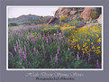
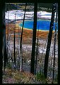
Critique By:
Steve Shuey (K:-415)
3/19/2004 11:20:18 AM
Great subject and you nailed the exposure. It's a little busy with all the trees, and I think it needs to be cropped more. The foreground (brush and road) should be cropped out. Emphasize the pool and it's colors because that's what our eyes are drawn to.
|
| Photo By: pasquale ale angelini
(K:2543)
|
|
|
Critique By:
Steve Shuey (K:-415)
2/25/2004 7:17:58 PM
nicely done. My guess is there is a graduated filter here? The exposure is very good and the cool color of the ice/snow portray the cold that must have been there.
|
| Photo By: Guy Dube
(K:6932)
|
|
|
Critique By:
Steve Shuey (K:-415)
1/31/2004 5:42:10 PM
Really nice composition and the exposure is right on. Super shot. Thanks for sharing.
|
| Photo By: Amancio Couto
(K:15720)
|
|
|
Critique By:
Steve Shuey (K:-415)
1/30/2004 7:13:29 AM
Nicely exposed. It looks like a pretty place to be. If there was some subject matter in the foreground, it would be a stronger image, but it is still very nice to look at. Thanks for sharing.
|
| Photo By: Arto Alanenpaa
(K:566)
|
|
|
Critique By:
Steve Shuey (K:-415)
1/26/2004 7:33:09 AM
Nice Shot kevin. What a cool thing to see and well done in capturing it. At first I was worried about the lack of scale (e.g. something else in the photo), but when I saw it bigger, it works very well on it's own. THanks for sharing.
|
| Photo By: Bob Smith
(K:2340)
|
|
|
Critique By:
Steve Shuey (K:-415)
1/20/2004 6:04:32 PM
It looks like a nice spot but the photo is soft overall (did you use a tripod?). The top portion is blown out and that is distracting. It might be better to try as a vertical and really concentrate on the falling water and not the surrounding areas. Also, if this could be taken under even overcast skies it would be better.
|
| Photo By: Zsolt Baranyai
(K:116)
|
|
|
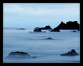
Critique By:
Steve Shuey (K:-415)
1/20/2004 6:00:29 PM
Very nice. For being on a fast moving boat this is just excellent and the exposure is right on the money. The composition works very well. Normally I'd say the horizon was too much in the middle, but it works well here. Thanks for sharing. I may have to look this place up for a potential honeymoon spot. Worth it?
|
| Photo By: Bob Whorton
(K:2740)
|
|
|
Critique By:
Steve Shuey (K:-415)
10/29/2003 7:20:48 AM
Nice composition and exposure. The out of focus line of brush at the very bottom is distracting to me as is the road right smack in the middle, yet it's a pleasing photo to look at, thanks for sharing.
|
| Photo By: John Lamb
(K:9687)
|
|
|
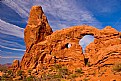
Critique By:
Steve Shuey (K:-415)
10/29/2003 7:16:17 AM
I really like the composition, but the lighting is flat and uninteresting. This would probably be much better with the warmer light at the beginning or end of the day. Those rocks would really light up nicely.
|
| Photo By: Marco Miserini
(K:10)
|
|
|
Critique By:
Steve Shuey (K:-415)
10/28/2003 7:53:30 AM
Really nice light and good contrast between the green and the blue. THe brown at the bottom does not add much, in my opinion, and the pole sticking out of the ground on the left is out of place. Maybe zooming in to get rid of the brown foreground and the pole, or moving the camera to the right and recomposing. Also, maybe a polarizer. Nice image.
|
| Photo By: Mads Bangsø
(K:253)
|
|