|
|
Critique By:
absynthius . (K:20748)
10/23/2009 9:34:00 AM
Hi Nick,
I think the interesting relief of the arched stoned facade, its deep dark engravings to the naked eye, saved your photograph. it is true that the exponation was too long to save the superficial behaviour of the facade, but i find it a really nice idea having this try of yours which worked well in the minor decorative details on top columns and arch.
cheers,
v.
|
Photo By: Nick Karagiaouroglou
(K:127263)

|
|
|
Critique By:
absynthius . (K:20748)
10/23/2009 9:28:34 AM
Hi Nick, and thanks for the comment and suggestion.
I am looking at your suggestion and i think it is nice for it really helps on generating a more "real" image as you put. the gradients, do suffer a little fading but they do not change the content. and so it seems to me, and i am considering your suggestion.
in fact, the original version, before retouch, had a similar contrast as your suggestion. but i played with exposure a bit thinking of putting more emphasys on the mesh.
thank you a lot for that,
cheers,
v.
|
| Photo By: absynthius .
(K:20748)
|
|
|
Critique By:
absynthius . (K:20748)
10/23/2009 9:12:50 AM
Hi Nick and thanks a lot for your further elaboration on the matter.
Now, I see of what images you are referring on the stream of Andre. I of course wasnt pointing out at a single one of them, but rather a few, which, really are embodiment of absurdity. I think there is great arguments of resignation to recognizing that a full rational explanation of various human manifestations of life, and totality of universe, is beyond reach; and thus, we may assume ultimately that the world is to be seen as such- absurd.
Example: http://www.usefilm.com/image/1360455.html
I see well what you mean, when you compare *art* manifestations of life which may well use any free imagination to illustrate an idea about it, and there is many movements of such nature, all having in common the ONE existence. In that sense, youre practically right when you state of that ONE existence, and us being the ones that shape the meaning of it, with our concrete presence.
As for *other existence* (and me being not thorough in explaining my understanding), and what I hint with it is that the Life celebrates itself in various labels in human interactions, all human *intellectual* invention, at times beautiful and hilarious, as well as as stupid as it can get: full of trivialities~ and yet, this only existence, is fully self contained and 'infinite' world/ existence stands totally indifferent to them all~ it just does its thing.
Cheers,
v.
|
| Photo By: absynthius .
(K:20748)
|
|
|
Critique By:
absynthius . (K:20748)
10/23/2009 8:28:07 AM
as simiple as it is, it is fascinating.
complements,
v.
|
| Photo By: Saad Salem
(K:89003)
|
|
|
Critique By:
absynthius . (K:20748)
10/23/2009 8:05:01 AM
hi Nick,
i see this image and i sit in awe!~
there is a fascinating abundance of details in the dark regions, dominating the image; and i am thinking of similar images, underexposed, recorded on digital sensors, and how much can they get (?). that would be just a sad wishful attempt compared to this!
looks that the choice of your topic of shooting here was smartly selected for this type of experiment, for there is nice default contrast between white frames of windows and other white geometric forms and the darker surfaces.
a such a perfect gradient generated here can rarely be seen. everything shifts so smoothly, and almost unnoticed, that i imagine would continue that shifting beyond the canvas, even if there would be too much light~
by the way, was there some very unwanted detail that you decided to go for this crop?
complements to you, and cheers,
v.
|
| Photo By: Nick Karagiaouroglou
(K:127263)
|
|
|
Critique By:
absynthius . (K:20748)
10/22/2009 7:52:43 AM
very nice highlits and shadows- the texture and the wall itself is lovely in tonality and composition.
i guess it was hard to generate this result considering the hard light conditions.
regards,
v.
|
| Photo By: Mostafa Tartak
(K:1639)
|
|
|
Critique By:
absynthius . (K:20748)
10/22/2009 7:48:45 AM
very nice use of negative spece, and lovely moment of the subject.
cheers,
v.
|
| Photo By: Wanderson Rezende
(K:1157)
|
|
|
Critique By:
absynthius . (K:20748)
10/22/2009 7:43:30 AM
ah!! you're lovely looking~
the kind of lazy focus and a bit of the blur somewhat fits with this positioning of head and gaze- i perhaps would enhance the look through blur a bit more to add more tension.
nice work,
v.
|
| Photo By: derin deniz
(K:3544)
|
|
|
Critique By:
absynthius . (K:20748)
10/22/2009 7:35:53 AM
a very nice abrupt shifting of colours and contrast.
well seen Ananda,
cheers,
v.
|
| Photo By: ANANDA NIYOGI
(K:4486)
|
|
|
Critique By:
absynthius . (K:20748)
10/22/2009 7:34:52 AM
thanks :)
v.
|
| Photo By: absynthius .
(K:20748)
|
|
|
Critique By:
absynthius . (K:20748)
10/22/2009 7:34:25 AM
thanks mine,
regards,
v.
|
| Photo By: absynthius .
(K:20748)
|
|
|
Critique By:
absynthius . (K:20748)
10/22/2009 7:33:51 AM
thanks a lot Leo, i was surprised myself :)
cheers,
v.
|
| Photo By: absynthius .
(K:20748)
|
|
|
Critique By:
absynthius . (K:20748)
10/22/2009 7:32:21 AM
:) thanks Fabrice.
cheers,
v.
|
| Photo By: absynthius .
(K:20748)
|
|
|
Critique By:
absynthius . (K:20748)
10/22/2009 7:31:39 AM
thanks a lot Ozcan.
regards,
v.
|
| Photo By: absynthius .
(K:20748)
|
|
|
Critique By:
absynthius . (K:20748)
10/22/2009 7:31:03 AM
thank you Arup.
v.
|
| Photo By: absynthius .
(K:20748)
|
|
|
Critique By:
absynthius . (K:20748)
10/22/2009 7:30:03 AM
thanks a lot Morc.
v.
|
| Photo By: absynthius .
(K:20748)
|
|
|
Critique By:
absynthius . (K:20748)
10/22/2009 7:27:27 AM
what an exeptional composition, and great moment captured!~
this one deserves an award.
cheers,
v.
|
| Photo By: luis pereira
(K:26013)
|
|
|
Critique By:
absynthius . (K:20748)
10/22/2009 7:23:11 AM
a fantastic motion recorded here!
the black background helps a lot on the visibility of it.
complements,
v.
|
| Photo By: Eduard Maydanik
(K:116)
|
|
|
Critique By:
absynthius . (K:20748)
10/19/2009 12:08:06 PM
very nice work-
maybe your sensor needs a little cleaning?!! :)
|
| Photo By: subho chatterjee
(K:359)
|
|
|
Critique By:
absynthius . (K:20748)
10/19/2009 12:06:51 PM
very beautiful photograph~
bravo.
|
| Photo By: Kallol Majumdar
(K:27691)
|
|
|
Critique By:
absynthius . (K:20748)
10/19/2009 12:05:07 PM
very nice composition, and DoF
perhaps a less exposure would be better?
cheers,
v.
|
| Photo By: Keith Saint
(K:13784)
|
|
|
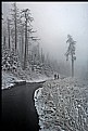
Critique By:
absynthius . (K:20748)
10/19/2009 10:15:09 AM
from my side, i think this image is huge, Nick!
it is a complex symphony that strikes sporadically enchanting in its crisp colourfullness and depths of resonance~ i simply cannot stop on a detail and negate the other- it is solid in coposition of all that we see in there, so direct and frank.
the contrast is perfect, colours just the same, the exposure just right on, and cyan you applied makes it right the atmosphere that you wanted to generate.
the most striking element of the photo is the depth. it starts on the roof and the tree and ends in the wall of the mountains, and everything in between is purely defined- just like the snow on the top of the mountains.
so, i see what you mean when you tell me about your Hassie!
enjoy it Nick ;).
cheers,
v.
|
| Photo By: Nick Karagiaouroglou
(K:127263)
|
|
|
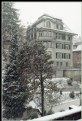
Critique By:
absynthius . (K:20748)
10/19/2009 9:50:15 AM
Hi Nick,
I think here you have seized the most of what you can get on weather conditions like this.
the idea of having the smallest aparture and longest exposure has drawn patternal lines of fallinig snow in a very pleasant fashion. and i think it cannot get any better.
i have tried the same with my camera, on a rainy day, and i failed. perhaps i should have considered a background that stands in contrast with rain drops.
one particular thing i think about, always, is the look of the film that generates those stunning colours; though vague and pale due to dominence of white, they still pop out throughout adorably.
cheers,
v.
|
| Photo By: Nick Karagiaouroglou
(K:127263)
|
|
|
Critique By:
absynthius . (K:20748)
10/19/2009 9:40:30 AM
Hi Nick,
now, i do know that Andre's images are what one would describe real, in visual apearance, and faithful to the world outside and its manifestation, they reach absurdity, in what they seal in their contours, despite what there is real and appearing to be so. that's a craft of its own.
... that is the way of manifastation of a certain phenomenas and the way we choose to present it; which entirely depends on the author.
sometime, the presence of a single detail, that in appearance is obselete, it withholds an entire story to be unfolded. and that is a distinct pleasure for me.
we have, and will still have the whole history of humanity being written everyday in its (claiming to be) most accurrate to how it happened. a vision, and idea, can always do good to it~ so that perspective takes a slight turn, just to remember the possibility of another existence. ;)
thanks a lot for your comment, and cheers,
v.
|
| Photo By: absynthius .
(K:20748)
|
|
|
Critique By:
absynthius . (K:20748)
10/19/2009 7:44:49 AM
Hi Nick,
thank you for your ever thorough examination of "photo" and "graphy"~
what an interesting question you have posed here! in fact, now that you raised it, and that i am thinking about it, there is a major difference i take note of.
I guess in "photo" i need a long way, still, until i get to know most about it, in technical sense. but, just like many dilettante, i have learned to press the button when i recognize the content i want to squeeze inside the frame-
and "graphy", is where i find myself by drawing thicker lines when those are pale... that is to say, that i enjoy the freedom that i consciously seize in building up that what matches the vision i have. in a work, in graphy, i do it most, so that the content does not become alien to us in recognition of form contours, but not just leave it as readymade as it was served/ as was shot~ rather, modify! and i do that, wishing to get inside the character, closer than the shirt of a subject; i wish i could, really, see my fingers tickling the heart of it- (like Caravaggio did), straight, rough, harsh, and merciless and as meek as a lamb of those sensations that grow my brain soft~
here, there is no compromise, here in graphy, i enjoy most of what i do. the rest is as good as it gets.
cheers to you my friend,
v.
|
| Photo By: absynthius .
(K:20748)
|
|
|
Critique By:
absynthius . (K:20748)
9/7/2009 8:57:57 PM
I like the (post)Apocalyptic light here- which is only suggested with the strong shadow of the man in front, while the horizon seems pretty heavy with threatening clouds-
looks like there is not much of other ways to follow, rather than the ones that sort of push one straightforward.
very suggestive work Kevin,
cheers,
v.
P.S. i do not know if you noticed it, but seems like you have forgotten that 'minor failure' of your photoshopping- there is a circle between the three men and the tree (on the left), right on the upper edge of your composition.
|
| Photo By: KEVIN TEMPLE
(K:8657)
|
|
|
Critique By:
absynthius . (K:20748)
9/7/2009 8:51:57 PM
i like how this texture has manipulated the DoF~
really beautiful warm tones here Fabio.
regards,
v.
|
| Photo By: Fabio Keiner
(K:81109)
|
|
|
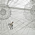
Critique By:
absynthius . (K:20748)
9/7/2009 8:50:35 PM
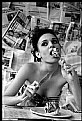
the both works are really interesting.
in composition i like the upload with the girl underneath, it is less complex and it is as if that formation over the head of the subject suggests her brain~ however, in this view, that man is like doubtful between two net geneses.
nonetheless, they both do have a great graffic presantation to them.
regards,
v.
|
| Photo By: Paolo Corradini
(K:59552)
|
|
|
Critique By:
absynthius . (K:20748)
9/4/2009 2:41:39 PM
shume mire e konceptume Lejla, edhe e realizume~
mbrame e pata rastin ta shoh ne exp. Gjon Milli~ urime per pjesmarrje,
v.
|
| Photo By: Lejla Ibrahimi
(K:660)
|
|
|
Critique By:
absynthius . (K:20748)
9/2/2009 9:49:43 AM
Hi Nick,
i see how fun it must have been working on getting those results of the shapes with your "moving camera"~
this one reminds me of the "swan lake", with all the beautiful ballerinas on the front line in perfect dencing symetry- and the prima ballerina just over their heads, on the left, getting ready for the floor.
Nick, my friend, you have make a grand show for us with this one. absolutely dazzling!
cheers,
v.
|
| Photo By: Nick Karagiaouroglou
(K:127263)
|
|