|
|
Critique By:
wayne stubbs (K:130)
3/6/2004 12:51:17 PM
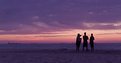
Thanks for the comments Roger.
It sounds a very intresting project taking church interiors with a rotary camera.
You certainly will have a huge image area. My main reasons for using 5x4 is not for the image area it provides but because of the superb range of wide angle lens available. The 75mm I used for the shot above allowed me with the use of movements to include all of the foreground arch whilst being in a very confined space.
panoramic shots are something I am just beging to experiment with and I look forward to seeing how your interiors turn out on usefilm
Wayne
|
| Photo By: wayne stubbs
(K:130)
|
|
|
Critique By:
wayne stubbs (K:130)
2/3/2004 5:54:27 PM
looks like someone frozen in ice,
reminds me of Boris Karloff as frankenstein.
Great shot,
Wayne
|
| Photo By: Tajiro `
(K:77)
|
|
|
Critique By:
wayne stubbs (K:130)
2/3/2004 5:45:49 PM
I love the use of colour it gives the picture a feeling of warmth.
Wayne
|
Photo By: Robert Levy
(K:413)

|
|
|
Critique By:
wayne stubbs (K:130)
2/3/2004 5:36:39 PM
I think this would have been much better as a straight portrait shot.
It looks too messed around with in photoshop.
Wayne
|
| Photo By: laura diaz
(K:863)
|
|
|
Critique By:
wayne stubbs (K:130)
2/3/2004 5:27:59 PM
love the colours, great shot
Wayne
|
| Photo By: David Siller
(K:1317)
|
|
|
Critique By:
wayne stubbs (K:130)
2/3/2004 6:03:10 AM
Great lighting a very atmospheric shot.
Wayne
|
| Photo By: Vladimir Feodorov
(K:19)
|
|
|
Critique By:
wayne stubbs (K:130)
2/3/2004 5:52:16 AM
Puppy's at play. A universally loved subject.
Well captured,
Wayne
|
| Photo By: Roger Cotgreave
(K:15892)
|
|
|
Critique By:
wayne stubbs (K:130)
2/3/2004 5:38:02 AM
The Great British bobby, I can almost hear them now " move along there your causing an obstruction "
Just a pity its not a little sharper.
Wayne
|
| Photo By: Koray Oz
(K:0)
|
|
|
Critique By:
wayne stubbs (K:130)
11/14/2003 8:50:29 AM
This is a great shot. the colours are wonderful.The compostion is very pleasing a classic rule of thirds shot.
Wayne
|
| Photo By: Natalie Papadopoulos
(K:5247)
|
|
|
Critique By:
wayne stubbs (K:130)
11/1/2003 6:00:31 AM
I think the netural background and the sepia of the subject works very well.
|
| Photo By: Fatih KILIC
(K:137)
|
|
|
Critique By:
wayne stubbs (K:130)
8/18/2003 2:43:48 PM
I find this shot very appealing. The tonal range is very good with plenty of shadow detail. Composition is good but looks a little too cut off at the bottom of the picture maybe stepping back or taking the picture from further down the street would have helped a little.Even so I think it makes a very nice shot
|
| Photo By: Vitaly Titov
(K:121)
|
|
|
Critique By:
wayne stubbs (K:130)
7/17/2003 6:51:30 AM
I think the portrait is a very nice composition.
But I think the bleached out highlights are very distracting especially on the hair, Its just too much of a white mass. Maybe a bit of fill in flash would have helped to even out the exposure which was obviously taken in very bright sunlight. But overall it is a well captured informal portrait.
|
| Photo By: Ursula I Abresch
(K:6515)
|
|
|
Critique By:
wayne stubbs (K:130)
1/10/2003 12:50:18 AM
Thank you all for your comments.
Matt, I agree that it is a tad too harsh. I did try to control the highlights during the development stage by reducing the development time by a third.
I have never really understood the Zone system it has always seemed like a psuedo science to me. Maybe i should start paying it more attention.
|
| Photo By: wayne stubbs
(K:130)
|
|
|
Critique By:
wayne stubbs (K:130)
1/10/2003 12:32:53 AM
Thanks for the comments.
Matt I do control contrast during development. To prevent the highlights burnig out and to gain good shadow detail I use a much weaker solution of Id11 developer than normal and extend the development time, using far less agitation say 10 seconds in every 2 minutes.
Its an old trick that works very well.And the great advantage with any large format camera is being able to process one sheet at a time.
|
| Photo By: wayne stubbs
(K:130)
|
|
|
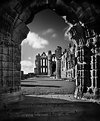
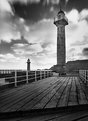
Critique By:
wayne stubbs (K:130)
1/9/2003 5:34:12 PM
Whitby is a fishing port on the east coast of Yorkshire England. Famous for being the place the explorer captain Cook sailed from. The town is also famous for its connection to the Dracula story, it is where the russian ship the Demeter runs ashore on the cliffs just below the abbey.
|
| Photo By: wayne stubbs
(K:130)
|
|
|
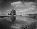
Critique By:
wayne stubbs (K:130)
1/8/2003 4:02:07 PM
Thanks for the comments.
Lisa on the original print the abbey is pinsharp. The clouds are blurred due a combination of long exposure and a very windy day. I think the problem with a slight softness comes from the fact that when I save the image as a Jpeg for uploading to the site, I save at a quality setting of 70%.
|
| Photo By: wayne stubbs
(K:130)
|
|
|
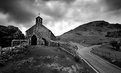
Critique By:
wayne stubbs (K:130)
1/8/2003 11:25:05 AM
Thank you all for your comments. Andrew, I didnt use a graduated filter but I have burnt in the far corners of the print. The rest of the sky is pretty much as it was on the day, and for the rest of my stay  . .
The only reason to be thakfull of yellow lines is that at least no one parked there car there.
Although I cant imagine a place so small and remote as buttermere has ever seen a traffic warden.
|
| Photo By: wayne stubbs
(K:130)
|
|
|
Critique By:
wayne stubbs (K:130)
1/8/2003 11:06:33 AM
Thank you all for your comments.I think Kyle you are right about the step. It produce a better balance to the compostion by not being there.
|
| Photo By: wayne stubbs
(K:130)
|
|
|
Critique By:
wayne stubbs (K:130)
12/4/2002 3:51:31 PM
I really like this shot but I do have one criticism regarding the sky.The central portion looks very heavy and seems to hang as a mass over the building. I think a little toning down would produce a much more balanced shot.
|
| Photo By: james norman
(K:162)
|
|
|
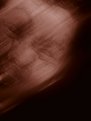
Critique By:
wayne stubbs (K:130)
11/18/2002 7:22:16 AM
Thank you all for your comments. What I tried to do with this photo is sum up those irrational fears of childhood.This is the man who lives under the bed when the lights are out, the man who taps on the window on a stormy night.
The effect on the face was achieved by putting a ladys stocking on the models head (rather like a bank robber) and then slowly pulling it off, this distorts the features of the face.
I then added some radial blur in photoshop and also used the plastic wrap filter to make the skin look leathery.
I think the best place for this photo is under the bed but dont turn the lights off ! ;-)
|
| Photo By: wayne stubbs
(K:130)
|
|