|
|
Critique By:
Erlend Mørk (K:145)
8/27/2005 7:37:51 PM
Very nice. Makes me want to check out the band 
|
| Photo By: Aernout Casier
(K:1376)
|
|
|
Critique By:
Erlend Mørk (K:145)
8/27/2005 7:34:22 PM
Thank you very much for all the comments Especially Aernout and Jude for such long ones. I appreciate it.
|
| Photo By: Erlend Mørk
(K:145)
|
|
|
Critique By:
Erlend Mørk (K:145)
1/11/2005 9:11:51 PM
Fantastic model. I envy you. It seems you have really captured something here. Nice dark tones and composition.
|
| Photo By: marmur-Marek Urbanski
(K:2307)
|
|
|
Critique By:
Erlend Mørk (K:145)
8/26/2004 11:46:02 AM
Thanks!
|
| Photo By: Erlend Mørk
(K:145)
|
|
|
Critique By:
Erlend Mørk (K:145)
8/12/2004 6:14:11 PM
Takk for alle de hyggelige kommentarene!
|
| Photo By: Erlend Mørk
(K:145)
|
|
|
Critique By:
Erlend Mørk (K:145)
8/12/2004 6:12:23 PM
Thank you all! And a special thank to Tiro Leander, for the comment spree on my previous postings today ;-)
|
| Photo By: Erlend Mørk
(K:145)
|
|
|
Critique By:
Erlend Mørk (K:145)
8/2/2004 12:48:14 AM
Well thank you KT and JS!
|
| Photo By: Erlend Mørk
(K:145)
|
|
|
Critique By:
Erlend Mørk (K:145)
2/13/2003 3:51:09 PM
Thanks for all your comments. The burned out highlights yes. I somehow burned them out when I toned the picture. I just didn't notice it. But it's all there in the original negative. I'll be more careful next time. Too bad I can't fix this version here..
|
| Photo By: Erlend Mørk
(K:145)
|
|
|
Critique By:
Erlend Mørk (K:145)
1/12/2003 1:36:25 PM
Beautiful picture. But the hard jpg-compression blurs the picture too much.
|
| Photo By: Mitchell Miller
(K:3009)
|
|
|
Critique By:
Erlend Mørk (K:145)
1/3/2003 9:03:02 AM
I like this. Good composition. But it could use slightly more contrast. But it is a little boring, I would put people in it. Perhaps someone crying under the stairs to the left, and another person going up the stairs to the lower right..? Or maybe you only wanted to portray these walls and stairs?
|
Photo By: Alisa Mudge
(K:7511)

|
|
|
Critique By:
Erlend Mørk (K:145)
1/3/2003 8:38:56 AM
Excellent composition. I like the colors. But I think the wings shoud be a little sharper.
|
| Photo By: Sudheer Kilav
(K:47)
|
|
|
Critique By:
Erlend Mørk (K:145)
1/3/2003 8:36:18 AM
Yes, you definetely have succeeded. I love the composition here, as well as the colors, and the perfect POF/DOF. It's beautiful!
|
| Photo By: Christian Gennert
(K:964)
|
|
|
Critique By:
Erlend Mørk (K:145)
1/2/2003 4:48:38 PM
Cool! Now which moviecover does this remind me of? I can't remember.. Looks sort of alienish, with even more light, you could have made the arms, legs and head even thinner, thus making it even more standard-old-hollywood-invasion-from-mars-scifi-movie-alien -like. (if you see what I mean..) I'm a little curious about how you made this backlightning. But I think it would be better to make the picture outside, instead of inside your house(?). Perhaps with a forest in the far background, and with a little hint of a mothership(you only need a $99999999 budget), behind the glow, and of course this excellent take-me-to-your-leader pose..!
My two cents.
|
| Photo By: Sean Fitzgerald
(K:310)
|
|
|
Critique By:
Erlend Mørk (K:145)
1/2/2003 3:51:52 PM
Nice picture! But why so small..?
|
| Photo By: Ed Hebert
(K:53)
|
|
|
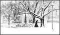
Critique By:
Erlend Mørk (K:145)
1/2/2003 8:27:57 AM
Great picture. I agree with the two previous. I wish there were less trees behind grandma, then the branches would stand out even better than they already do. I don't like that the background trees on each side are cut right off at the end of the picture, I would have tried to find another solution. But it is nice like this anyway. It's absolutely a winter-feeling here.
|
| Photo By: Jim Fuglestad
(K:1564)
|
|
|
Critique By:
Erlend Mørk (K:145)
1/2/2003 7:04:16 AM
I like the composition, and how the yellow jacket is a contrast to the other dim colors. But it doesn't go much beyond that.
|
| Photo By: Jim Fuglestad
(K:1564)
|
|
|
Critique By:
Erlend Mørk (K:145)
1/2/2003 6:45:07 AM
Great shot! I like the extreme contrast, and the way the bottom of the image is overexposed. Nice composition and everything..
|
| Photo By: Wallace Rollins
(K:149)
|
|
|
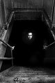
Critique By:
Erlend Mørk (K:145)
1/2/2003 5:38:42 AM
I've seen this picture all over the net.. And I love it. It's really really creepy and ethereal! I love the way you have created the reaper in the window. I would hang this, and many others from you, on my wall!
|
| Photo By: Rene Asmussen
(K:138)
|
|
|
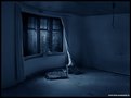
Critique By:
Erlend Mørk (K:145)
1/2/2003 5:29:01 AM
I'm sorry, but I don't understand this picture. It seems to me like a picture taken by accident. It's not technically good, and lacks a good subject (in my eyes of course) and composition.
|
| Photo By: pablo perez
(K:1)
|
|
|
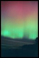
Critique By:
Erlend Mørk (K:145)
1/2/2003 4:33:20 AM
Very scary! I love it!
|
| Photo By: Martin Mora
(K:4666)
|
|
|
Critique By:
Erlend Mørk (K:145)
1/1/2003 10:43:11 AM
This one could be good. But it needs more contrast, the shadow areas aren't entirely black. It also suffers from to much noise, perhaps because of a poor scanner..? I also think that you could have been a little more creative when it comes to composition.
|
| Photo By: Shawn Kellogg
(K:454)
|
|
|
Critique By:
Erlend Mørk (K:145)
1/1/2003 10:30:56 AM
Way too soft I think.. It could also need some more contrast.
|
| Photo By: Drecci GISLAADT (anagram
(K:558)
|
|