|
|
Critique By:
Henk Kok (K:673)
8/31/2003 2:24:10 AM
Hugely under apreciated! Composition is slightly central, however you might've gotten even closer to the animal to get the shot proper. Very high appeal, excellent colors and a attention requiring image. Wildlife the way its meant to be shot.
|
| Photo By: Kosmas Lazaridis
(K:943)
|
|
|
Critique By:
Henk Kok (K:673)
8/26/2003 1:13:55 PM
Still like it, after having a subtle go at your original i have done my version of your idea. Basicly i toned down the contrast a bit while retaining the absolutely charming colors and lightning, add a sublte sharpening to enhance the geometry. It's not the perfect way to do it, just like translating languages, there are different ways to say things in different languages. I enjoy your image a lot more after having had it sink for a while.
|
| Photo By: Jorge Vasconcelos
(K:33746)
|
|
|
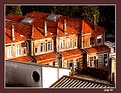
Critique By:
Henk Kok (K:673)
8/26/2003 7:23:42 AM
Just a guess. Looks like Praha to me. Color of the houses and the black roofs on those 2 larger buildings kind of give me that feeling. Also the houses appear similar but i could be wrong ofcourse. The unsharpness normally doesn't really bother me, but it does slight injustice to your image. Shot at a nice time, good lightning.
|
| Photo By: sayan mitra
(K:2)
|
|
|
Critique By:
Henk Kok (K:673)
8/26/2003 7:19:27 AM
Jorge, thanks for you advice. I've already learned quite a few things eversince.
The very strong light makes the colors almost bright.(i've taken a look from both my warm and my cold monitor). There is an excellent geometrical potential out there. However the things don't seem to work together a lot? The colors take over the geometry, while the slightly odd framing (your personal choice, my personal comment  does a slight injustice the geometry and repetition out there. does a slight injustice the geometry and repetition out there.
I'm not sure what to change. I guess take the same image but an hour or two later? Or on a rainy clouded day. Use a F8 or something and a long shuttertime to get your image. Perhaps even in a late hour of dusk or dawn to have a less contrasty scene. I won't say you should change the frame, but i guess i'd move it a bit to the left to catch the repetitions on the roof better. However, ofcourse only you know if there is a huge factory overthere blocking the beautifull view. I'm only suggesting some slight changes to perhaps improve your image, as always: nothing serious.
|
| Photo By: Jorge Vasconcelos
(K:33746)
|
|
|
Critique By:
Henk Kok (K:673)
8/25/2003 9:15:08 AM
A charming image. Can't figure out why but even the thumbnail is showing a lot of character. Very good model and expression and just the right framing to be honest. His expression does demands a place straight in the middle. Film like in some way, inquisitive.
|
| Photo By: Terrence Kent
(K:7023)
|
|
|
Critique By:
Henk Kok (K:673)
8/25/2003 9:10:41 AM
Isn't it fun fooling around with lab color?
Shot with a D1? you lucky bast! Or did you forget the two zeros
and you meant d100? Anyway interesting image, not your best, you seem to produce
a LOT and you come up with some shots i really like.
|
| Photo By: Terrence Kent
(K:7023)
|
|
|
Critique By:
Henk Kok (K:673)
8/21/2003 9:17:30 AM
Hi Jorge.
Its not important at all. My point is quite simple. Next time you shoot something similar. pay a little attention, just half a second, to see if the borders of your images unite with the rest. Don't spend more then 0.5% of your time to this ofcourse. Mostly it doesn't matter. But in this case, i guess it could slightly improve your image. Its already good. Please, don't get me wrong. Its a very very minor insignificant detail.
Im not living in CA, and neither an official student of photography. I wish i was. I'll be looking to combine my studies with some time abroad but so far i haven't advanced enough. I'm an animation student in The netherlands, europe. I've done a half year course in B&W photography and continued with increasing speed by myselve. Shot a little over a 6000 images so far. Digital helps me a lot with cutting cost and not be shy with the shutter. Apart from that i comment on other people's pictures a lot as well for fun and perhaps even fresh perspectives. FOr example, i'd never dare take a shot like you did. I might feel confident after having seen it can turn out quite well. You made excellent use of you window, with a nice scene outside, and a nice scene inside. I try to figure out what makes your image charming and learn something in the process.
|
| Photo By: Jorge Vasconcelos
(K:33746)
|
|
|
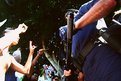
Critique By:
Henk Kok (K:673)
8/21/2003 9:06:27 AM
Why not give the guy a cigar instead of a piece of food? I get the idea, but a cigar would probably better fit his friendly character and total mastery of the kitchen. I mean, food and people generally mix quite hard. Anyway, excellent pose, beautifull lightning, and enough detail, but not too much.
|
| Photo By: Shalom Bar Tal
(K:139)
|
|
|
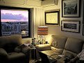
Critique By:
Henk Kok (K:673)
8/21/2003 8:51:23 AM
Thanks for your comment Jorge.
Ill try to be more specific.
Your lightning is perfect i think. BOth outside as inside look very natural within this extreme. BOth seem to be in focus. A job well done. What i meant was. The very edges of this image. If you look at them, you see on the right a half frame of a photo. On the downright corner a hand and partial body. The bottem itself is quite clear. the left side contains a slight cut from the window. the top features the very dark black part of the corner in your room.
|
| Photo By: Jorge Vasconcelos
(K:33746)
|
|
|
Critique By:
Henk Kok (K:673)
8/21/2003 2:24:54 AM
Quite a moody image, and one of your best images so far if i may say so. I'm slightly annoyed by seeing you kind of "show off" that you're a doctor. I guess for photography it doesn't really add much unless you'd completely combine your work with finding apropriate images and posting them here. But don't let me annoy you. I think personally you did a great job here.
|
Photo By: Dr. Rafael Springmann
(K:89517)

|
|
|
Critique By:
Henk Kok (K:673)
8/21/2003 2:15:06 AM
That's quite a comfortable corner you have there. I like the fact that you shot a scene where people live, instead of harsh geometry and slick lines. The edges if the frame are kind of chaotic, its the only comment i have. Apart from that i'ts a very nice image, even for people who never saw you, or your place. In chaotic scene's like this with very much to see, keeping the edges of the frame organised helps the image sometimes.
|
| Photo By: Jorge Vasconcelos
(K:33746)
|
|
|
Critique By:
Henk Kok (K:673)
8/20/2003 11:06:50 PM
Quite an excellent image. I love the strong ideological (potentially) contrasts by women in burka's resembling clothing spending money and walk around with trendy bags. Makes you just wonder what's IN those bags. A very nice angle to shoot from.
|
| Photo By: Vanek Jindrich
(K:2)
|
|
|
Critique By:
Henk Kok (K:673)
8/20/2003 5:22:28 AM
Excellent potential. Love the negative space and excellent curves. Do however improve your technique a bit by getting your subject sharp and well exposed with a load of nice details and interesting lightning. You already have the hardest part done.
|
| Photo By: Daniëlle Bergman
(K:19)
|
|
|
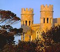
Critique By:
Henk Kok (K:673)
8/20/2003 5:18:40 AM
YOu managed to get quite an awsome lightning in this shot. With you eye it should be possible to find a better angle then this. In your shot "citadella" you showed that you are quite able to find quite a remarkable angle. This scene has some potential. THis one is interesting but nowhere near the quality you really poses i think. Keep it coming, you should be very able to continue with excellent compositions, geometric shapes and graphical solutions i guess.
|
| Photo By: Gordon Zammit
(K:401)
|
|
|
Critique By:
Henk Kok (K:673)
8/20/2003 5:08:29 AM
Excellent catography. Normally i tend to be bored with cats and flowers. However you managed to capture this animal's decadent tendency to lay around and stare at you. Lovely shot with good emotional elements.
|
| Photo By: a tostes
(K:3)
|
|
|
Critique By:
Henk Kok (K:673)
8/20/2003 5:06:01 AM
Excellent angle. QUIte a good way to turn a complex scene into something both graphical (stick looks 3d but is quite liniair) and thus creating a barriere. The sarcasm in your title is interesting as well. Im impressed with your choice of angle. ALso F8, you tried to capture the other parts of the scene as well? A job well done.
|
| Photo By: Steve Mayeda
(K:210)
|
|
|
Critique By:
Henk Kok (K:673)
8/20/2003 5:00:24 AM
Masterfully composed. I tend to agree with people that flower shots are boring. You seem to disagree and even better, you show that they indeed can be interesting. Not from a florist point of view, but from a compository angle. Quite a nice image. Technically it would've been impossible but some more sharpness would've been excellent. I mean, more dof and less bokeh. Anyway, an excellent achievement.
(i tend to keep my comments in english for others to enjoy as well. no offense intended)
|
| Photo By: Diana Cornelissen
(K:26437)
|
|
|
Critique By:
Henk Kok (K:673)
8/20/2003 4:53:23 AM
Interesting subject. I would've enjoyed it more if it would be slightly sharper and contrasty. YOu took quite a good angle but i wonder if at the other side there would be a beautifull horizon to go with your original composition?
|
| Photo By: Ebru Uskan
(K:63)
|
|
|
Critique By:
Henk Kok (K:673)
8/20/2003 4:51:34 AM
What the? I particularly enjoy three images at the same time. Kind of keeps the suspense. I guess the expression in this guy is quite playfull and funny. No idea how it relates to "above your head portrait" but then again, i haven't read that one yet.
Anyway, its dang funny to watch. What are those cables for? Amusing though.
|
| Photo By: Valbona Shujaku
(K:71)
|
|
|
Critique By:
Henk Kok (K:673)
8/20/2003 4:47:57 AM
I'm not as impressed as the others seem. Perhaps i'm to much of an addict for a very graphical negative space. Perhaps frame them in the center and let the lake and background form a nice strong symmetrical negative space around them? Just me giving my idea how to shoot it though. Its not a bad thing to frame things wide with some background.
|
| Photo By: Kim Taylor
(K:2816)
|
|
|
Critique By:
Henk Kok (K:673)
8/20/2003 4:36:23 AM
This one demands ultra sharpness. And the framing of the other bolts as well. Shooting at your lense most sharp mm and stopped down might improve it a bit. Colors are already quite good. COmposition could be a tad better imho.A very nice texture on that wall. Im in no way demanding ultra sharpness done by photoshop. But it wont hurt to stop it down. You where at 1/250 with f4.5 you mightve reached F8 with 1/60th or something?
|
| Photo By: Roland Le Gall
(K:7018)
|
|
|
Critique By:
Henk Kok (K:673)
8/20/2003 4:32:02 AM
Interesting Idea. How about using a long shutter like you did, but witha second curtain flash? That way you'll capture the entire scene, and have one pose which is the final pose. I think it would result in a bit cleaner result. Looks like you did already something like it. Quite amazing.
|
| Photo By: Inokenty Kastorkin
(K:28)
|
|
|
Critique By:
Henk Kok (K:673)
8/19/2003 4:03:36 PM
To be quite honest there isn't much dof in here at all. I see you're having a good time with your toy though. Might i suggest a 50mm F1.8 instead of your current choice of lense? That should give you some proper dof. Now its up to you to shoot another and different picture.
|
| Photo By: Reidar Olsen
(K:144)
|
|
|
Critique By:
Henk Kok (K:673)
8/19/2003 4:00:43 PM
Yes, i see it. THis one however feels probably much better at wide angle. This is an excellent pose but i suggest changing the light to a bit more warm color or at least with slightly more color while using something like a semi wideangle. A very noteworthy image if i may say so.
|
| Photo By: Lucas Zielasko
(K:78)
|
|
|
Critique By:
Henk Kok (K:673)
8/19/2003 3:58:14 PM
I remember a similar image which was probably done by you as well. I guess when i looked at the other image this was what i would've done as well. However you might wan't to change the background color to a blue/dark gradient instead of red to enhance the product and its reference to ice. Apart from that excellently executed. Ill take two.
|
| Photo By: Marco Favali
(K:76)
|
|
|
Critique By:
Henk Kok (K:673)
8/19/2003 2:05:02 AM
Excellent idea well executed. I do suggest though to increase the use of light in order to enhance your idea a bit. Unless ofcourse you wanted it this way. Your comments however don't show any proof of that.
|
| Photo By: Aleksandra Zvonar
(K:4623)
|
|
|
Critique By:
Henk Kok (K:673)
8/18/2003 4:00:01 AM
Is this reel? Quite strange proportions which do enhance the feeling of lonelyness quite well. Very nice composition in the sea and quite good light.
|
| Photo By: Nick Russill
(K:929)
|
|
|
Critique By:
Henk Kok (K:673)
8/14/2003 11:53:48 PM
You had me fooled quite well with the boat and shadow part. I took a second look and still it seemed quite natural. A job job well done.
Never took a picture from a plane yet, but perhaps i should. You where lucky on that position in the plane. doesn't really give you much flexibility composition wise, but it does create a story.
|
| Photo By: Jorge Vasconcelos
(K:33746)
|
|
|
Critique By:
Henk Kok (K:673)
8/14/2003 7:58:53 AM
A tad overbright lightning wise, quite original, very nice composition but slightly contrasty. Has a lot of potential. quite an amazing scene.
|
| Photo By: Ordilei Caldeira
(K:2545)
|
|
|
Critique By:
Henk Kok (K:673)
8/14/2003 7:53:46 AM
Love the blue tone, kind of dislike the part with no shadow. Perhaps use a polariser next time to enhance the intended effect. The boat fits in quite nicely imho.
|
| Photo By: Jorge Vasconcelos
(K:33746)
|
|