|
|
Critique By:
Elsa Mota Gomes (K:1565)
4/19/2004 8:28:24 PM
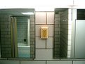
interesting detail, i suppose the shot would improve a bit if you chose to include all the door.
|
| Photo By: Ross Montgomery
(K:333)
|
|
|
Critique By:
Jeanette Hägglund (K:59855)
3/30/2004 12:53:24 AM
Nice shot and very interesting shadows.
Jeanette
|
| Photo By: Ross Montgomery
(K:333)
|
|
|
Critique By:
Ahmet Baki Kocaballi (K:13618)
3/29/2004 10:24:55 PM
nice capture ..
|
| Photo By: Ross Montgomery
(K:333)
|
|
|
Critique By:
Marcio Giudice (K:244)
2/24/2004 7:16:28 PM
Fantastic composition!!  ) )
|
| Photo By: Ross Montgomery
(K:333)
|
|
|
Critique By:
Joshua Rainey (K:5069)
12/7/2003 11:58:25 PM
wHAT i rEALLY lIKE iS tHAT yOU dONT sHOW tHE eNTIRE cLOCK...jUST eNOUGH fOR dETAIL aND tO kEEP mE fROM fEELING lIKE sOMETHING iS lEFT oUT...gOOD sHOT...
jASH
|
| Photo By: Ross Montgomery
(K:333)
|
|
|
Critique By:
Jose Ignacio (Nacho) Garcia Barcia (K:96391)
8/8/2003 9:43:01 AM
Stunning colours.I agree with Bill.
|
| Photo By: Ross Montgomery
(K:333)
|
|
|
Critique By:
João Figueiredo (K:7674)
5/15/2003 8:19:04 AM
like the idea...
|
| Photo By: Ross Montgomery
(K:333)
|
|
|
Critique By:
Robert Gaither (K:34128)

5/14/2003 10:40:26 AM
nice concept and good pictue.
|
| Photo By: Ross Montgomery
(K:333)
|
|
|
Critique By:
T Glow (K:14955)
5/14/2003 9:18:49 AM
nice detail & natural colors. well done! regards,T.
|
| Photo By: Ross Montgomery
(K:333)
|
|
|
Critique By:
Gatis Ozolins (K:1502)
5/14/2003 9:14:14 AM
interesting
|
| Photo By: Ross Montgomery
(K:333)
|
|
|
Critique By:
Adrian Cornish (K:307)
5/14/2003 9:09:23 AM
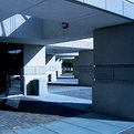
I really like the textures of the wood, chain and concrete, and the colours of the bricks and leaves. Great combination.
|
| Photo By: Ross Montgomery
(K:333)
|
|
|
Critique By:
Nicola Vassallo (K:9801)
5/14/2003 9:05:19 AM
ciao Ross. Carina. Buona la combinazione titolo - foto.
|
| Photo By: Ross Montgomery
(K:333)
|
|
|
Critique By:
Gatis Ozolins (K:1502)
5/13/2003 9:22:53 AM
well seen moment, only not focused enough
|
| Photo By: Ross Montgomery
(K:333)
|
|
|
Critique By:
Hayri CALISKAN (K:16195)
5/13/2003 9:08:11 AM
Beautiful composition with nice blue tones.
|
| Photo By: Ross Montgomery
(K:333)
|
|
|
Critique By:
Fabio Keiner (K:81109)
5/12/2003 7:09:29 AM
blurry and dark as hell
and equally dominated by a geometrical grid
:
hope you're not as schematic in reality as in pictures
|
| Photo By: Ross Montgomery
(K:333)
|
|
|
Critique By:
Onur Aydin (K:9815)
5/12/2003 6:14:58 AM
Very nice project shot then Nice outcome Regards; Onur.
|
| Photo By: Ross Montgomery
(K:333)
|
|
|
Critique By:
Larry Billinger II (K:236)
5/11/2003 7:21:35 PM
Awesome photo ross. I like it a lot. the blue is kickin'. You should get ahold of my office and ask susanne if you she will put it on the fhsu front page.
|
| Photo By: Ross Montgomery
(K:333)
|
|
|
Critique By:
Robert Gaither (K:34128)
5/11/2003 6:57:46 PM
Good nighttime image shadows work well.
|
| Photo By: Ross Montgomery
(K:333)
|
|
|
Critique By:
Kye Emrys (K:134)
5/11/2003 4:17:17 PM
I very much like this idea. The title is great. Although I admire the use of PhotoShop, it is nice ot see something presented "as is".
I do wish this was a little sharper, and I find the 2 balls of light distracting. Nice work.
|
| Photo By: Ross Montgomery
(K:333)
|
|
|
Critique By:
Larry Billinger II (K:236)
5/11/2003 2:36:33 PM
Love this pic Ross, Great Job. Don't know what that white thing is on the right but it's a good attention getter. Did you just erase it? hmmm, well, have a great day. I will add some of my own thoughts about this site now. I have figured that there are a lot of photographers who go for one style that is very popular right now. It's called Deconstruction, or thats what we would call it in Graphic Design. Either very colorfull or very dull and abstract, computerized look. I don't know why the person gave it such bad ratings before me, but I think it's one of my favorite of yours. And it's in daylight. I will not conform to there style, and I don't think anyone should. I appreciate the style and think it's pretty cool looking but enjoy my style as well and will not stop working with it, I will just try to get better at using it. Peace out!
|
| Photo By: Ross Montgomery
(K:333)
|
|
|
Critique By:
Nicola Vassallo (K:9801)
5/9/2003 8:32:14 AM
strana inquadratura per una strana luce. bella foto nel complesso.
|
| Photo By: Ross Montgomery
(K:333)
|
|
|
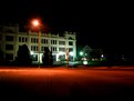
Critique By:
Ross Montgomery (K:333)
5/8/2003 10:32:23 AM
Shuter lentgh 1" and Exp. -1. I did realize I needed to crop tighter after I posted. Oops :P
|
| Photo By: Ross Montgomery
(K:333)
|
|
|
Critique By:
Alice Ewing (K:2418)
5/8/2003 8:21:14 AM
Keep up the good work! I would have liked to see tighter cropping, the building seems a bit too far away. I would also be interested in how long you left the shutter open for.
|
| Photo By: Ross Montgomery
(K:333)
|
|
|
Critique By:
Larry Billinger II (K:236)
5/7/2003 10:36:26 AM
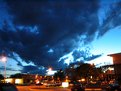
Man it's always interesting when people just say they like the photo or they don't like it. I like that Mr. Arrey actually left some constructive comments. Well Ross, I do like it. I would have to agree with Mr. Arrey that it's a bit grainy but I am happy with the sharpness. This grainy issue is something I don't like to comment on though becuase it is a compressed image. I think any pictures taken during this time of day or at night is hard to take without it turning grainy on a digital camera for some reason. I would photoshop them out of my pics but I will not touch my pics with a photo editor. I like the fact that you go with what your camera puts out and don't doctor it. I think it starts turning into graphic design a little. Overall, I love the blue man. My eye definatly moves from the bottom left to the top right just like the clouds are positioned. This makes it very appealing to me. Like I have said on some of my photo's I love focal point perspective and capturing it bluntly in photos. I think this photo is more of a thing of how most Latin speakers are tought to read, and that is from left to right. It gives me a good feeling. There, I think I gave you a meaningful critique. Hope you enjoyed it. Lata!!! Let's go take some pictures again soon before I leave.
|
| Photo By: Ross Montgomery
(K:333)
|
|
|
Critique By:
Mr. Arrey (K:11516)
5/7/2003 9:42:58 AM
Nice colours, but too grainy and not really sharp.
|
| Photo By: Ross Montgomery
(K:333)
|
|
|
Critique By:
Fabio Keiner (K:81109)
5/7/2003 9:42:53 AM
high on clouds
in the sky
|
| Photo By: Ross Montgomery
(K:333)
|
|
|
Critique By:
Klaus Wiese (K:614)
5/6/2003 10:03:44 PM
A good portrait, Ross!
PS: Cut the strings :-)
|
| Photo By: Ross Montgomery
(K:333)
|
|
|
Critique By:
Ross Montgomery (K:333)
5/6/2003 10:15:34 AM
yeah, funny thing is, I bought a tripod at wal-mart right after this picture. so hopefully I can get some better shots next time.
|
| Photo By: Ross Montgomery
(K:333)
|
|
|
Critique By:
Bill Krul (K:5597)
5/6/2003 10:12:19 AM
Ross: Did you use a tripod for this shot? I appears hand held as the buildings are blurred. Or are they out of focus? Since you have photo shop i would suggest cloning out the blak white rectangle in the fore ground and maybe a few of the real hot spots in the image. Otherwise beautiful color in the sky.
|
| Photo By: Ross Montgomery
(K:333)
|
|
|
Critique By:
Ross Montgomery (K:333)
5/5/2003 9:10:57 AM
Yes, a tripod is my next purchase for my camera. I've been trying to make do though, using my head (thanx Larry) and knee and anything solid.
|
| Photo By: Ross Montgomery
(K:333)
|
|